
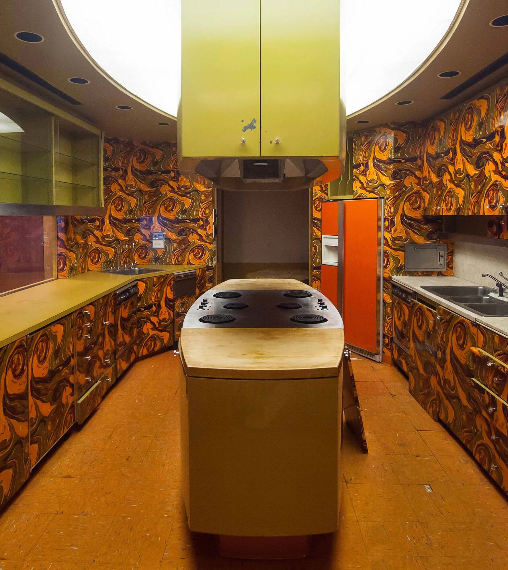
Issue 38 / Kitchen / Spring 2021
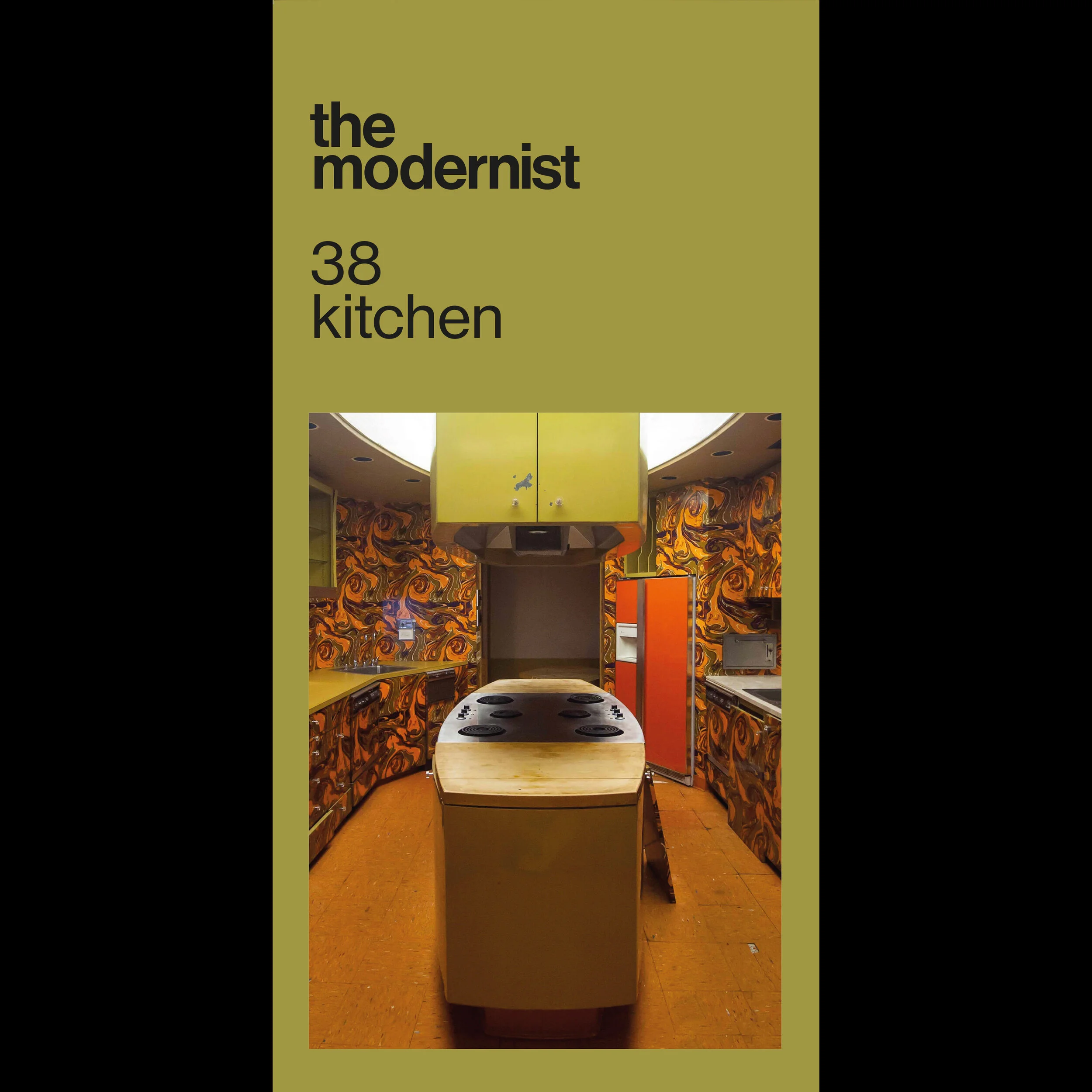

issue #38 KITCHEN MARCH 5th 2021
£7.00
Introduction from guest editor Matt Retallick:
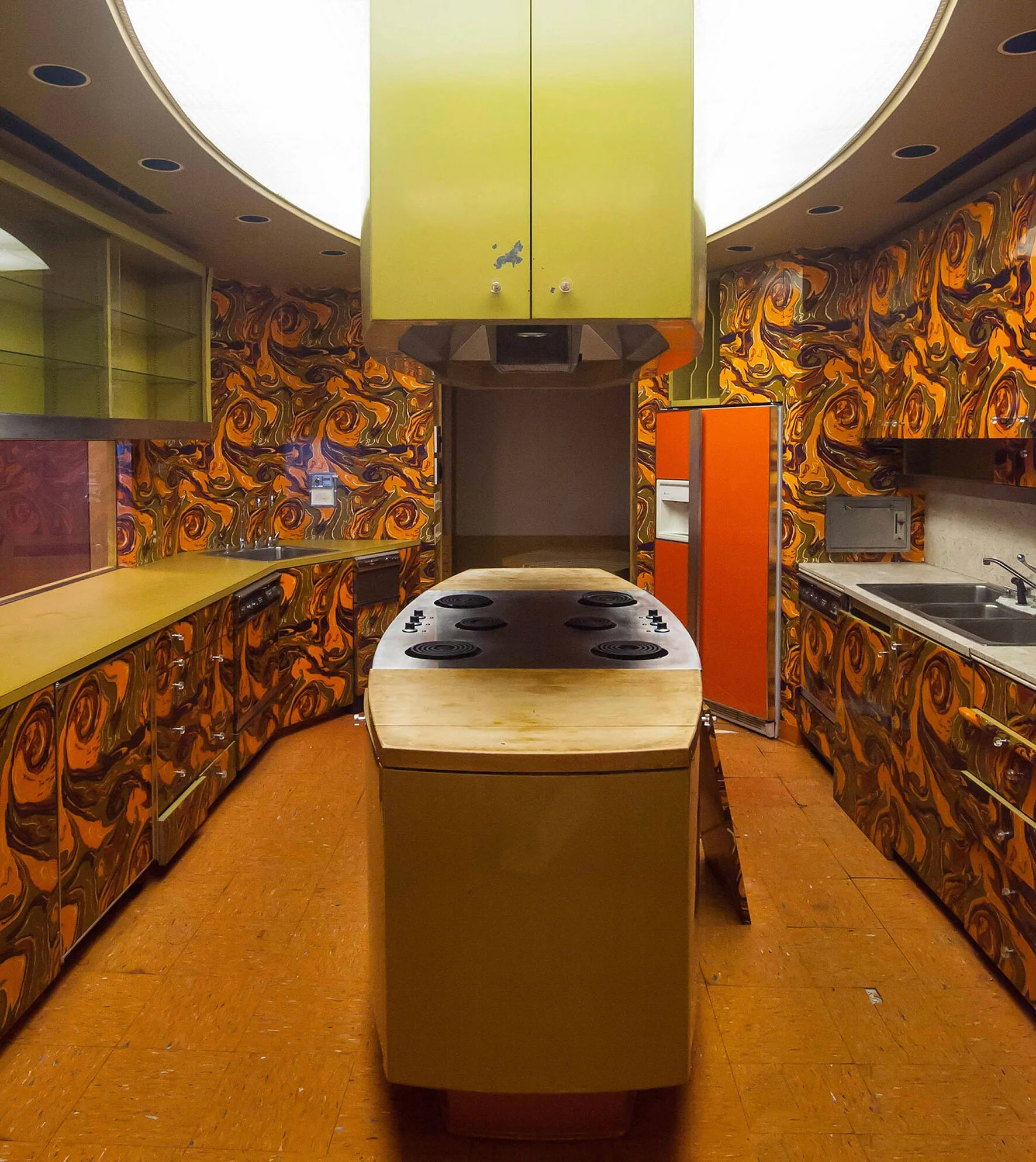
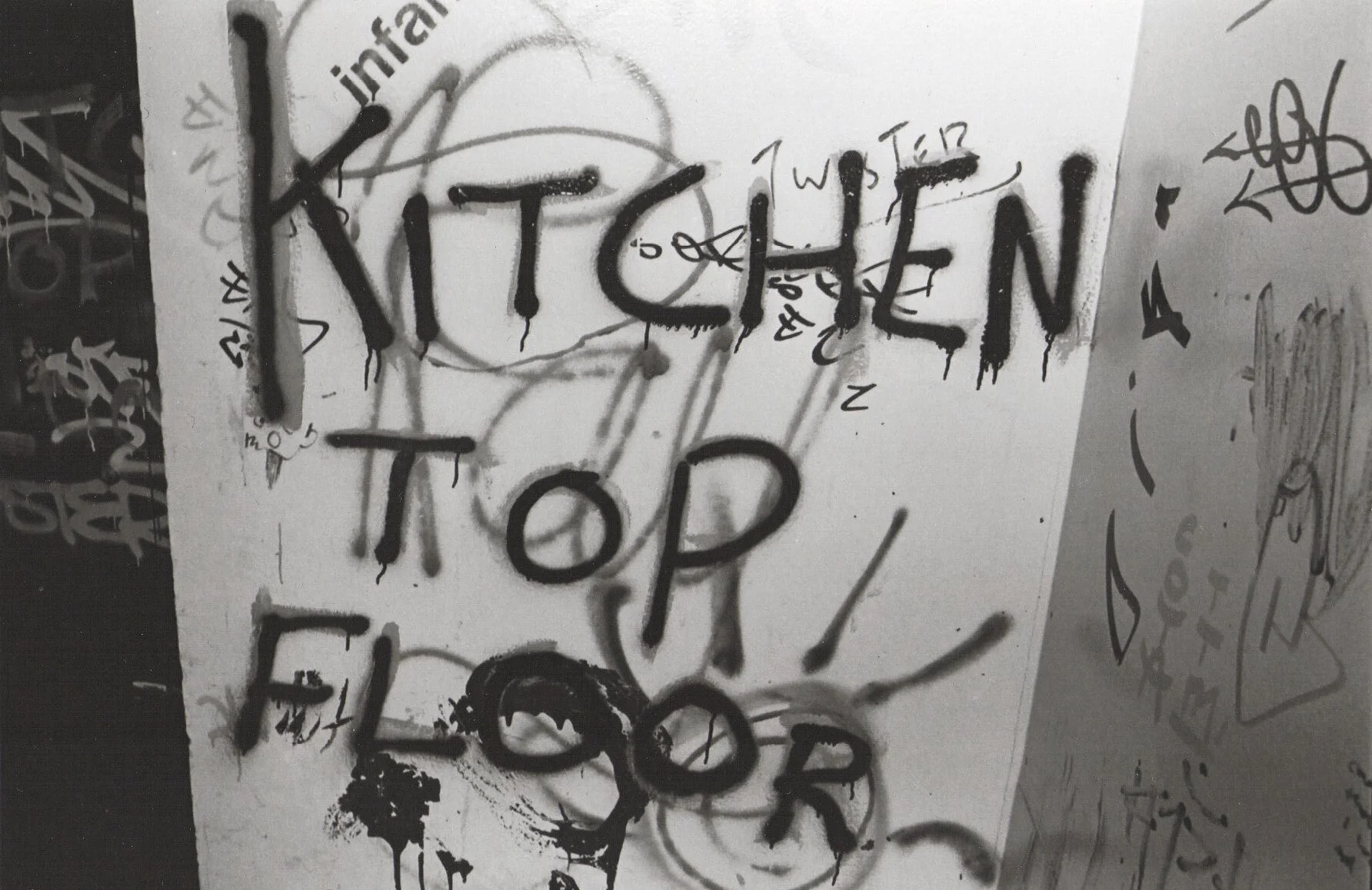
The kitchen is the heart of the home. I can’t believe I’m using that old cliché either, but as we’ve all been stuck indoors, it’s maybe truer than ever. We’ve taken to our kitchens, starting those ambitious culinary projects the normal working week wouldn’t ordinarily allow. Sourdough starters bubbling, vegetables pickling, fruit fermenting, cakes baking.
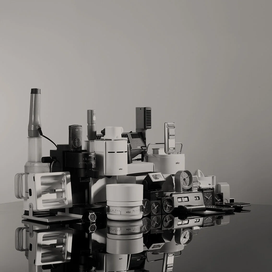
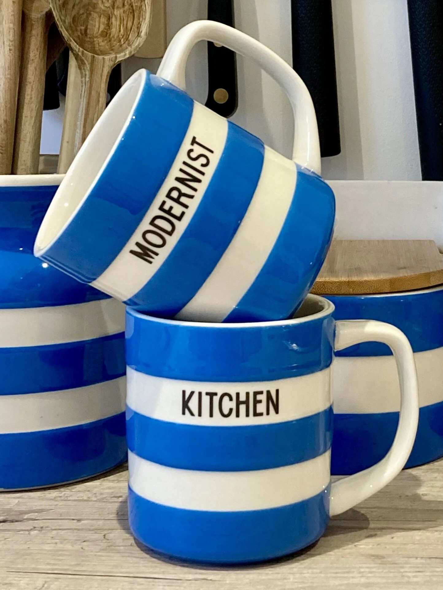
It seems fitting and timely then that this issue of The Modernist focuses on the kitchen, a room where modernist design informs all our lives. When I was asked to guest edit this issue, I jumped at the chance – I am a self-confessed kitchen obsessive, and as a lifetime member of The Modernist Society it won’t come as any surprise that my own kitchen favours the mid-century, the timeless, the made to last. The Bialetti Moka Pot, Leach Pottery, Cornishware, my Braun coffee grinder, a 1960s casserole from Elizabeth David Ltd, Falcon enamel plates and bowls.
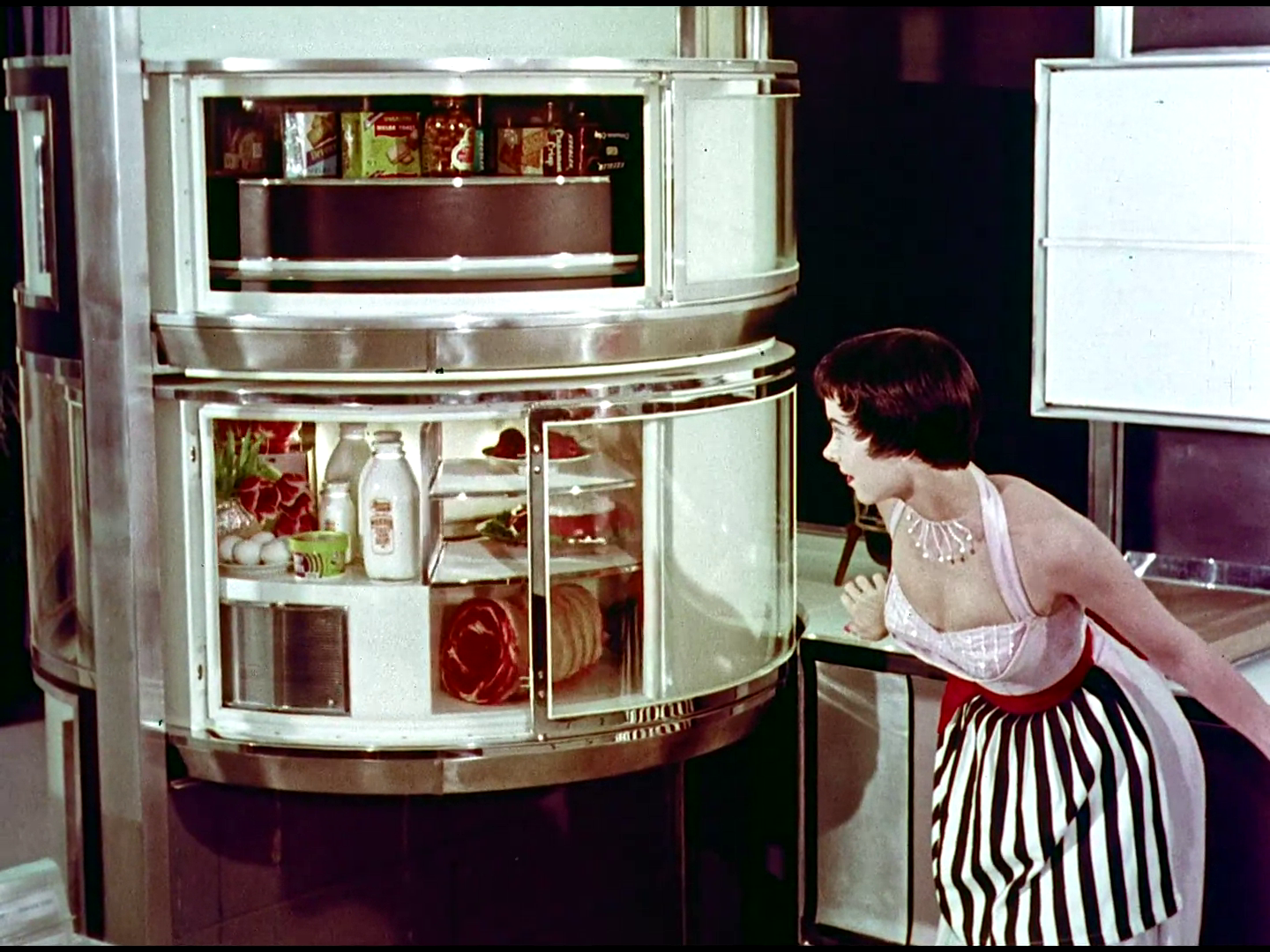
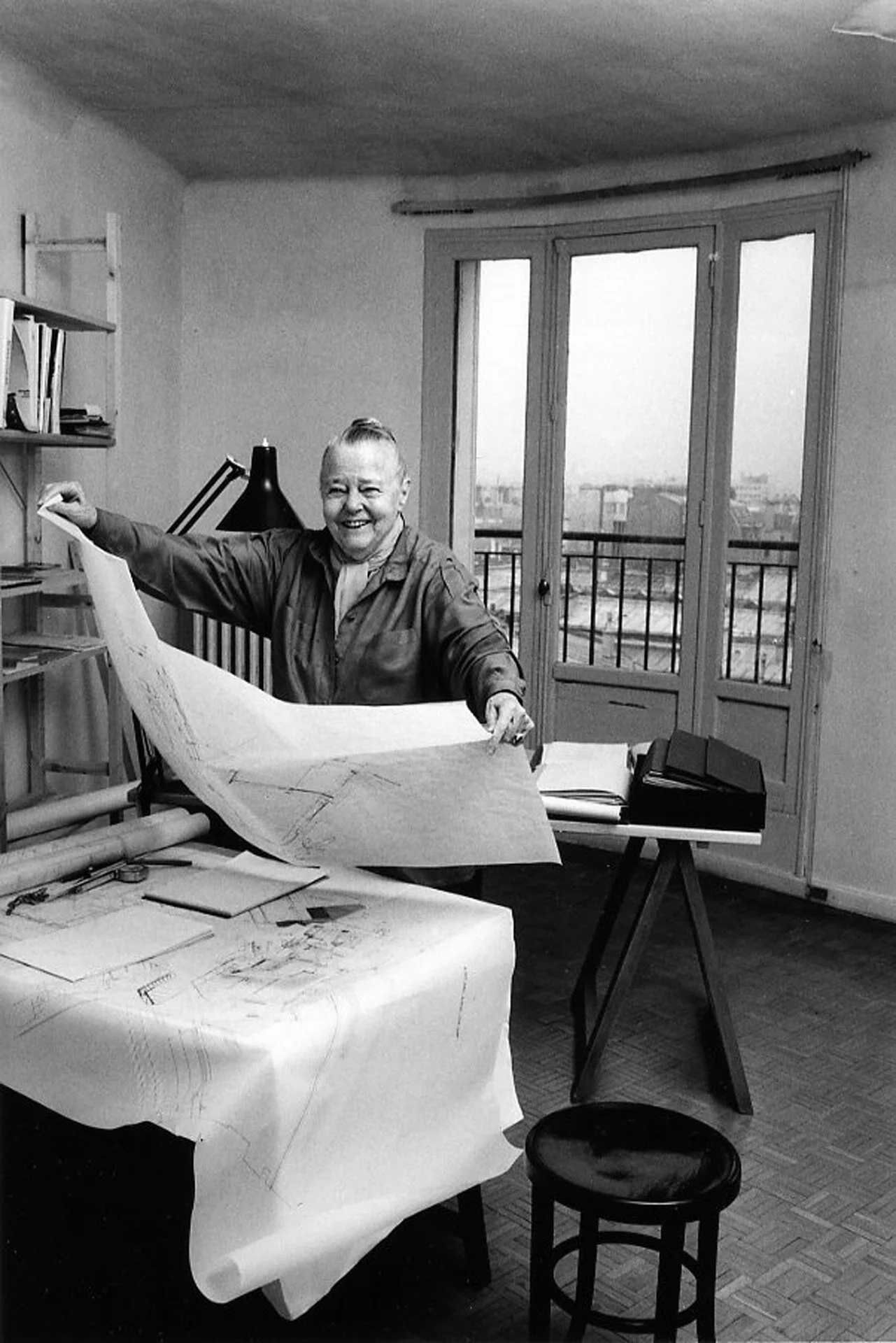
I have brought together those, who like me, are obsessed with kitchens and modernism, and collectively we offer you articles on a wide range of subjects, from American streamlining, to the Stelton EM Press and the work of Charlotte Perriand.
We also explore how in modernism handmade craft is often perceived as problematic, but articles featured here will remind the reader that modernist design isn’t always about the pure efficiency of the machine-made. This is explored through writings on Leach Pottery and Cornishware, but also in an article on how the traditional and modern collided in the mid-century Irish kitchen. We explore the iconic Frankfurt Kitchen, the precursor to all fitted kitchens, showcase collections of promotional beer mats for recognisable larder staples, and Braun appliances, as well as exploring Mancunian kitchen raves and a personal look at the ways in which modernism facilitates breakfast, the fastest meal of the day.
So, let’s put the kettle on to boil, pull up a Cesca chair and spend some time in the modernist kitchen.
CONTENTS: the modernist magazine issue 38
KITCHEN REVERIES Elena Falco // POTTERY TO ENRICH LIFE Matthew Tyas // BRAUN Glenn Thornley // CHARLOTTE PERRIAND: A WELL DONE KITCHEN Joe Austin // MODERNISM COOKS! Peter Wyeth // THE IMMEDIACY OF MORNING MEALS Harry Griffiths // KITCHEN POWER! Sorcha O'Brien // PULPED Adam Kimberly // YOU WILL ALWAYS FIND ME IN THE KITCHEN AT PARTIES Eddy Rhead // ORGANIC SCANDINAVIAN DESIGN Simon James Hadfield // A DATE WITH A DISH Ashiya Eastwood // CLEANLINESS IN DESIGN Matt Retallick
An annual subscription to the Modernist Magazine will save you money and time. Becoming a Modernist Society Member has more benefits still, as well as the option to save £8 a year on your magazine subscription. A combined subscription and membership costs £50 and provides additional benefits as well as supporting our not-for-profit organisation. More information on our membership scheme can be found here.
By subscribing to The Modernist magazine, you will be supporting The Modernist Society, a not for profit organisation.
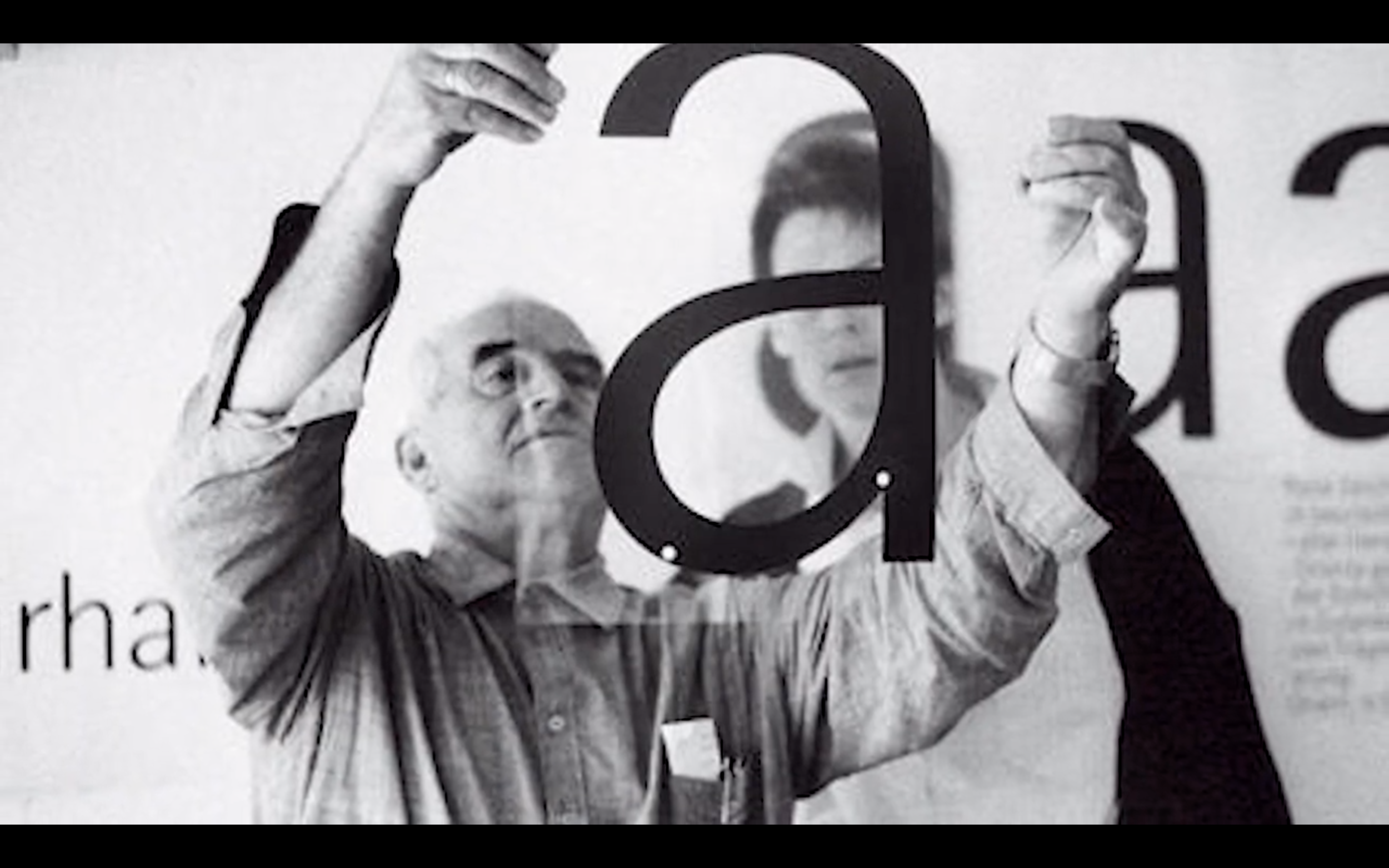
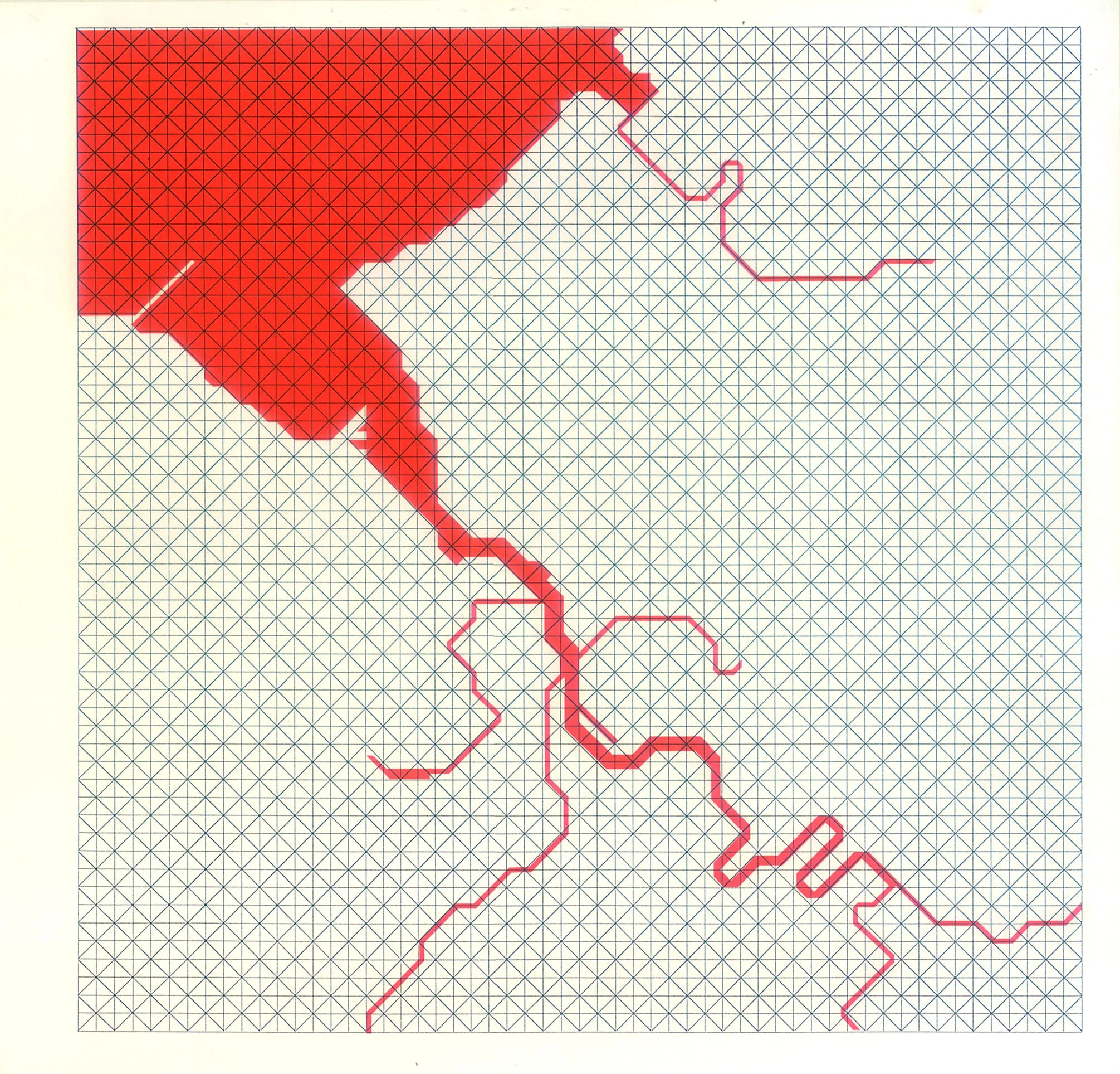
Otl Aicher. Metro Bilbao. Architecture and Landscape
05 November 2020–28 February 2021
BBK Gallery
Sponsored by Metro Bilbao
Metro Bilbao is presenting the first major international retrospective devoted to the German graphic designer Otl Aicher, with more than 200 works and projects from the HfG-Archiv Ulm (Archive of the Ulm School of Design) (Germany). Highlights include 80 never before seen drawings from his project for the Metro Bilbao, as well as a dozen drawings and photographs from the Norman Foster Foundation archive, the outcome of the encounters between Foster and Aicher.
This is also the first time the museum is presenting a monographic exhibition on design, an initiative which is part of the 25th anniversary of Metro Bilbao, on 11 November, a museum board member since 2001. Metro Bilbao is one of the essential projects in Aicher’s career which the museum now wishes to hold up as a paradigmatic example of design that is capable of changing the city—in this case, from underneath—and the way its inhabitants perceive it.
The show is a milestone among exhibitions on graphic design. Other celebrated drawings by Aicher are also on display, such as those for Braun, the 1972 Munich Olympics, Bulthaup and Isny Allgäu, in addition to unpublished materials for his architecture projects for Rotis, a former agricultural complex which he turned into a residence and work site.
Aicher is the heir to the Central European graphic design tradition, which uses grids to structure the space. He applied this system freely, subverting the geometric order when the composition did not require it to generate a structured yet visually active design. The combination of rigour and freedom, along with the intellectual development fuelled by the web of relationships he forged with intellectuals around the Ulm school like Josef Albers and Alexander Kluge, made him an exceptional designer.
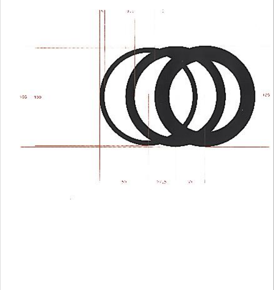
Starting in the 1980s, Aicher worked with Norman Foster on publications of his Works, who considered him “a legendary figure in the world of design”. As a result of this relationship, in around 1988–1989 he was entrusted with the design of the corporate image of the Metro Bilbao. The project was grounded in architecture, and both the city and his inquiry into Basque culture and landscape are the elements that defined its communication system. This and the projects he carried out for the 1972 Munich Olympics and Bulthap comprise the core works in Aicher’s career.
The exhibition is curated by Gilermo Zuaznabar, a researcher and professor in the field of Art and Architecture Theory at Rovira i Virgili University (Tarragona). He was also in charge of publishing the catalogue—issued in Basque, Spanish and English—an invaluable contribution on the figure of Otl Aicher and on European graphic design.
For further information please visit the Museum Bilbao exhibition page.
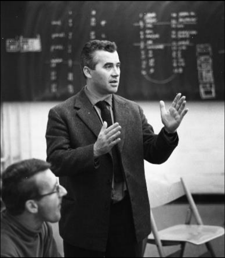
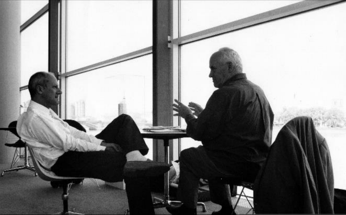
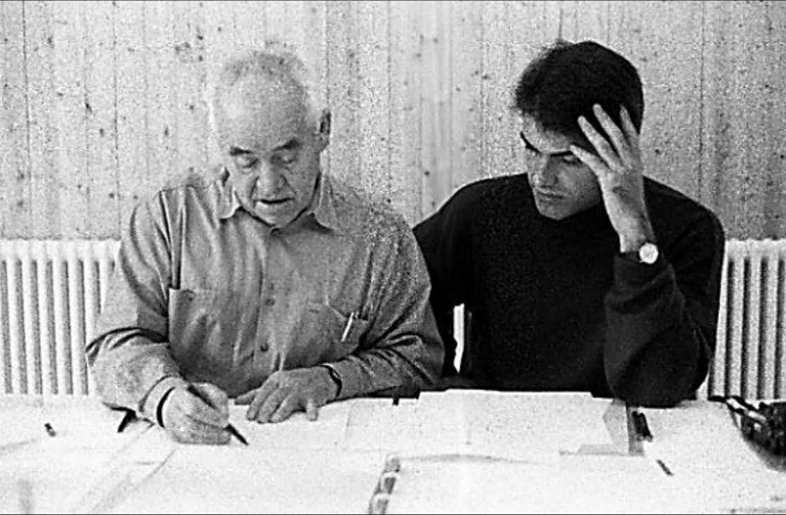
Otl Aicher (1922-1991)
Otl Aicher (1922–1991) is the most influential European designer from the second half of the 20th century. He, his wife, Inge Scholl, and the artist and architect Max Bill, founded the Hochschule für Gestaltung Ulm (HfG, Ulm School of Design) in 1953, an institution he directed with Tomás Maldonado and Hans Gugelot between 1956 and 1958, and by himself from 1962 to 1964. Both the HfG Ulm and the Ulmer Volkshochschule (Ulm Community College), also founded by Aicher and Scholl in 1946, were founded as cultural acts to repair the damage caused by the Nazi regime to German and European citizens.
Otl Aicher. Metro Bilbao. Architecture and Landscape shows, for the first time, much of the unpublished drawings that Otl Aicher made when designing the Metro's image. Both the infrastructure designed by Norman Foster and the corporate identity designed by Aicher are perfect examples of the merger of design, urban planning and architecture. Aicher viewed design as a means of economically and culturally transforming society. Along with Metro Bilbao, other projects are also presented in which landscapes and architectures are the subjects of his work. We are celebrating the 25th anniversary of Metro Bilbao by acknowledging the city's transformation dreamt up by this German designer in 1988.
Exhibition route
Gehen in der Wüste (Walking in the Desert)
Gehen in der Wüste (1986) tells the story of Otl Aicher's walking journey around the Sahara. The photographs accompanying his texts reveal such beautiful landscapes that one can sense that the experiences he had on the journey must have made it a "total" experience for Aicher. In a conference given in 2012 Yves Zimmermann clarified that the text reveals that his relationship with the environment is so intense that he cannot stop thinking about what he needed in each situation: shoes, clothing, materials, protection, food, drink. Aicher subjected everything he is wearing or has in his backpack to rigorous scrutiny, since his life may have even depended on the usefulness and efficacy of each object, utensil or piece of clothing.
William of Ockham
Along with Professor Wilhelm Vossenkuhl, in 1986 Aicher developed a unique project: an exhibition on William of Ockham. According to Aicher, Ockham was one of the first thinkers and designers of modern science; thanks to him, thought «abandoned abstraction and turned towards concretion».
As Neus Moyano explains in the exhibition catalogue, Aicher drew inspiration from mediaeval painting and Gothic architecture. Each panel repeats the same structural and semantic order: four bands organising the narrative. Axonometric and isometric projections are used to represent cities and landscapes from above, the same aerial perspective Aicher used when preparing the Bilbao Metro project.
Braun
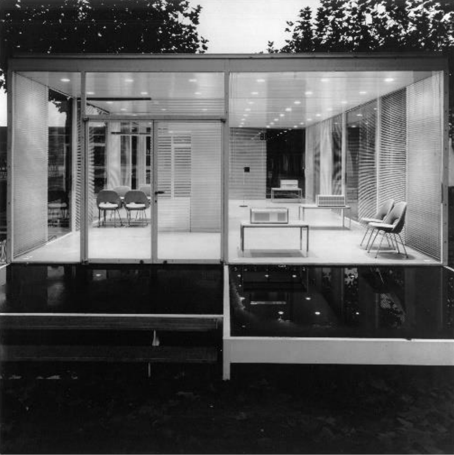
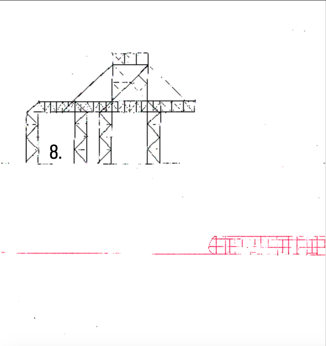
In August 1960, Otl Aicher designed an industrial construction system. The document is comprised of 91 plates which are illustrated with freehand drawings and texts typed on parchment paper. Even though this was a personal undertaking, it was drafted in such painstaking detail that we can still assess and appreciate its construction. The system is based on the Braun pavilions that he and Hans Gugelot designed in 1955 for indoor fair venues –on display– and in 1959 for outdoors areas. Aicher most likely developed it to offer it to Braun executives, who at that time were considering building in a housing development, the Siedlung Roter Hang, for its employees in Frankfurt.
Rotis
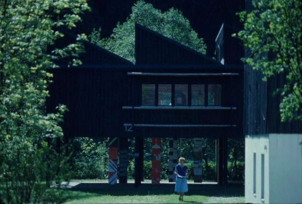
After the HfG Ulm closed in 1968 and the looming end of the projects for the 1972 Munich Olympics, in 1970 Otl Aicher was looking for a new place for his family residence and workplace. The designer found the Rotis rural mill house, with its multiple uses, to be everything he had envisioned for his future enterprise. He wanted to gather professionals from different disciplines in the field of visual communication there. In Rotis, Aicher remodelled the mill and stables (1972) and designed six new industrial-looking constructions: his own studio and the photography workshop (1972), the power plant (1973), the garage (1978), the small cabin as a sculpture atelier (1985) and a studio (1976) which he never built but just remained in the design stage.
Rotis is also the name of the font designed by Aicher in 1988 based on the new corporate design for ERCO. With it, he sought to build a bridge between the Grotesque and Roman fonts. Thus, the font has two intermediate styles: semi-Grotesque and semi-Roman. For Metro Bilbao, he used a 65-font Rotis semi-Grotesque (half-bold) or a 55 font (regular).
Isny Ällgau
In 1979, Otl Aicher received the commission to design promotional materials for the tourism bureau in the Ällgau region, where Rotis is located. He prepared an album with 80 black-and-white drawings showing different outings around the region. The series is comprised of sketches of people, animals, plants, buildings and landscapes. Tourist promotion via black-and-white graphics reveals Aicher's radicalness, but it proved to be an effective system, since the drawings neatly capture the landscape and culture of Ällgau. Reducing the drawings to their essence enabled them to be used in different formats over the course of several decades. The black and white of the clean surfaces encouraged viewers to imagine the colours of the landscapes and objects, leaving a strong impression both on the retina and in the memory.
Metro Bilbao
In March 1988, Norman Foster won the contest to build the underground of Bilbao. Even though the Metro's sign appeared on the panels in the proposal, once the contest was awarded, Otl Aicher created a "complementary study" to define its design in the autumn of that same year. It is comprised of 200 plates which graphically analyse the history, heraldry, culture and forms of the Bilbao metropolitan area, as well as different handwritten reflections. For the exhibition of this unpublished work, we have chosen 59 plates divided into four groups.
In addition to their exceptional graphic quality, the study is a good example of the designer's working method; to define signage and information system for the Metro, the designer made a diagnosis stemming from the city's economy, society and culture in which his work would act. He conducted this process with clear awareness of the economic, social and cultural repercussions that the final design would have.
Lufthansa
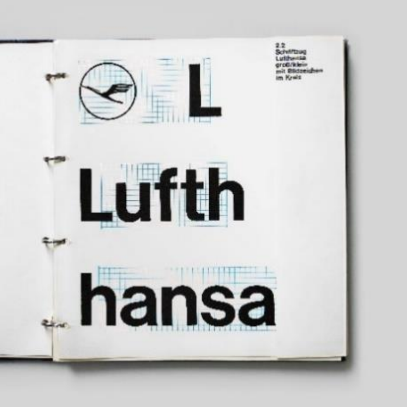
In 1962, the civil aviation company hired the E5 development group at HfG Ulm, led by Otl Aicher and Hans Gugelot, to update its corporate image. The project included the significant elements of Lufthansa: logos, signage, stationary, tickets, tableware, uniforms, etc. Between 1974 and 1984, Aicher's office, by then in Rotis, also designed the company's promotional publications and posters. The outcome of that partnership is the catalogue Im flug über Europa [Flying over Europe]. The publication is comprised of bird's-eye views of cities and landscapes that celebrate the continent's history and culture. Aerial photography is a resource that Aicher also used in the Metro Bilbao project (1988) to both represent and to analyse the old city.
1972 Munich Olympics
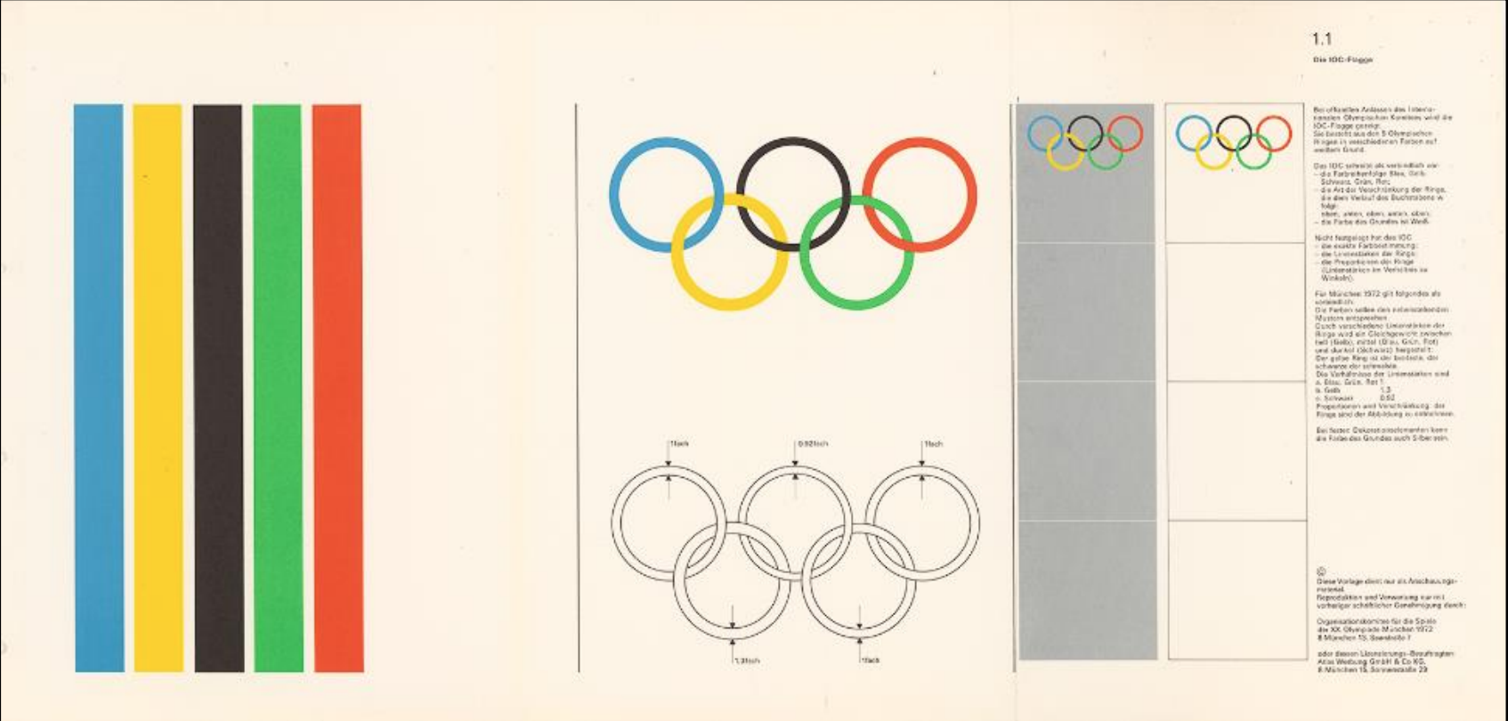
In 1967, Otl Aicher won the contest to design the communication system of the 1972 Munich Olympics. Both the organising committee and the designer himself sought to offer a new image of West Germany. This cheerful colouring based on extraordinarily dynamic figures, which avoid vertical and horizontal lines, with photographs of “messy” curved lines and oblique directions, was used to convey a vivid image of the event and the country. The colours were taken from the Olympic emblem, but Aicher avoided using red and black, which, along with white and gold, were the dominant colours in German society in the 1930s and 1940s, as well as the 1936 Berlin Olympics.
ERCO
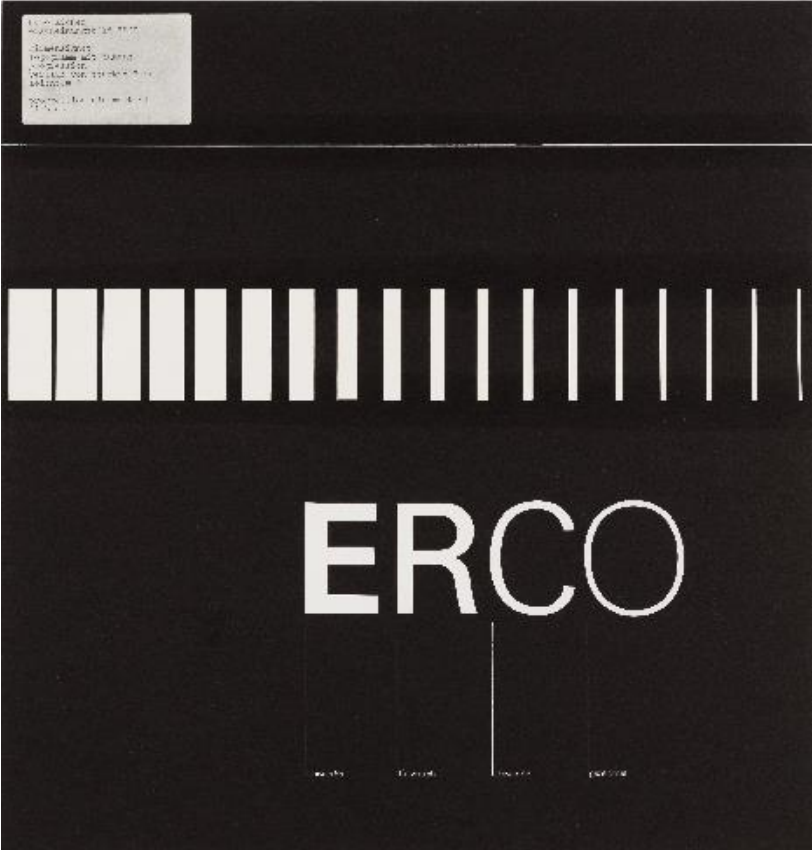
On commission from ERCO, between 1975 and 1978, Otl Aicher developed the system of pictograms designed for the 1972 Munich Olympics into a signage system for buildings and public spaces, still marketed today by the company. The Munich pictographs were developed in 1967 based on Matsuri Katsumi’s work for the 1964 Tokyo Olympics. Katsumi and Aicher are, in turn, indebted to the Wiener Methode der Bildstatistik [Vienna Method of Pictorial Statistics] developed by Otto Neurath, Marie Reidemeister and Gerd Arntz. This method was designed to convey data and complex concepts on the economy and sociology to the less educated citizens, with figures called Isotype figures, halfway between sign and picture.
Bulthaup
In the early 1980s, a kitchen manufacturer went to Rotis to commission Otl Aicher to design the corporate image of his small company. Before beginning the design, Aicher suggested conducting a study on what a kitchen is, with the goal of understanding what the new kitchen in the second half of the 20th century should be like. He drew country kitchens, mediaeval kitchens, kitchens from bourgeois haute cuisine restaurants and Ernst May’s kitchen in Frankfurt, as well as the items and fabrics used in them. Today, Bulthaup’s celebrated kitchens are the outcome of this research, which was compiled in the book Die Küche zum Kochen: Das Ende einer Architekturdoktrin (1982) [The Kitchen for Cooking: The End of an Architectural Doctrine].
Activismo
Both the HfG Ulm (Ulm School of Design) and the Ulmer Volkshochschule (Ulm Community College) were founded as educational and cultural actions aimed at combatting the damage caused to German and European societies by the Nazi regime. Aicher viewed design as a means of economically and culturally transforming society. He developed a design morality which he also transferred to his political commitment via his support of the German Social Democratic party and different actions in favour of ecology and nonviolence.
Sophie and Hans Scholl
On 22 February 1943, the siblings Hans and Sophie Scholl, along with Christoph Probst, were sentenced to the guillotine for high treason against the fatherland in an extraordinarily summary trial. Their crime: combatting the vast power of the Third Reich with their bare hands and a cyclostyle, by reproducing and distributing proclamations against Hitler and his wars. The Scholls and Probst were part of the resistance group Die Weiße Rose [The White Rose], which had been founded at the University of Munich in 1942.
Inge Scholl and Otl Aicher looked for a way of honouring the memory of her murdered siblings and colleagues with the understanding that there is no more effective “monument” than educating the citizens who had grown up under the Nazi ideology and who had mostly been complicit in their harassment and executions. This, in 1946 they founded the Ulmer Volkshochschule and in 1951 the Hochschule für Gestaltung Ulm.
In 1985, Otl Aicher built a small cabin in Rotis somewhat apart from the studios and from his house, where he secretly resumed practising sculpture, which he had abandoned in 1946. There, he shaped the busts of Sophie and Hans Scholl on 26 August 1991, just a few days before his death.
Issue 37 / Kino / Winter 2020
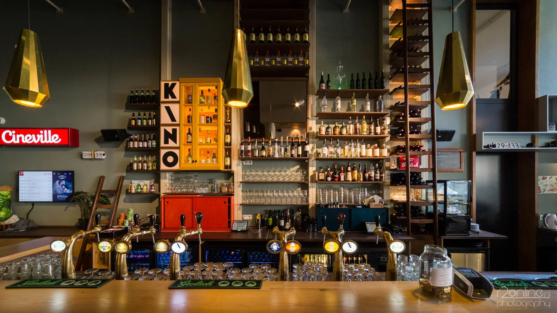
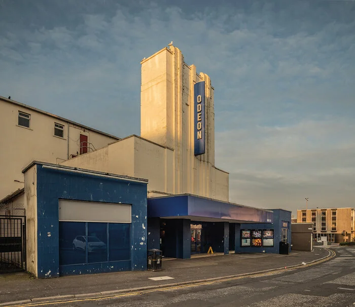
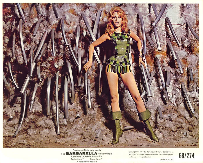
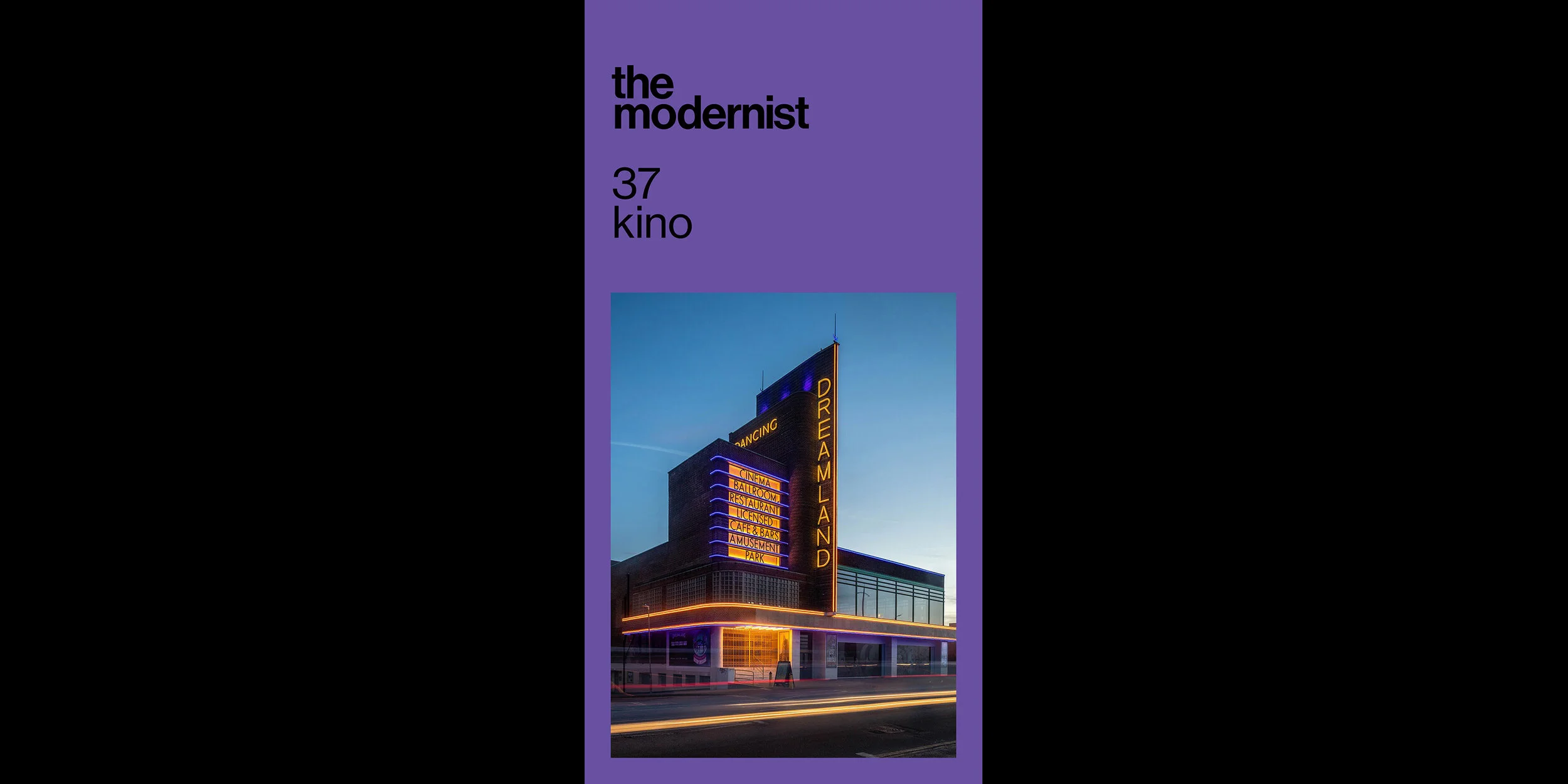
the modernist magazine issue 37 is guest-edited by Jason Wood, Creative Director of Film and Culture at Manchester’s HOME Cinema.
KINO explores the interaction between cinema and modernism.
Wood elaborates: “I wanted to think of the role the moving image and the physical cinema space plays in our collective lives and consciousness. COVID-19 has been very hostile to art spaces, and there will be more casualties to add to the venues that haunt the landscape like ghosts, re-purposed to house other businesses and other activities. With this in mind, I wanted to commission pieces that served to remind us of the function that any artform plays, especially in a time of crisis.
It is through arts and culture that we can come together to better understand and commune with each other, sometimes agreeing often disagreeing, but nonetheless being exposed to new aesthetics and perspectives that may help us build a better and more egalitarian society.”
CONTENTS:
KINO ROTTERDAM Jan De Vries // JOHN SIMONS: MODERNIST Mark Baxter // DEMONISATION OF SCI-FI Rebecca Power // IMPENDING ABSCENCE: KOGONADA’S COLUMBUS Jason Wood // ODEON RELICS Philip Butler // UNCOMPLICATED FUTURE: MODERNIST DESIGN IN SPIKE JONZE’S HER Ally Davies // LESS IS MORE: SCORING MUSCLE Nick McKay // THE RENOIR AND AFTER Robert Beeson // LIMINAL STATE Simon Barker // THE GHOSTS OF CINEMA PAST Andy Murray // NON-OBLIQUE STRATEGIES: RAMS AND ENO’S MUSIC FOR FILMS Jason Wood
An annual subscription to the Modernist Magazine will save you money and time. Becoming a Modernist Society Member has more benefits still, as well as the option to save £8 a year on your magazine subscription. A combined subscription and membership costs £50 and provides additional benefits as well as supporting our not-for-profit organisation. More information on our membership scheme can be found here.
By subscribing to The Modernist magazine, you will be supporting The Modernist Society, a not for profit organisation.
**Please remember - we are a not for profit organisation with a very small team. We aim to dispatch your order within seven days of receiving it. Please be patient with us. Thank you.**
Design a cycling jersey for The Modernist Cycling Club
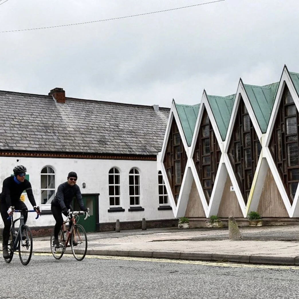
Photograph by HENRY IDDON
We are big cycling fans here at Modernist HQ (well Eddy is at least) and we know lots of you are too.
A few years ago we even set up The Modernist Cycling Club. However, mainly due to Eddy’s inability to get out of bed on Sunday mornings, it very rarely actually met for any rides. Despite this we know many of you enjoy cycling and also enjoy The Modernist - so we have decided to make our own cycling jersey, and hopefully a cap too. Instead of letting Eddy loose with his crayons we have decided to open it out as a competition. As well as many of you being cyclists we also know lots of you are designers too so its a perfect chance to combine your interests (although you dont have to either a cyclist or designer to enter).
The prize is not only the honour of seeing your design on the backs of skinny, and not so skinny, Modernist cyclists but we’ll also give you a jersey ( a winners jersey if you like) and a cap.
We don’t have any preconceptions regarding design, thats up to you, but if you would like to enter please email Eddy and we can send you some templates for the jersey and cap, along with some guidelines regarding typefaces and colour palette etc.
Chapeau and ALLEZ ALLEZ!
Issue 36 / Justice / Autumn 2020
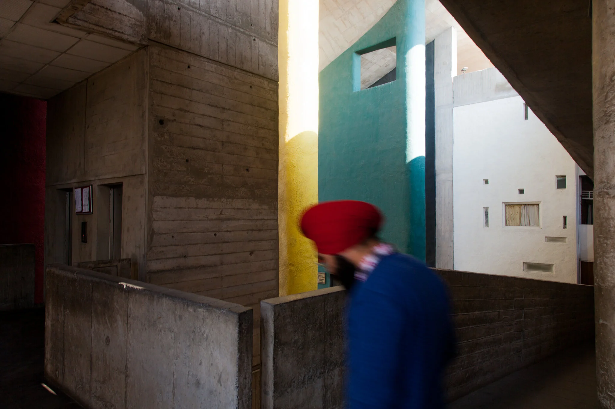
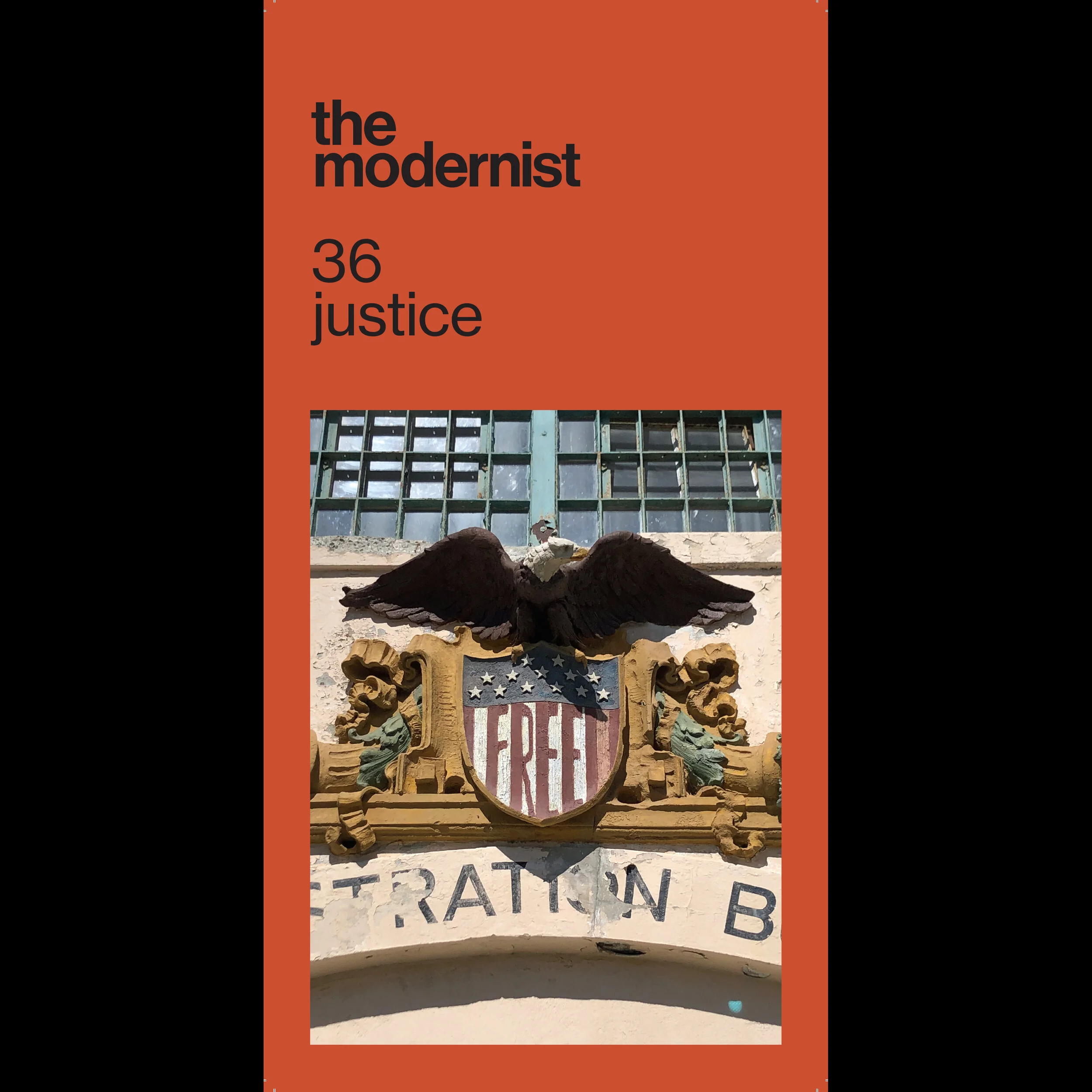
Though commissioned before the life of George Perry Floyd Jr. was cut murderously short by the knee of a white American police officer, the wave of unrest and injustice released has rocked and rippled throughout this issue. No Justice. No Peace. The words ringing in our ears after events across the globe, heard still in our cities, communities and in our consciences. Black lives matter, and like justice, this isn’t a new nor simply pertinent issue, but an ongoing fight. One the assembled stories herein show affinity with, and attest to.
When bringing these stories together they confirmed a deeply held belief in me, that even though movements and actions can be separated by distance, and even decades, those seeking justice recognise each other as allies and struggle together. A sense of solidarity has the power to converge movements. We can each see ourselves in the oppressions of others.
Therefore this issue may appear to take a somewhat tangential path for a magazine devoted to the design and architecture of the 20th century. Rather than examining the structures of modernism, it instead aligns with the people showing a sense of solidarity with its ideas and its ideals.
For if any movement or idea posits itself for the betterment of humanity, and one of peace, it must first deliver justice for its people.
Craig Oldham - guest editor
CONTENTS:
BRISTOL AFTER COLSTON Theo Watt // JUSTICE & MAINTENANCE Will Jennings // A FOLLY FOR LONDON // #CLAWSOUTFORTRANS Charlie Craggs // CONCRETE CAPITOL Josh Cunningham // UNBUILDING RACISM Designing Justice + Designing Spaces //COUNCIL ESTATE CORNUCOPIA: A LEGACY OF GREEN SPACE Leanne Cloudsdale // WE HOLD THE ROCK Craig Oldham // TYPOGRAPHIC IN/JUSTICES Timothy Donaldson //A BIRD’S EYE OF INJUSTICE Carl Cattermole //ESCAPE FROM NEW YORK Roger Luckhurst // JAIL GUITAR DOORS Billy Bragg
An annual subscription to the Modernist Magazine will save you money and time. Becoming a Modernist Society Member has more benefits still, as well as the option to save £8 a year on your magazine subscription. A combined subscription and membership costs £50 and provides additional benefits as well as supporting our not-for-profit organisation. More information on our membership scheme can be found here.
By subscribing to The Modernist magazine, you will be supporting The Modernist Society, a not for profit organisation.
Modernist Birmingham mapped
Back in 2015 we worked with our friends at the Birmingham chapter of the modernist society, to produce this on-line map. It features over ninety twentieth century buildings dotted around the city centre and beyond.
Madin’s magnificent Central Library has long gone and it is likely that some other Birmingham buildings have since been radically altered or even demolished since we drew up this list, but here you can once again see our selection - drag the map to view more or for a full page version with drop down list of the featured buildings see the full screen map here
Theaster Gates and the Rebuild Foundation
Continuing with our look at the contribution black people have made to architecture, design and culture we look at the work artist Theaster Gates is doing in his home town of Chicago through his Rebuild Foundation.
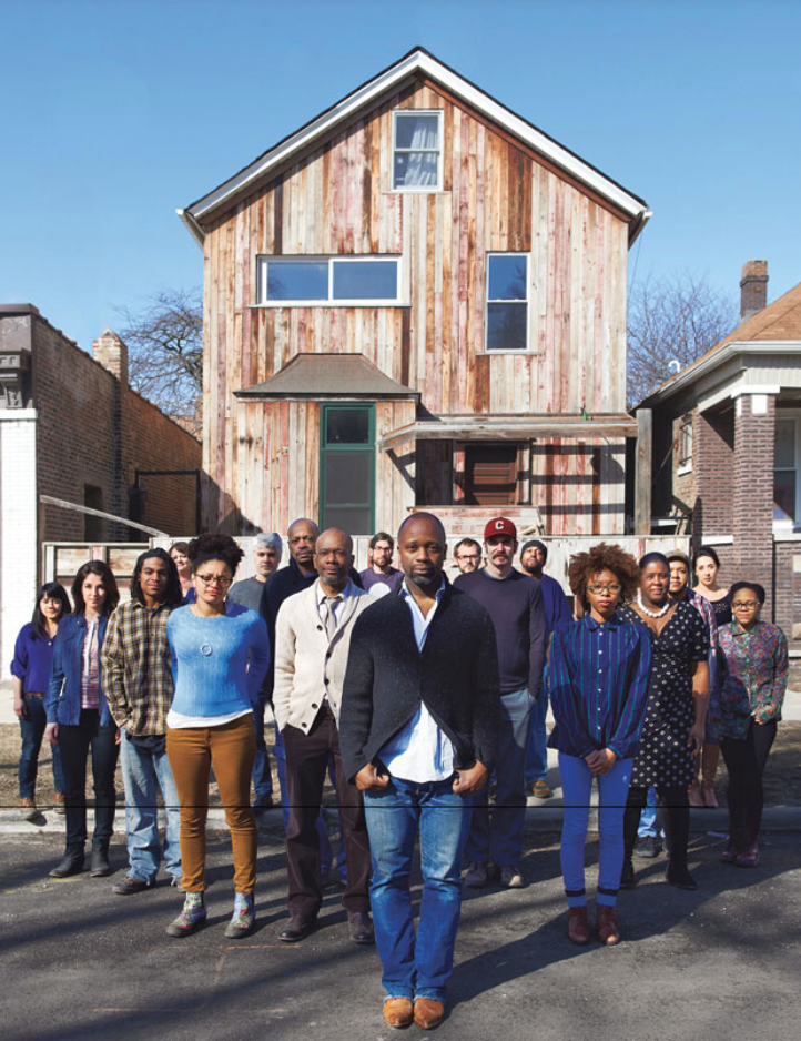
Those of you who have Apple TV may want to seek out the series HOME. If you don’t get Apple TV they are currently running a 7 day free trial. The series looks at a variety of projects around the world but perhaps the most inspiring is the episode that focusses on the work Theaster Gates is doing in Chicago, using art. culture and architecture to reinvest in and revitalise his community.
Theaster Gates, a successful artist, has made a significant living out of his art. Once making his wealth, however, he chose not to move out of the South Chicago area to a more affluent neighbourhood but instead chose to stay and renovate one of the once-grand houses that could be found in the predominantly black area of South Chicago - an area that was once prosperous but had seen ‘White Flight’ in the 1970s.
After renovating one house, he bought the house next door and extended into that also. He then renovated a building across the street into a community cinema. Through his Rebuild Foundation he then set about taking abandoned buildings and repurposing them, using art, culture and craft to bring investment and purpose back into the buildings and in to the wider community as a whole.
His most ambitious project to date was taking a derelict bank building, originally built in 1923, and converting it to the Stony Island Arts Bank. Not only does it serve as a gallery and arts space, it is now home to two amazing Chicago archives. You may remember we talked about the rise and fall of the Johnson Publishing empire recently and when they had to vacate their former HQ the enormous and unparalleled collection of books and periodicals relating to black culture had no home. Using a double height space in the bank, Theaster created a beautifully fitting home for this amazing collection.
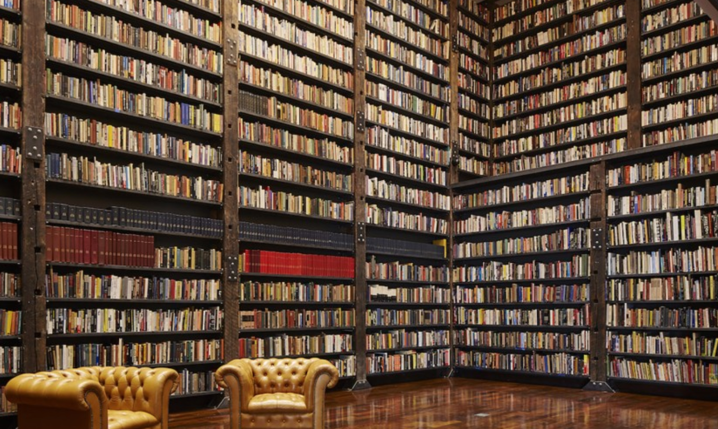
Another priceless collection is the former record collection of Frankie Knuckles, the originator of House music, who died in 2014. Thanks to Theaster and the Rebuild Foundation this unparalleled archive is now open to the local and wider community ensuring Frankie’s legacy lives on.
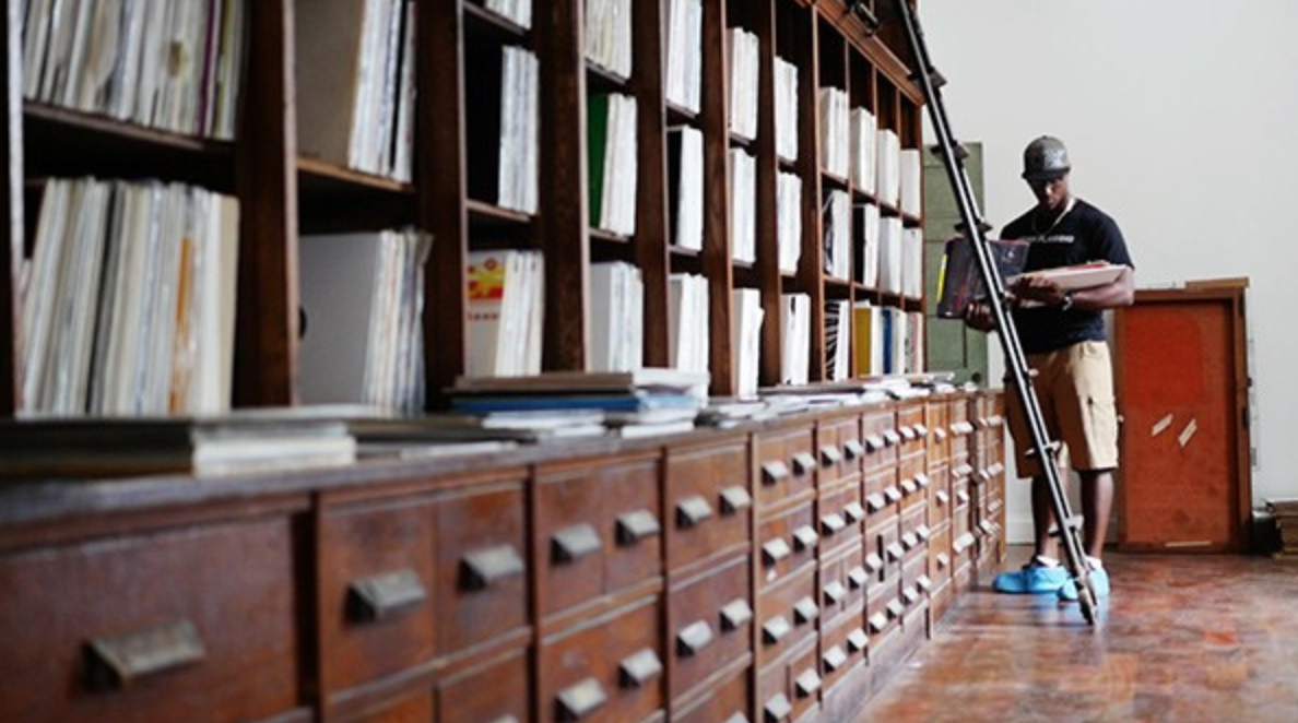
Theaster and the Rebuild Foundation’s work is far from finished and they continue to reinvest in the South Chicago district and they have many architecture-led projects planned. The story is inspiring and should serve as an example to people all over the world that with wealth comes power and what you do with that power should be a force for good.
Sign up for the free trial of Apple Tv and see the programme HOME here
Emory Douglas
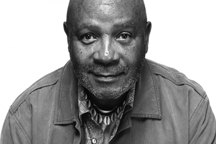
Portrait of Emory Douglas by Bryan Shih.
Emory Douglas
B. 1943 (age 77) Michigan, USA.
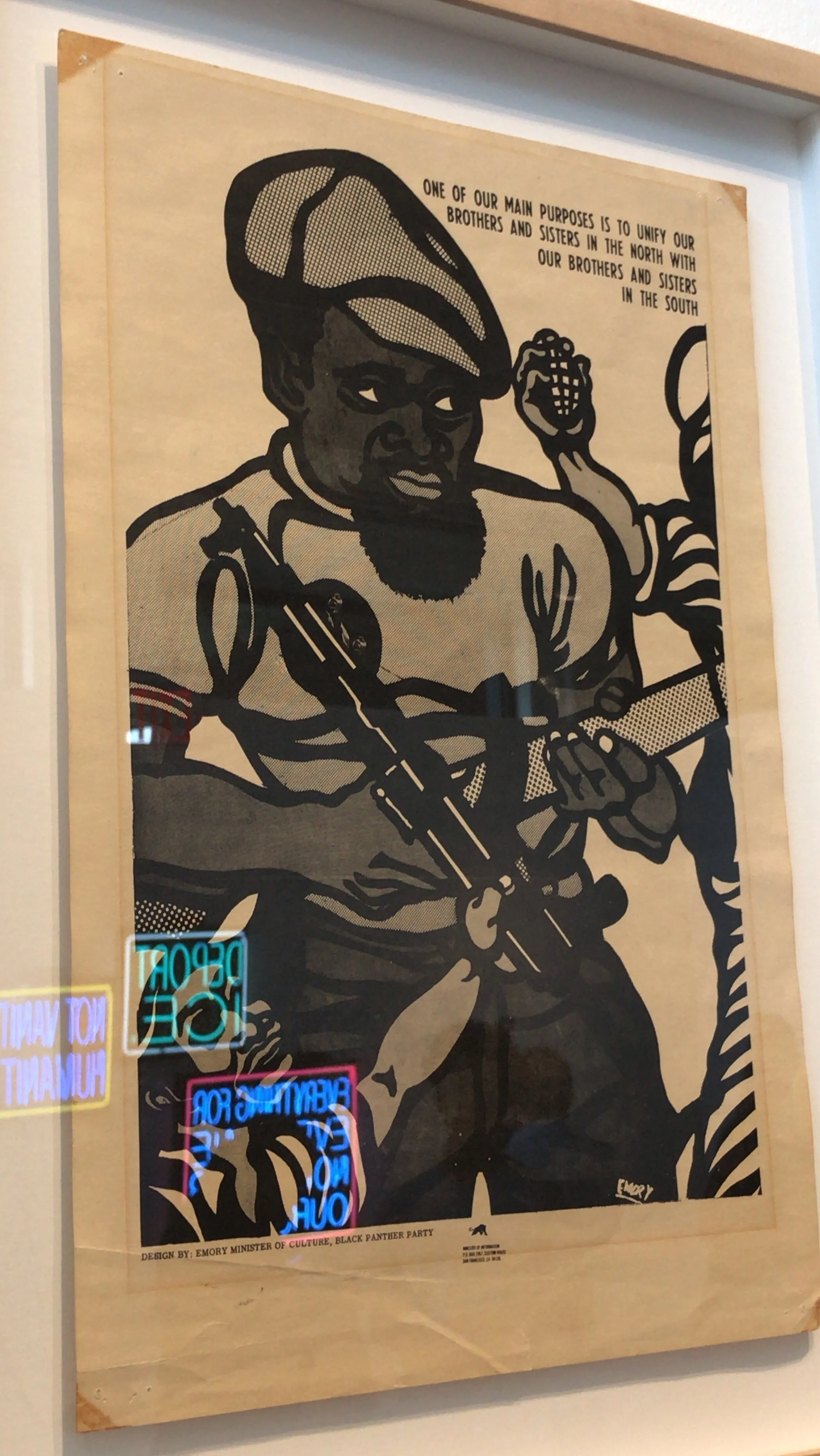
Emory Douglas was Minister of Culture at The Black Panther Party for the duration of its active years - 1966 to 1982.
The distinctive visual look of the Black Panther Party was as a result of the creative direction of Douglas - and that’s a BIG achievement because their visual game was strong.
His distinctive, stylised graphics and printed-poster-art aesthetic helped a message to be quickly understood. It perfectly complemented the parties bold and clear communiques highlighting the struggle of African-Americans with regards to structural and institutional racism, the fight not being in Vietnam but in their US homeland, police brutality, oppression and inequality.
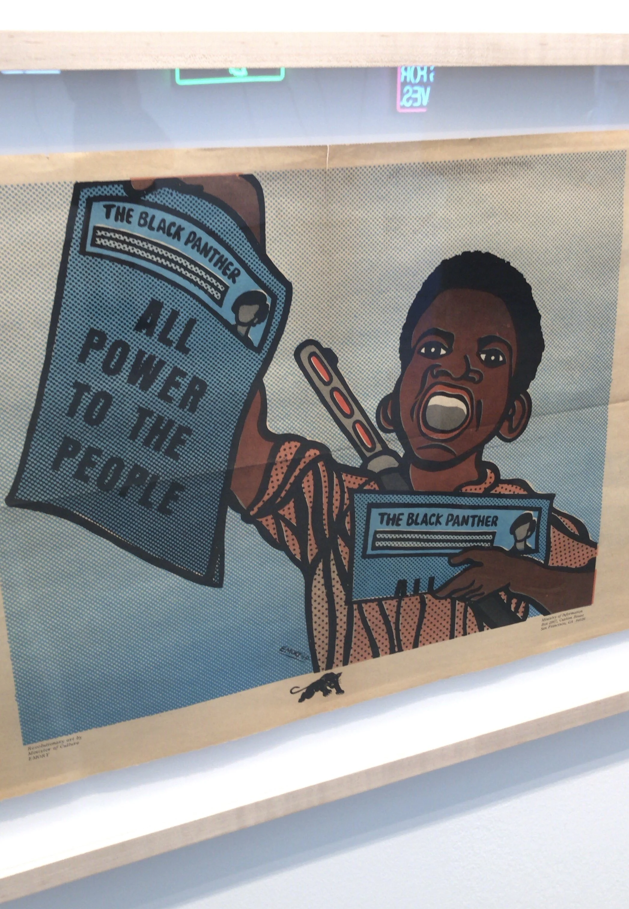
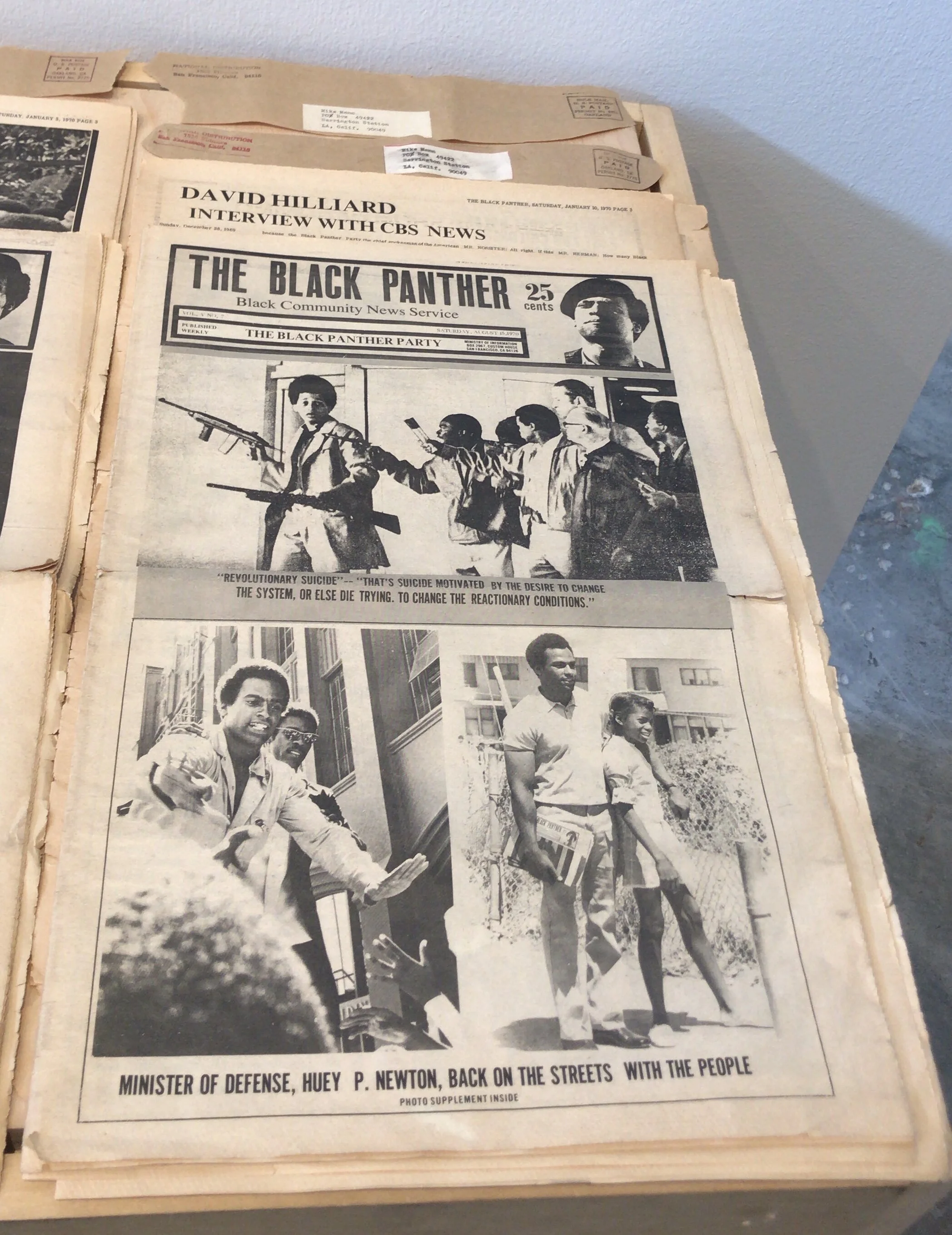
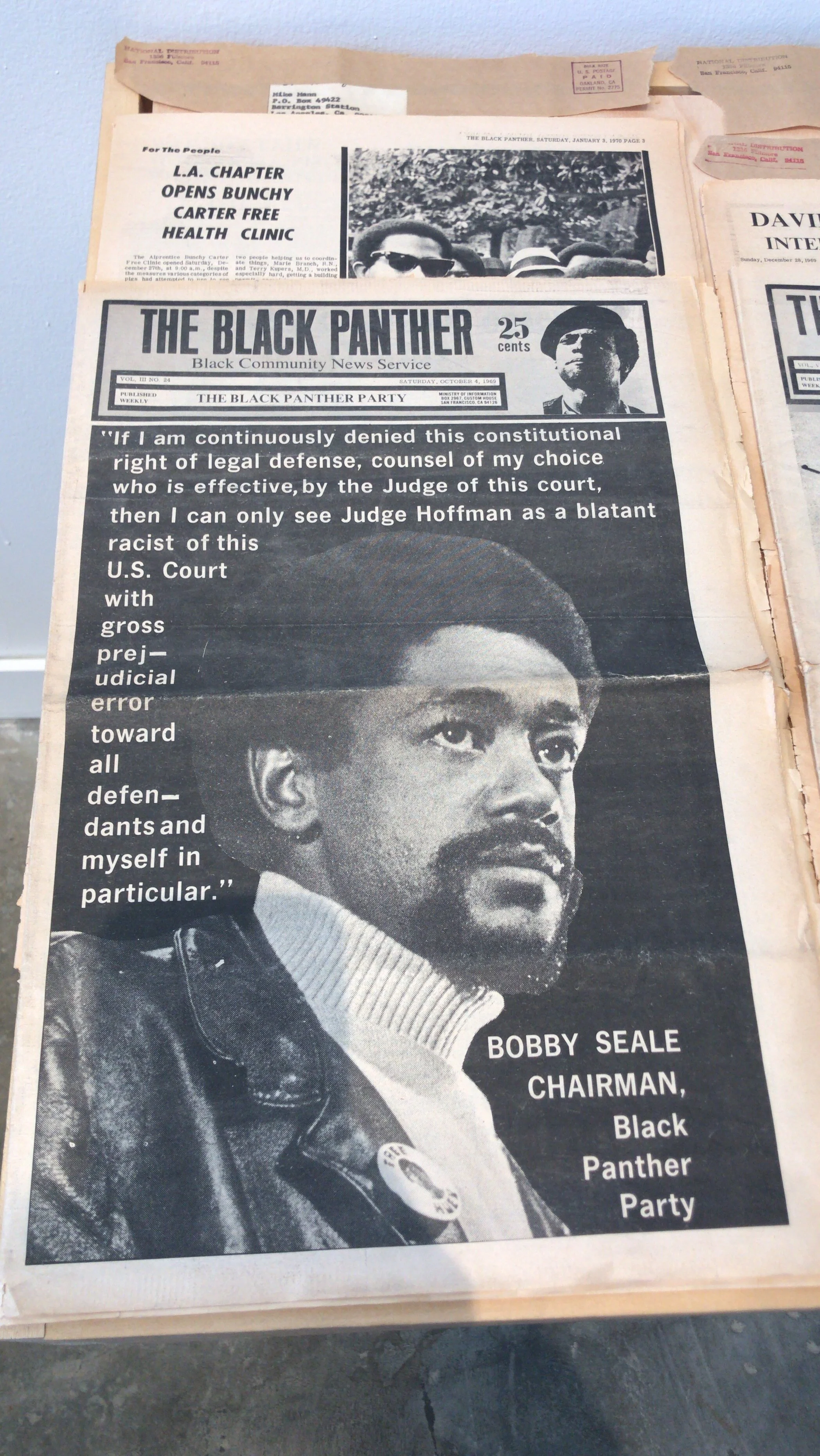
Their posters, pamphlets and newspaper The Black Panther - of which Douglas was Art Director - became the party's most powerful and effective weapon, the newspaper selling 300,000 copies a week at its peak in 1970.
It was protest-art and his work served the parties program of armed-activism and revolution: their ‘plot for progress’.
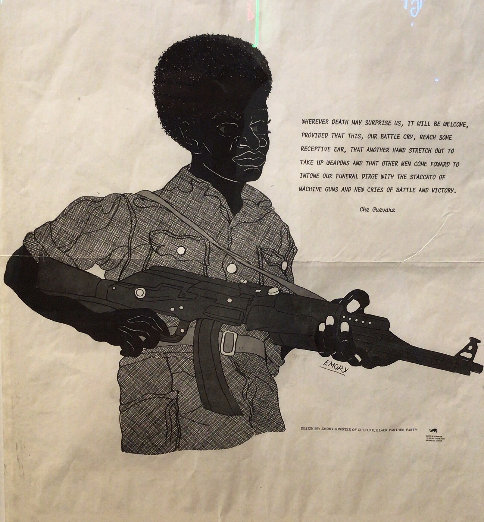
Although pre-1969 the party advocated masculinity and traditional gender roles, this soon changed and women took leadership too. Everyone was active and in turn, depicted in his work as bad-ass icons against sunburst motifs, their regulation Remington shotgun either at their side or leading the charge. The whole community - including the elderly and children - took a starring role - it was an egalitarian movement and art approach.
The dissemination of their printed material, via their state Chapters, was a well-oiled campaign and these creative outputs soon facilitated a coherent and consistent voice that rang loud and clear across the United States.
It was instantly recognisable. NOTHING looked or sounded like The Black Panther Party - nor has it since.
The spirit, ideology and culture of the Black Panther Party is kept alive today by the graphics Emory Douglas created. A visual archive of a moment in time and a spirit - and struggle - that still endures; in the words of The Black Panther Party itself:
SEIZE THE TIME.
REVOLUTION IN OUR LIFETIME.
Words and photography by Sarah Feeney https://underrockstravelproject.com
Photos taken from the pop-up exhibition: Beyond the Streets by Roger Gastman, NYC 2019.
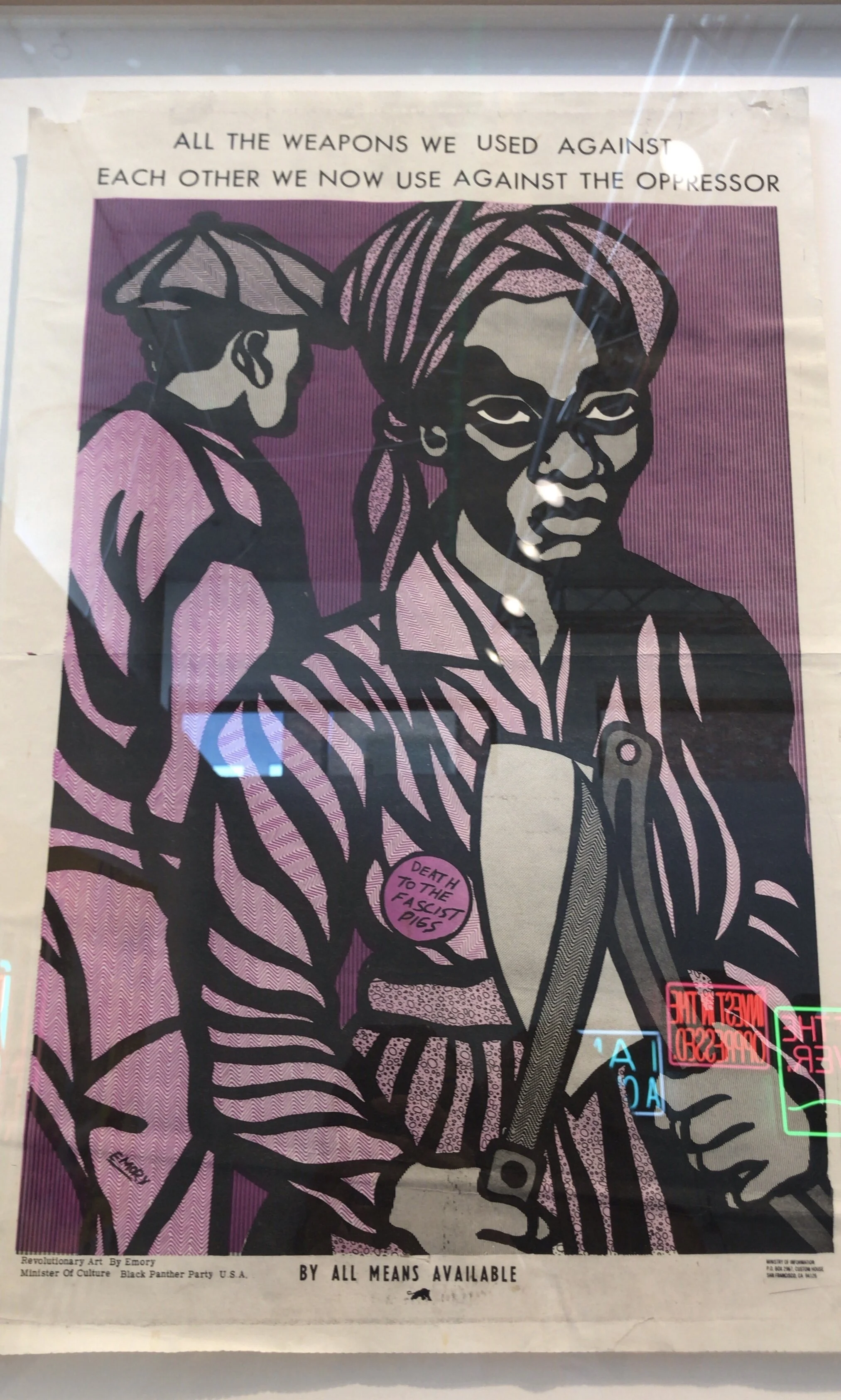
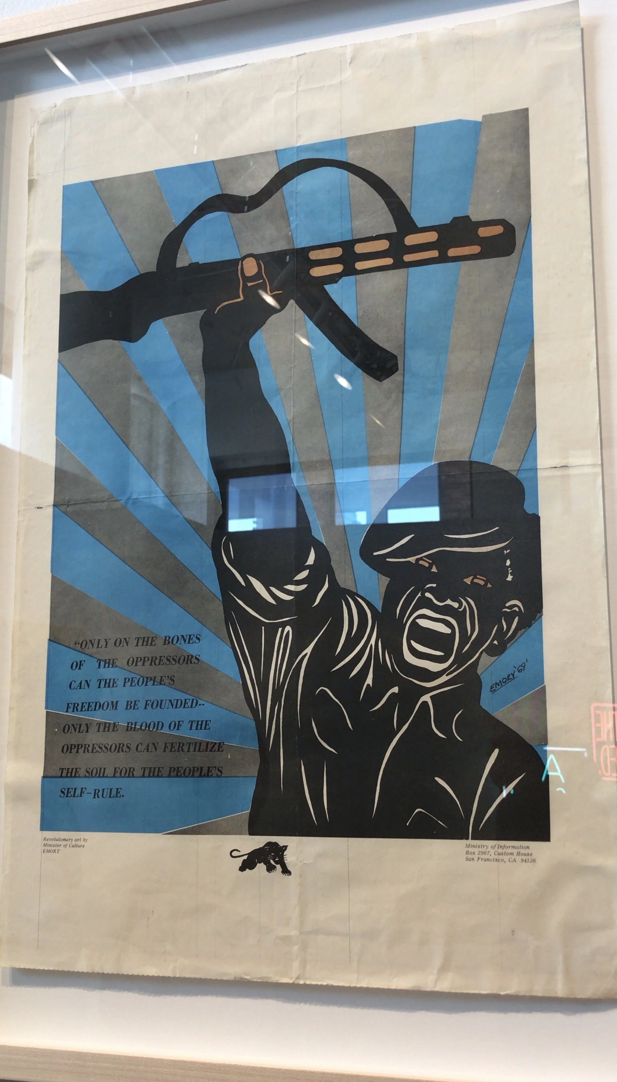
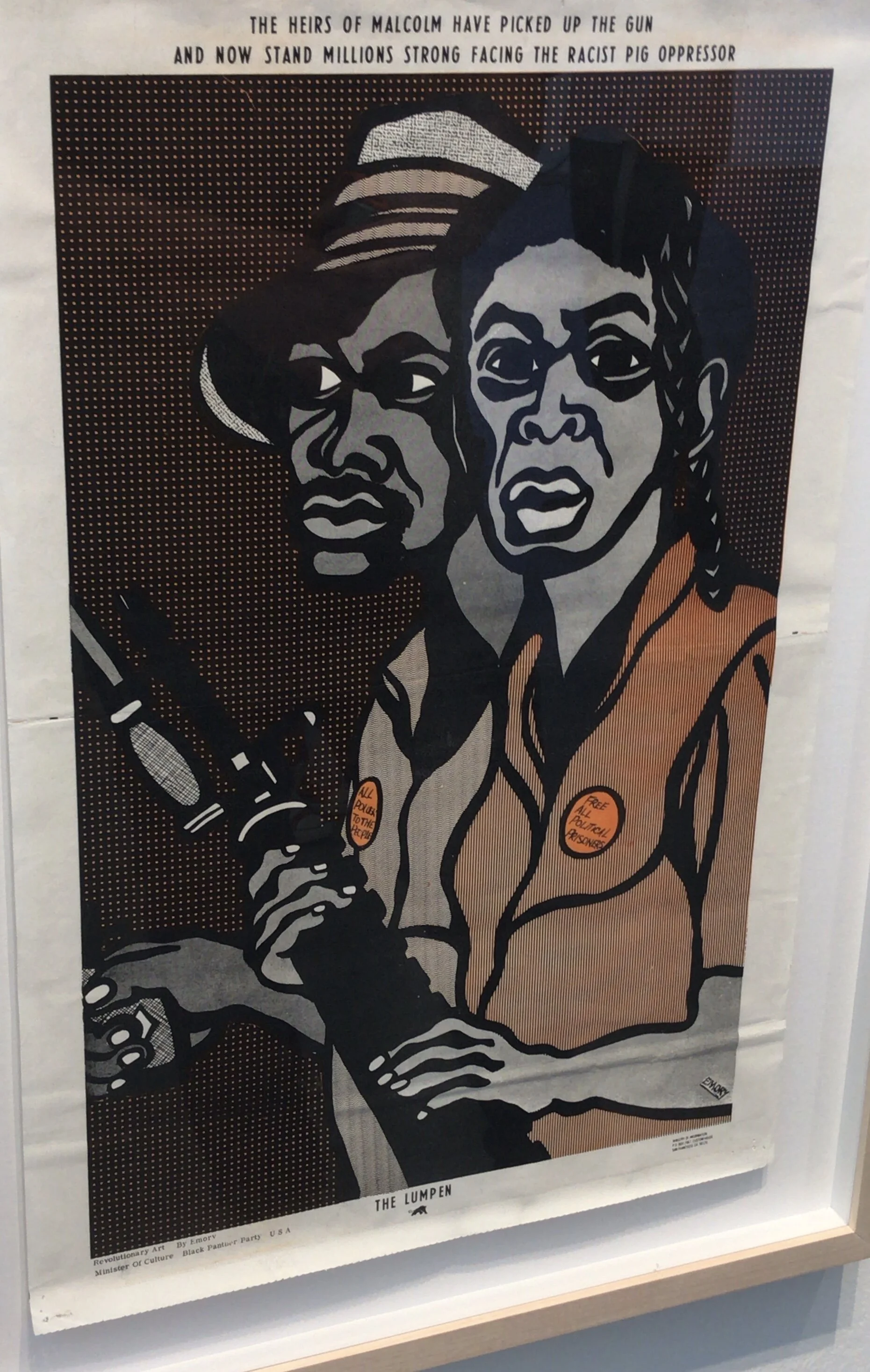
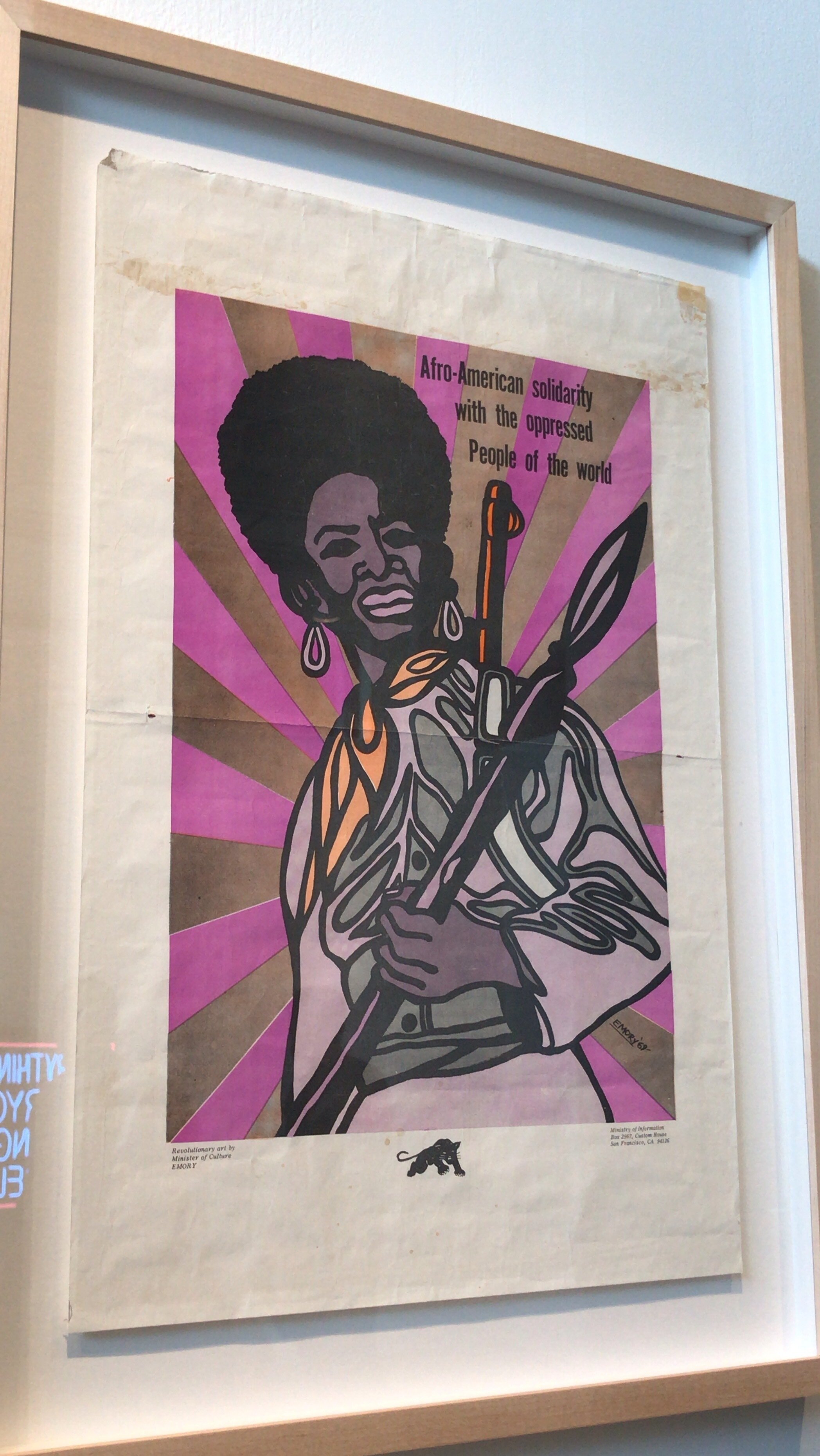
Skateboarding Niemeyer's Architecture
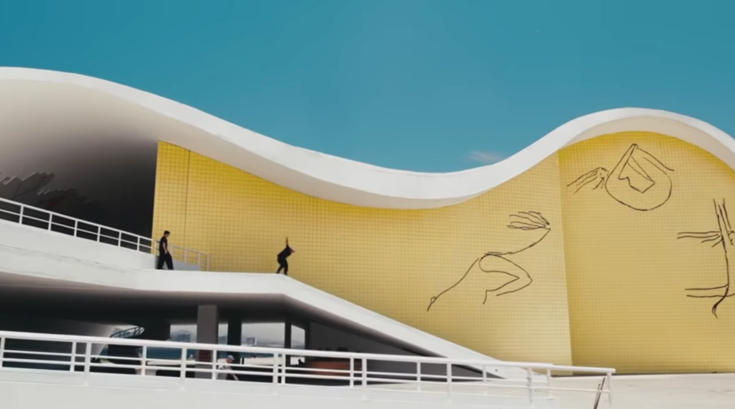
Skateboarders - a vibrant and critical part of urban life or selfish, destructive and obnoxious grown ups doing a childish activity?
Well that is up to you to decide but through the power of skateboarding and the seemingly limitless marketing budget of Red Bull we are given the opportunity to see some of Oscar Niemeyer’s beautiful buildings.
Allowing unrivalled access and the slick production values you’d expect from Red Bull this film gives a different perspective (literally) on Niemeyer’s buildings but, being a miserable 50 year old man, i personally can’t help being left with the idea the skateboarders are just a distraction in this film and hopefully Red Bull paid for any damage our 4 wheeled friends made to the buildings.
Video interview: Tom Burrell

Today we’re sharing an inspirational interview with Tom Burrell, co-founder of Burrell McBain Advertising, now Burrell Communications Group, along with Emmett McBain (more on McBain next week). Burrell was the first black person to work in advertising in Chicago, in 1961, where he began work in the mail room while observing the workings of the industry agency before becoming a copywriter. At first, Burrell had no direct contact with his clients: “It was radical enough for a black person to be working in an agency. Presenting that person to a client was another three or four steps ahead.” When Burrell McBain was founded in 1971, the agency aimed itself directly at black people and black culture. Burrell stated:
“Sometimes when you start talking to people about race and differences, implied in that is some kind of subordination, so I had to convince them that you can be different and equal, and that there are cultural differences that should be part of advertising aimed at a black cultural group, such as music.”
In this video, Michael Conrad, President of the Berlin School of Creative Leadership, interviews Burrell. In the first half of the interview Burrell focuses on the context and motivation for setting up in 1971. Burrell explains the challenges and nuances in selling to and targeting this distinct group. The latter part of the interview focuses on the subject of inferiority complexes within disenfranchised groups and minorities, particularly African Americans in the United States. He surveys the causes and effects of this predicament and examines how modern communication practices, particularly digital media can be effective in mending inferiority complexes within society. Watch the interview below:
Back to Blackburn
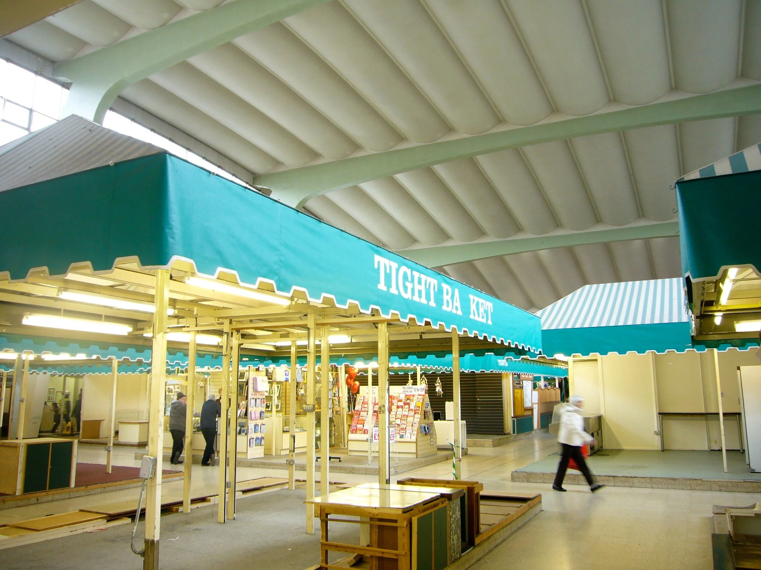
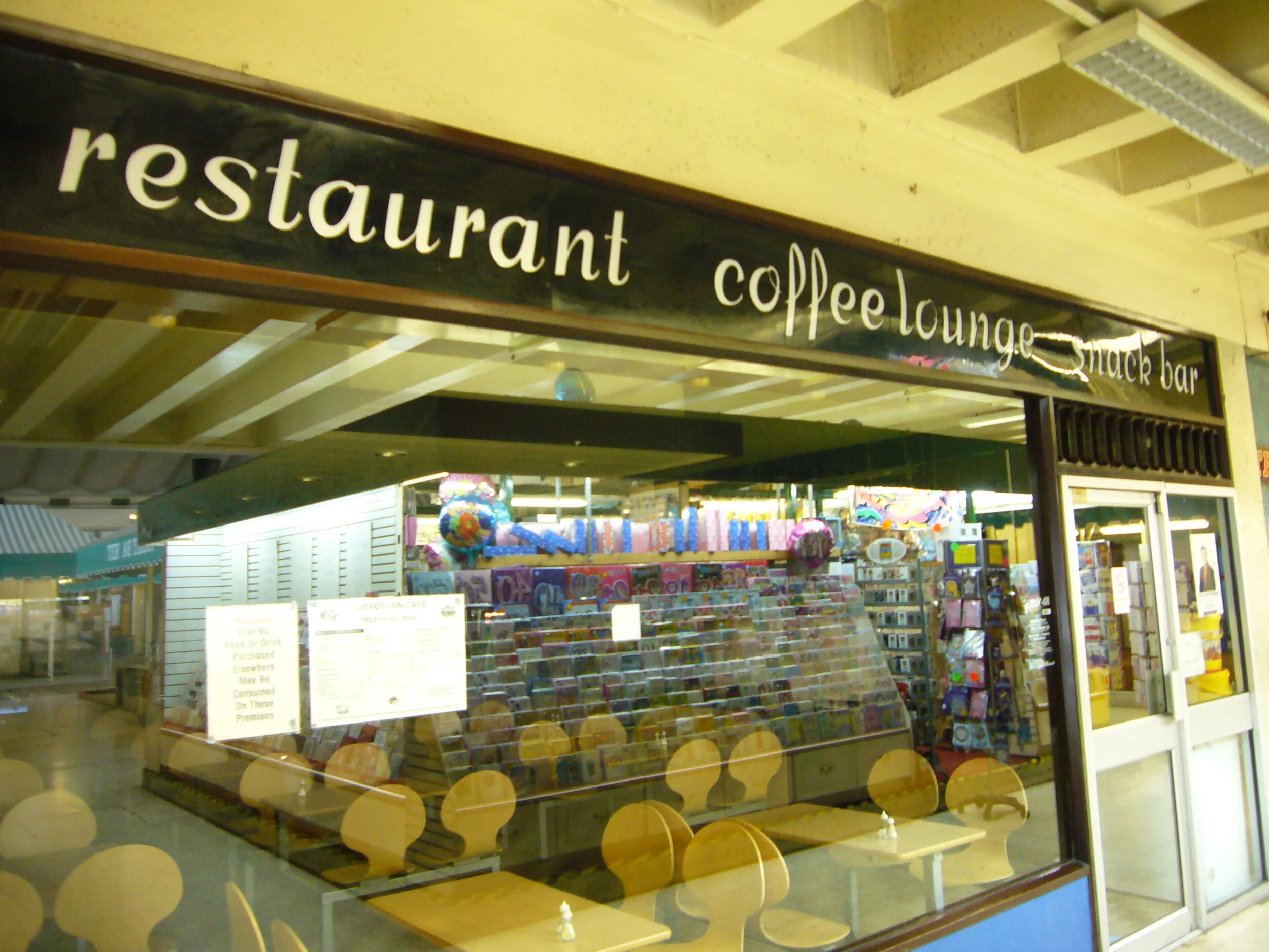
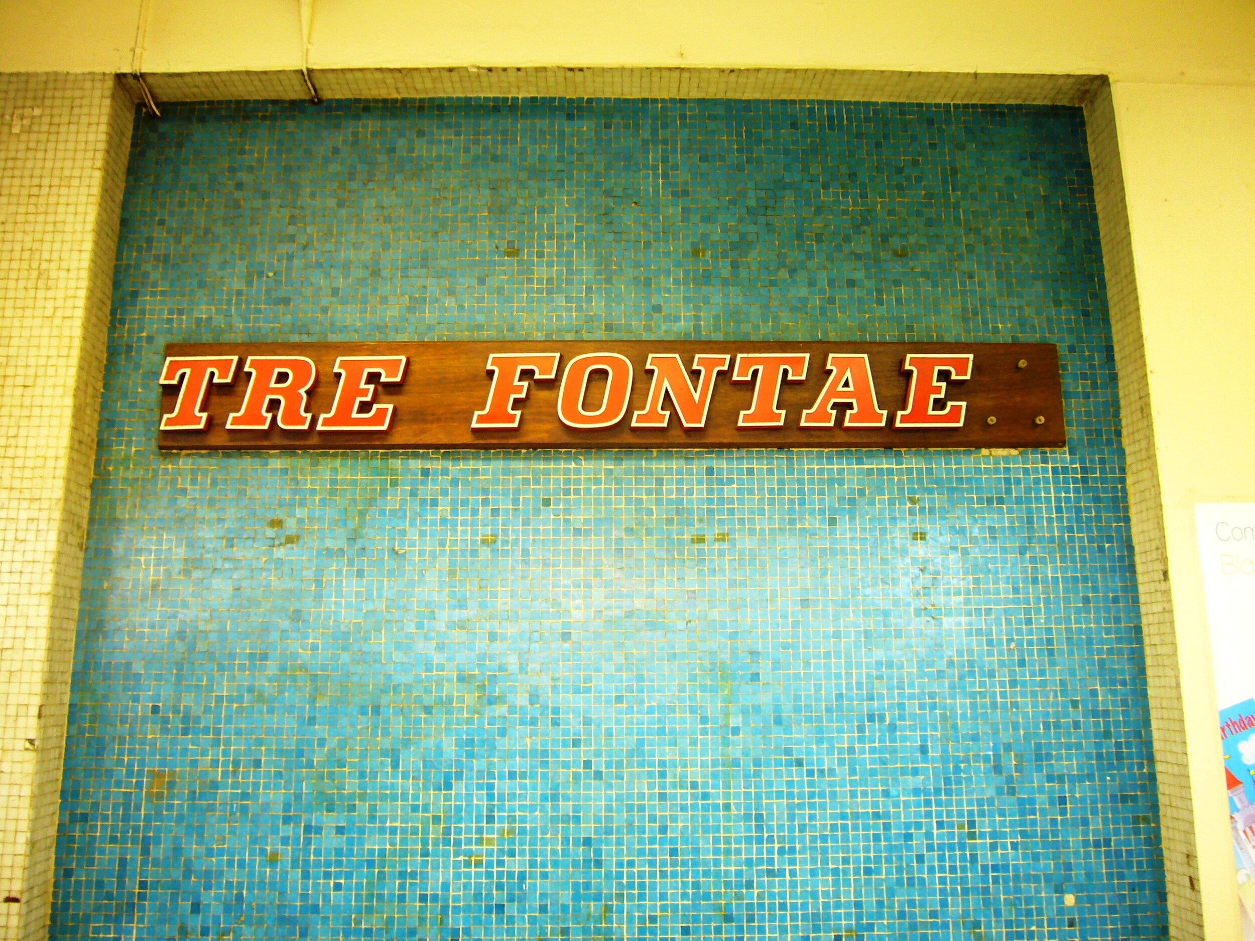
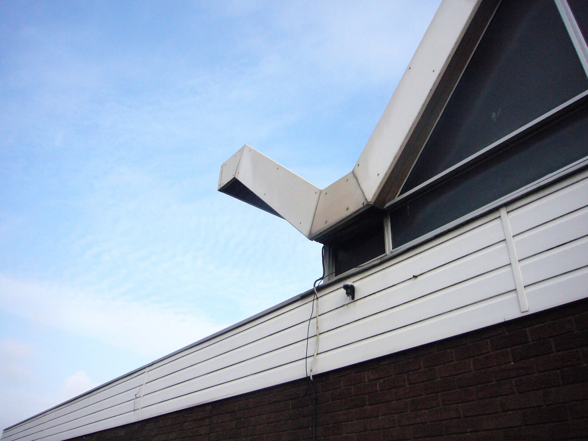
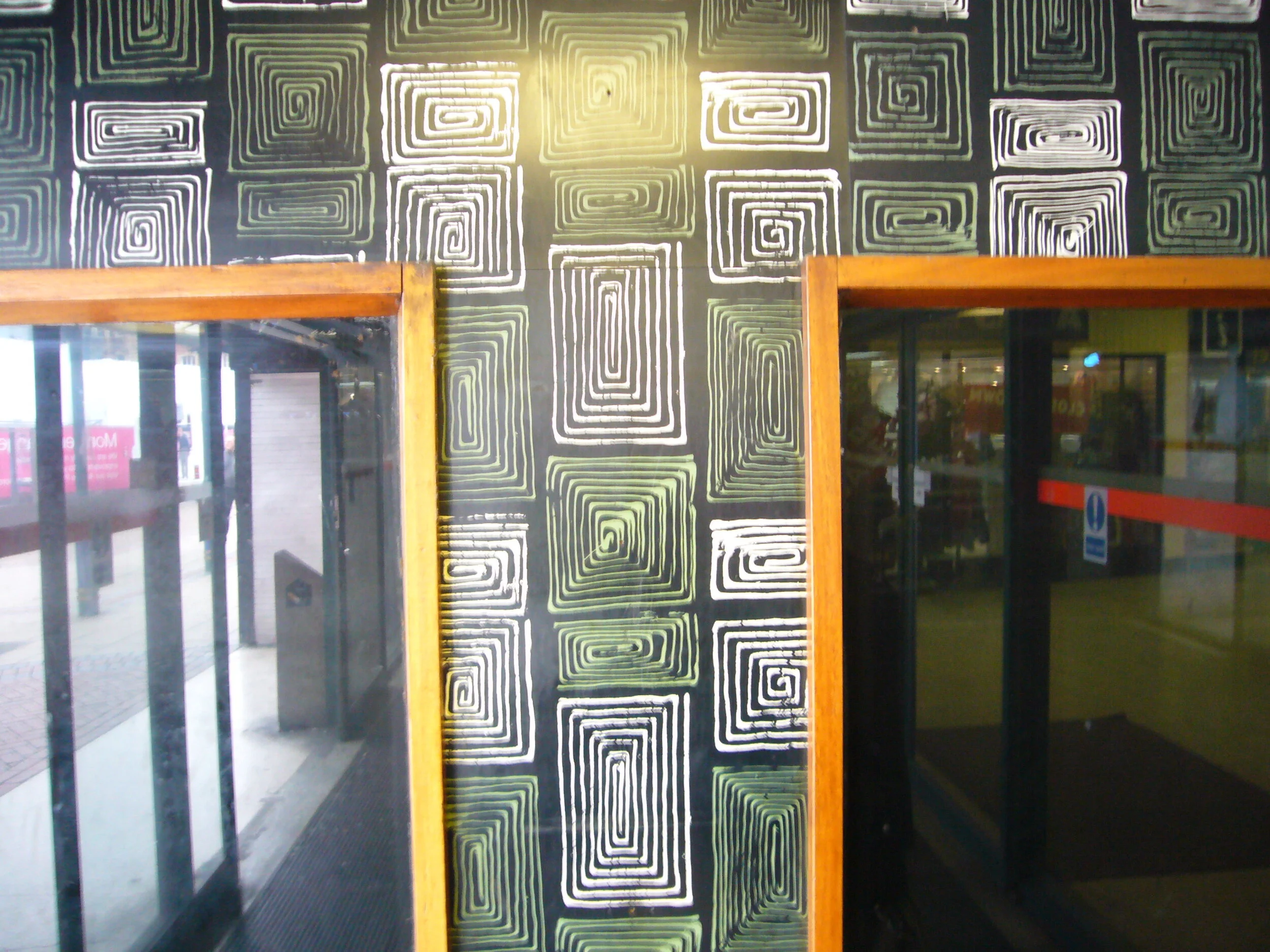
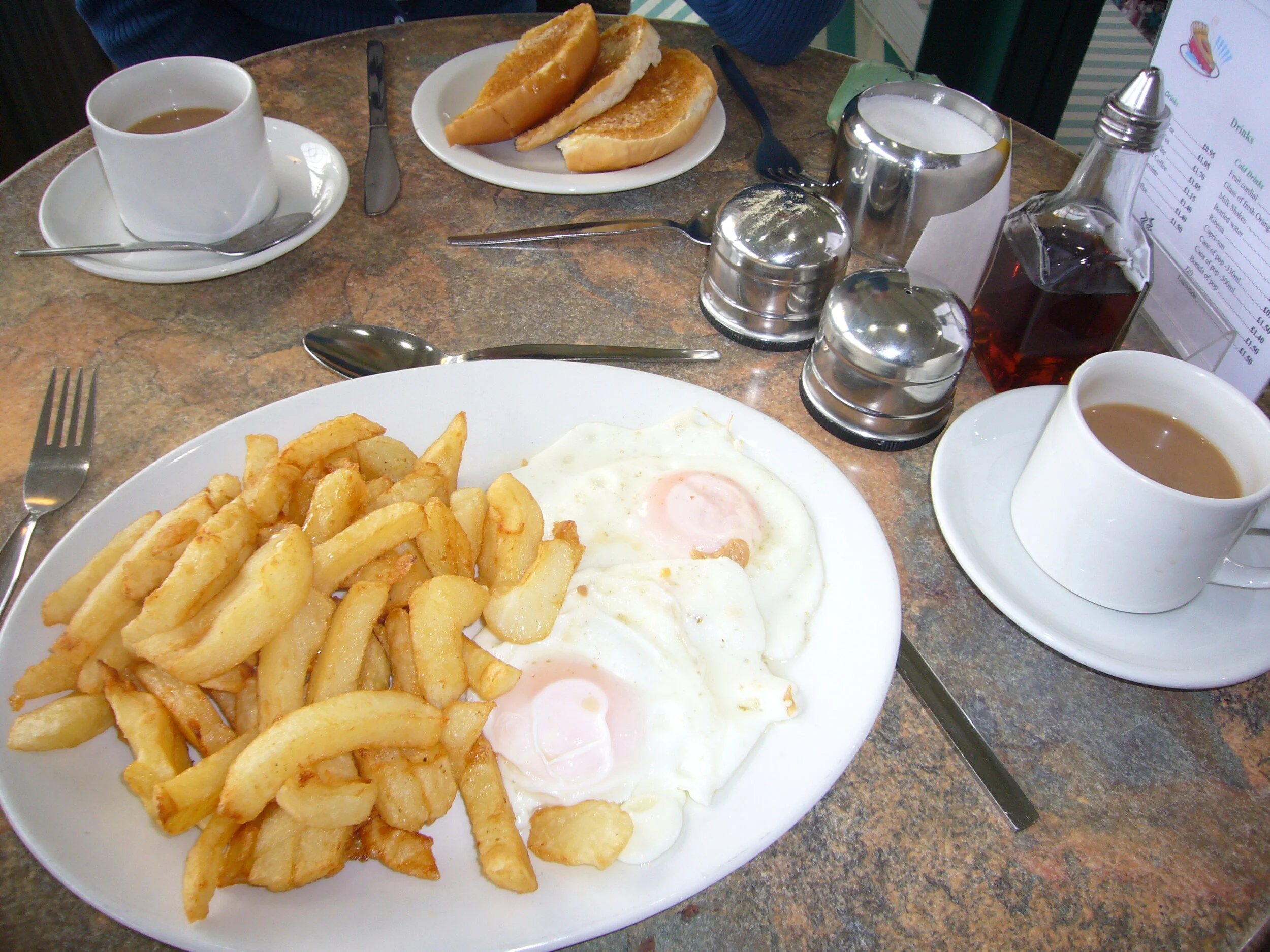
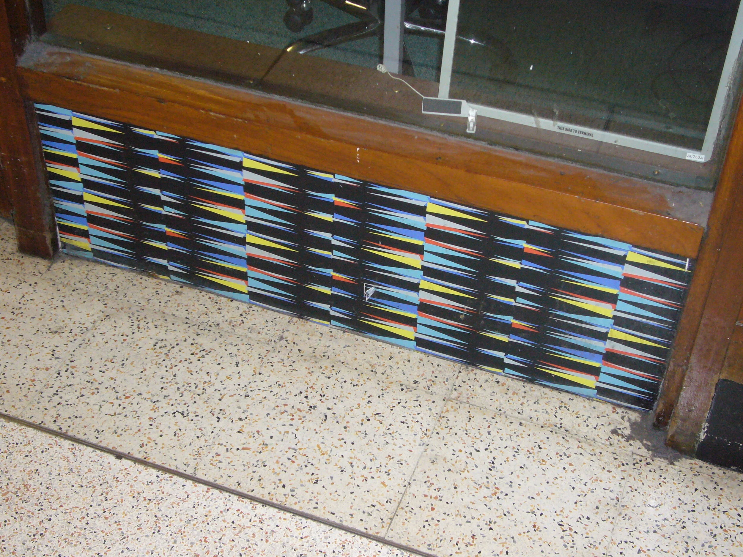
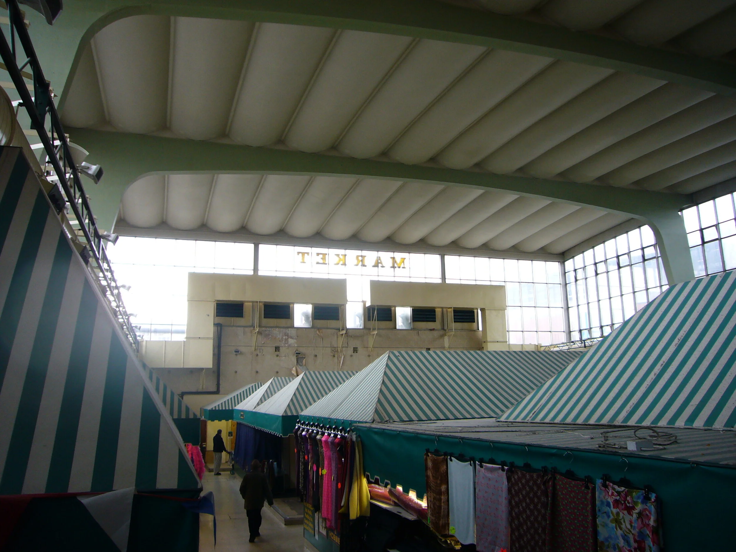
Blackburn Corporation (1964 slogan, “in touch with tomorrow”) opened its new markets in November 1964 and in 2013, shortly before it was demolished, our Jack visited Blackburn Market with his Kodak Brownie . Here are a few of his snaps showing the market and its distinctive hypar shell roof, as the stalls were emptied and the traders prepared to move on.
For a bit more on Blackburn Market, see Market Forces by Christopher Marsden from issue 1 of The Modernist here.

The BLK Art Group: 'Whoever Heard of a Black Artist?'
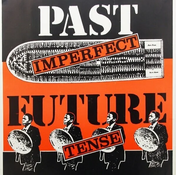
Currently streaming on BBC iPlayer for another eleven months, ‘Whoever Heard of a Black Artist? Britain’s Forgotten Art History’ is a 2018 documentary following artist Sonia Boyce’s three year research project Black Artists & Modernism, which sought to uncover the work of 20th century British Black and South Asian artists whose work had been relegated to museum archives, rarely shown or spoken about. The project, based at the University of the Arts London, culminated in Manchester Art Gallery’s 2018 exhibition ‘Speech Acts: Reflection-Imagination-Repetition’ and aimed to question the role of galleries and museums in representation. The resulting show demonstrated how these public spaces reflect and shape our collective imagination, and examined how exhibitions can affect these shared narratives. What do public museums collect and why? Which works become highlights, and which lie forgotten in storage?
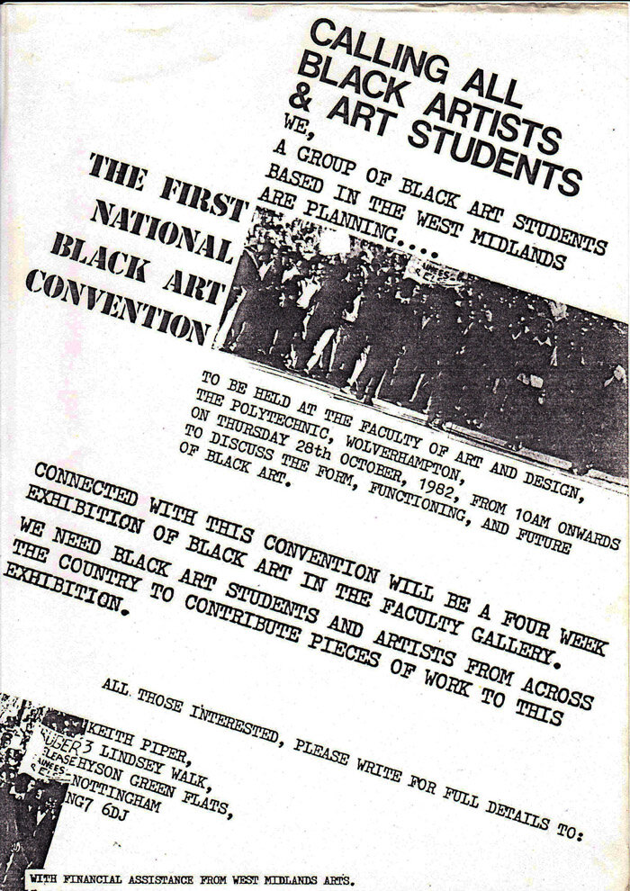
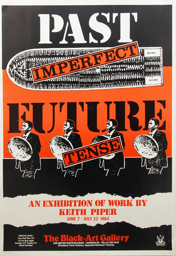
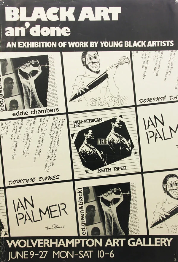
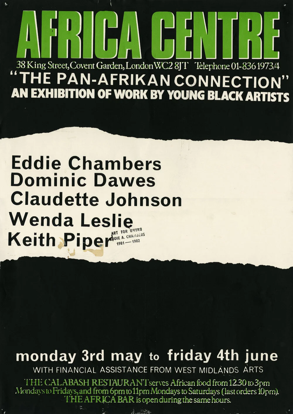
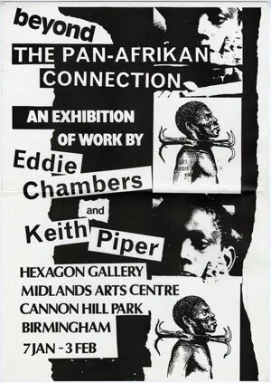
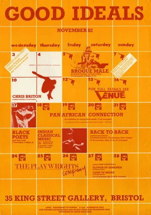
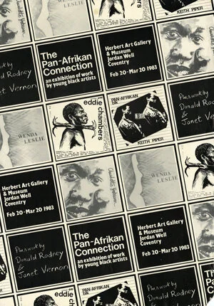
Featured in the documentary are The Blk Art Group, a collective of young black artists formed in Wolverhampton in 1979 whose work raised questions about what black art was, its identity and what it could become in the future. Members included Donald Rodney, Eddie Chambers, Dominic Dawes, Lubaina Himid, Claudette Johnson, Wenda Leslie, Ian Palmer, Keith Piper, and Marlene Smith, all of whom were raised in or around the industrial West Midlands as children of Caribbean immigrants. In 1982 the group staged ‘The First National Black Art Convention’ in 1982, which was attended by Black artists from across the UK and went on to have a huge influence on artists such as Boyce, Chris Ofili and Steve McQueen. Read more about the convention HERE.
The Blk Art Group Research Project was set up in 2011 by members Keith Piper, Claudette Johnson and Marlene Smith, and an archive of the group’s posters and ephemera can be found on their website. We share here a selection of the group’s posters, with credit to Keith Piper.
London Line film - 1966
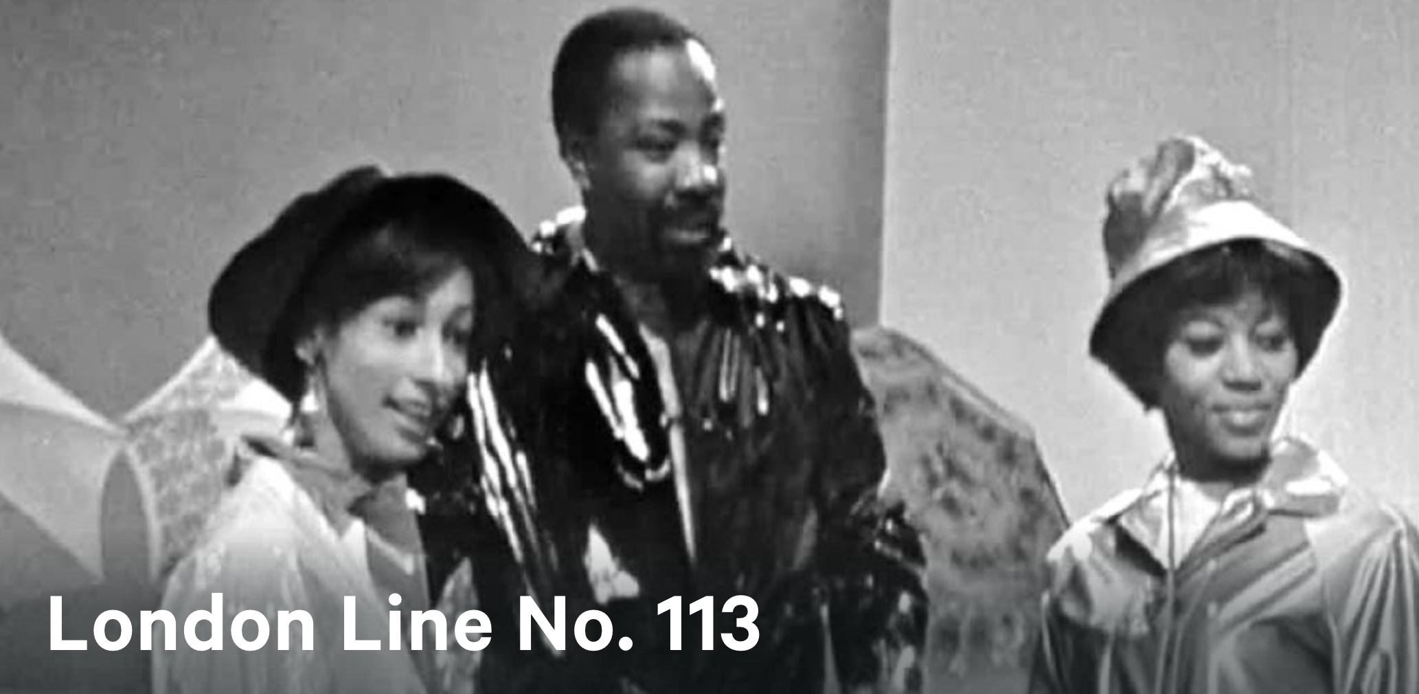
Representations of black people on television and film have, historically, been rare so whilst lockdown browsing friend of The Modernist John Williams came across this fascinating film in the BFI archive.
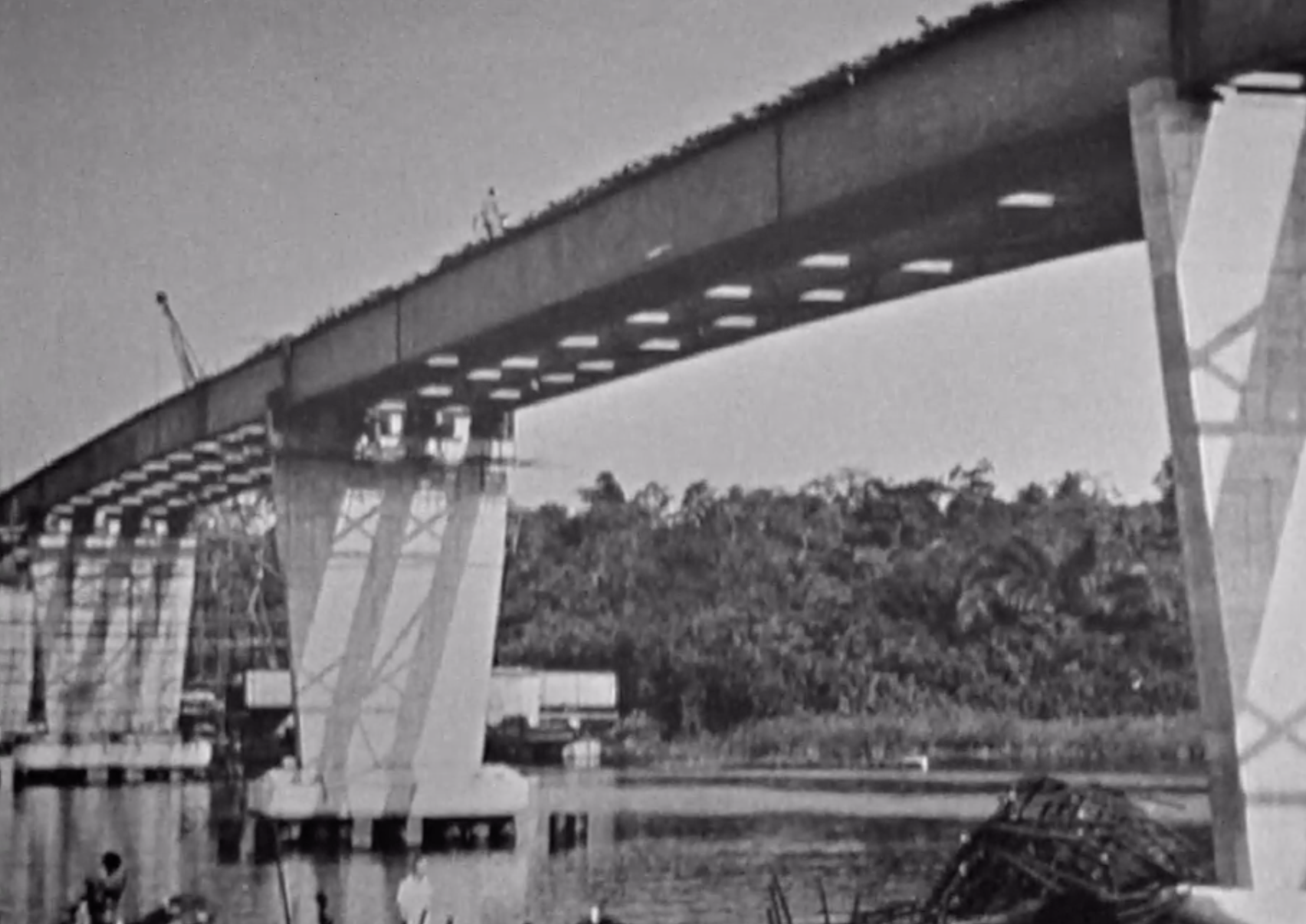
"Very few on-screen discussions about concrete are preceded by a live Afro-jazz drum workout. Fewer still are packaged alongside a racial re-casting of Swinging London fashion and the nerdiest group of Kent schoolboys ever assembled before a camera. Welcome to the London Line cine-magazine, the Central Office of Information's mid-1960s missive to the Commonwealth (available in four variations of content/language). The "New Commonwealth" edition was distributed weekly to the recently-decolonised countries in Africa - an audience who, on the evidence of London Line No. 113, were hungry to learn about cutting-edge rainwear and science clubs.
And, of course, concrete. Geoffrey Wood of Ove Arup gives a brisk account of the material's advantages for developing countries and a few examples of recent projects in Africa (most of which seem pretty amazing). A quick look at packable plastic furniture and another 15 minute episode is (ahem) "packed away".
From its hyper-contemporary title sequence (designed by Eddie Newstead) to its upfront use of "African Correspondents Reporting From London", one only wonders if a similarly-enlightended format couldn’t have been produced for a domestic audience."
John Williams works at the V&A and be found Instagram as @john_lordmuck
Interview with Andy Williams of DOVES
Eddy Rhead had a chat with Andy Williams of the band DOVES about architecture, music and their incredible new video.
Full disclosure. Links between The Modernist and DOVES go long and deep. I have been friends with the Williams brothers since we were teenagers. I grew up in the same small town as Jimi Goodwin - Jimi is also a subscriber to the magazine. Andy and Jez had a rehearsal room next door to old The Modernist HQ - before we moved to Port Street. But there is also another connection. The Williams twins have a brother and sister who are both architects (more of them in a bit) but their dad is a Modernist Society hero - Desmond Williams.
Desmond started the firm of Desmond Williams and Associates in the early 1960s and worked mainly in the religious and educational sector. Desmond Williams and Associates designed a number of modern churches, including the Roman Catholic Church of St Augustine, Manchester, 1966-1968 (Grade II), the Roman Catholic Church of St Dunstan, Birmingham, 1966-1968 (Grade II), and the Roman Catholic Church of St Michael, Penn, Wolverhampton, 1967-1968 (Grade II) and St Mary Dunstable (Grade II). Desmond’s work was recognised with an OBE in 1988.
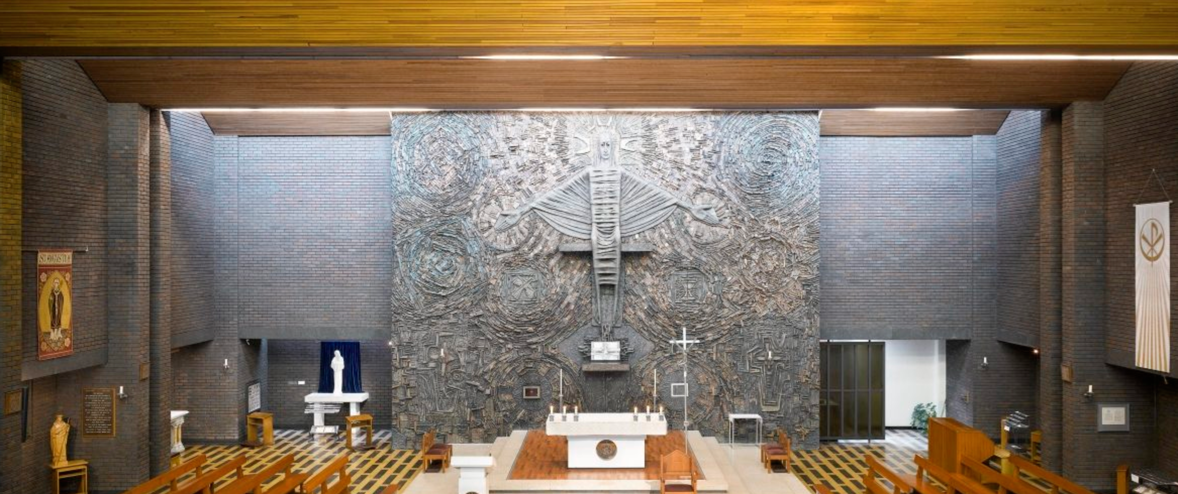
St Augustines, Manchester
Desmond and his wife separated whilst the children were small and the children lived with their mum so when i knew Andy and Jez growing up i had no idea their dad was an architect and it wasn't until much later in life, already discovering Desmond’s work and being a fan, I found out that their dad was THE Desmond Williams.
Dominic and Sarah decided to follow in their dads footsteps. Dominic made his name very early on - aged only 28 he landed the gig to convert a disused flour mill in Gateshead into the BALTIC Centre and is now a director of Ellis Williams Architects - a firm that has its roots in Desmond Williams and Associates, and the firm are still doing great work. Sarah ran, with fellow partners, the London office of AEDAS before starting her own practise Sarah Williams Architects in 2013.
Andy and Jez on the other hand were influenced more by their artistic mother and, by Andy’s own admission didn't have the academic qualifications and talent to become architects and were a little more ‘wayward’. Having hung out in many a park and empty car park with Andy and Jez in our teenage years i can testify to this.
After school Andy followed his artistic instincts and went to Northwich Art College. “it was a great experience. A very open minded course and it taught me a lot and the way of working has informed me ever since - in how i approach music “ Having come from such a creative family and having siblings as architects it was hard to avoid architecture but Andy was more interested in Art and Design whilst Jez was very much focussed on music. After a year studying Interior Design at Leeds University Andy was lured back to Manchester, as many of us were, by the nascent acid house scene and The Hacienda. The Interior Design degree would have to wait.
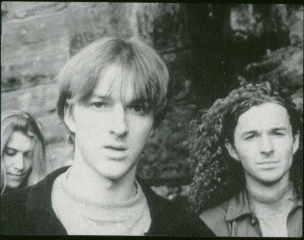
Baby Doves aka Sub Sub
Along with a school friend JImi Goodwin the band they formed , SUB SUB, was very much focussed on the dance music they were immersed in at The Hacienda, and after teaching themselves the art of sampling and programming SUB SUB enjoyed a run of success including a chart hit - Ain't No Love reached Number 3 in the UK charts.
After a fire in their Ancoats studio (mysterious fires in old mills were common place in 90s Manchester) destroyed virtually of their equipment they reinvented themselves with a more rock oriented sound as DOVES and went on to cult, commercial and global success.
In 2010 DOVES took a break from each other but now they are back together and with a new single and album but no tour (for obvious reasons) just yet. Which brings us right up to date - with the incredible video that accompanies the track CAROUSELS.
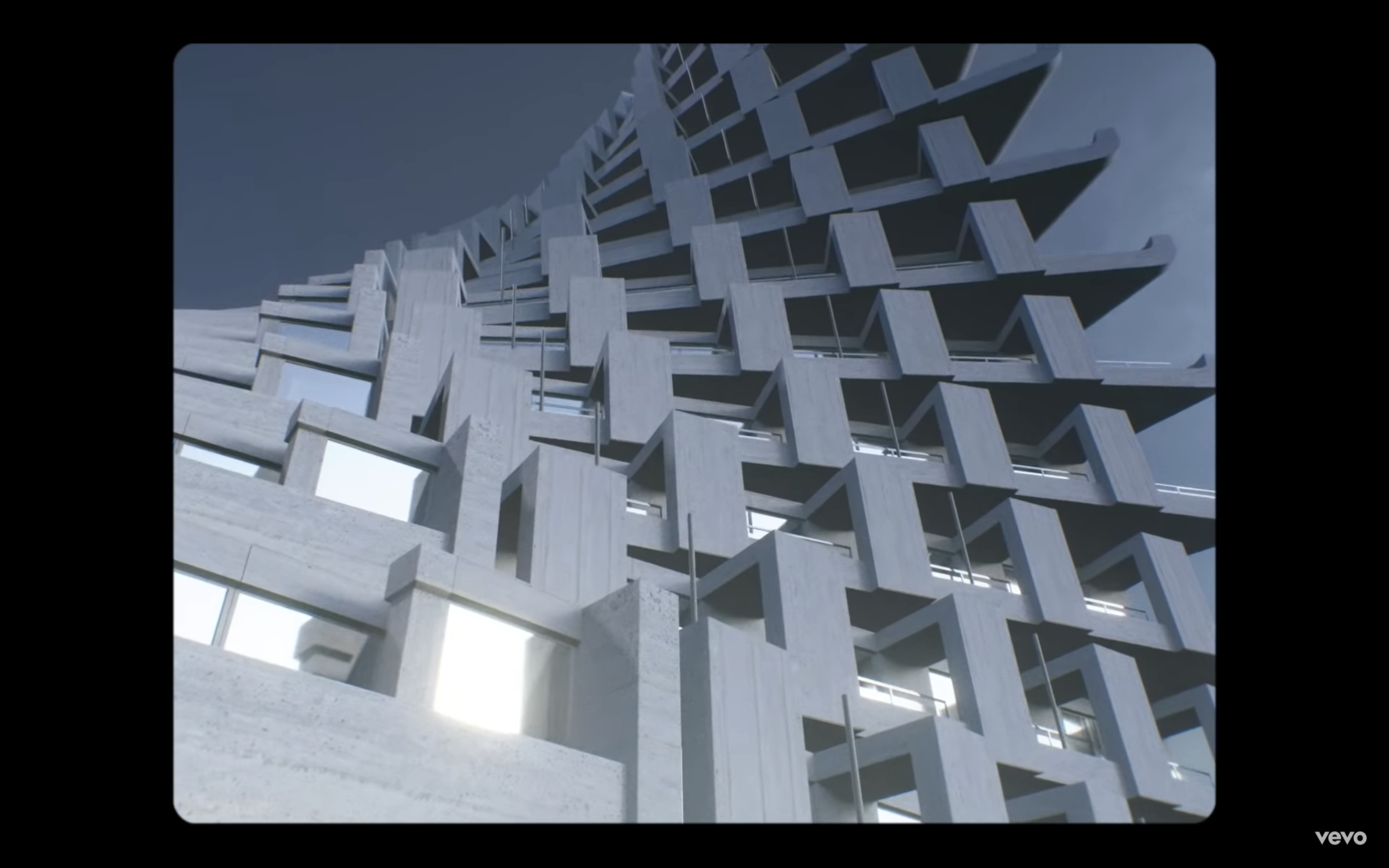
I asked Andy about the genesis of the video and i’m happy to say The Modernist played a part in it. “I picked up a book in your shop BRUTAL BRITAIN and was keen to somehow use Brutalist architecture in some of the visuals to go with the new releases. Dave Rofe, our manager, also put together some potential images which included some buildings. This inspired us towards using architecture in the video. It was the video commissioner at our record company who suggested Yoni Weisberg” Weisberg is a Manchester based director of CHIEF creative agency. “The record company do a call out for treatments from different directors and we loved Yoni’s”
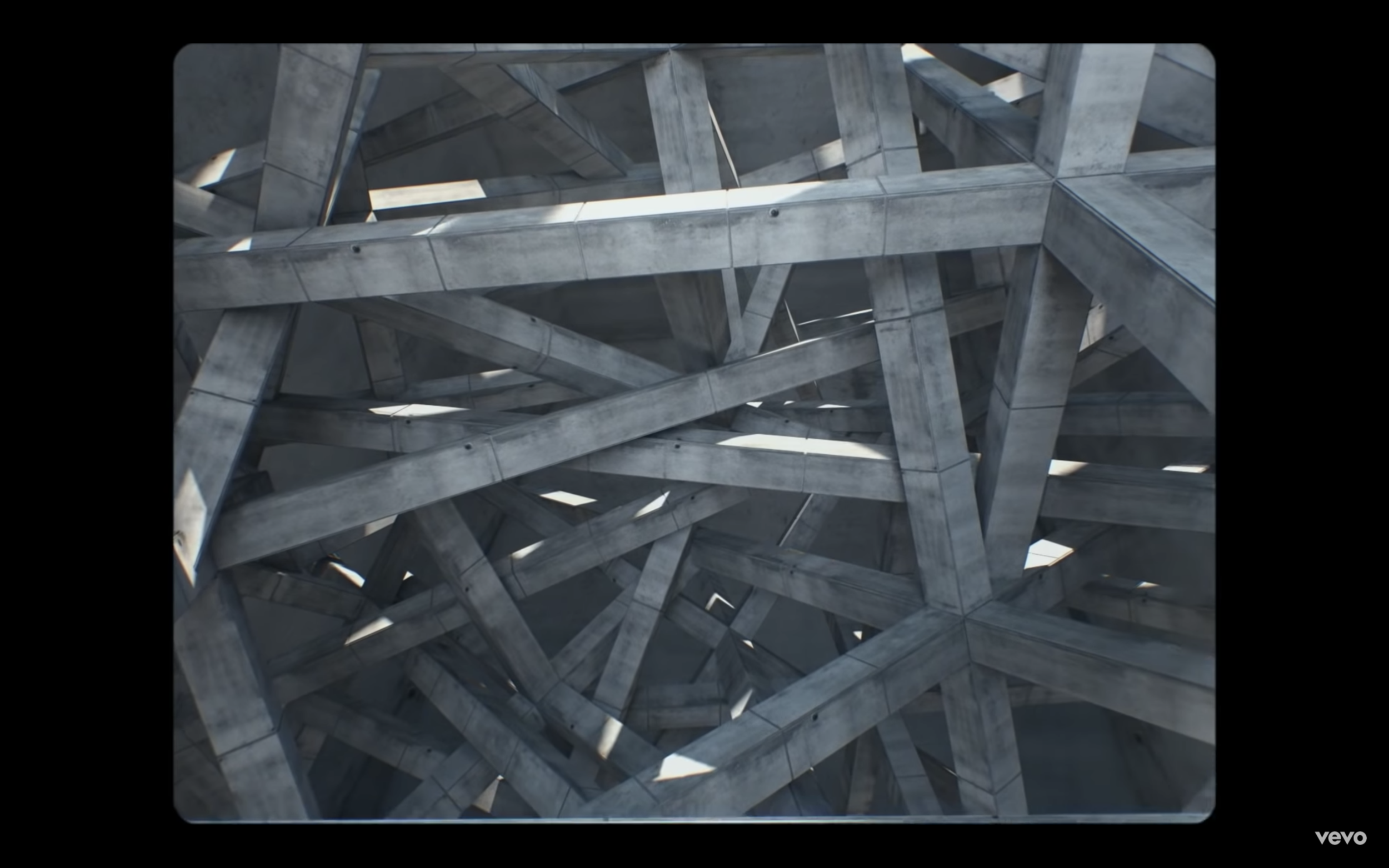
We are sure you’ll like the video - there is a link at the end of this article. I asked if they had any input on the source material. “I sent some photographs of the buildings from the book and Jez suggested one in particular that he liked and along with Dave Rofe’s suggestions Yoni sourced the images.” There is also a little nod to their family heritage (at around 1 minute)
The more eagle eyed amongst you may spot the now demolished Stella Maris building in Salford that was designed by Desmond Williams. The Stella Maris is a building close to the hearts of The Modernists - we even have the foundation stone at our HQ. We, along with long time collaborator Richard Brook aka Mainstream Modern, were happy to supply a bit of background info and images. The rest of the video may have you shouting at the screen “I KNOW THAT ONE”.
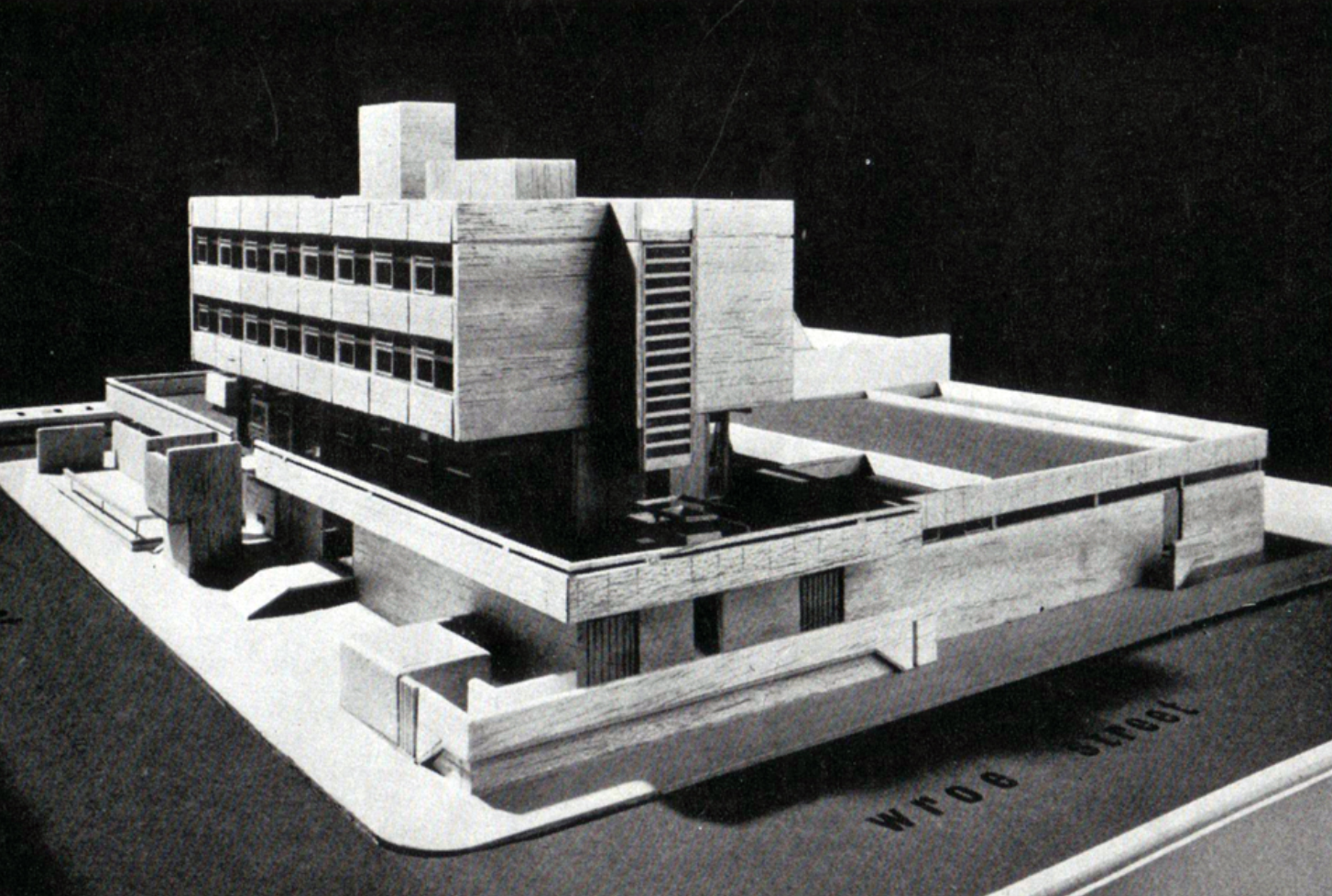
Stella Maris - photograph via Mainstream Modern
I asked Andy, who has travelled the world with DOVES, if the cliche rock n roll excess of bands on tour has now given way to architectural sightseeing. “We toured a lot in America so always liked to get out, if we a chance, and look at buildings. I took an architectural tour of Chicago when we there. It's incredible” Andy admits that he wasn’t really aware of the buildings his dad designed up until relatively recently. “I have to admit it was people like yourself bringing to my attention buildings like St Augustines and Stella Maris that i realised our dad did some good stuff in his time” Desmond Williams now has several listed churches to his name so it is good that his work is getting the wider recognition it deserves.
I am happy to nourish Andy’s growing appreciation of architecture so myself , Richard Brook, a mutual friend Matt Norman and Andy took a trip to Milan recently. He didn't grumble once as we dragged him half way across Milan in the drizzle to see the San Siro stadium and the incredible Gallaratese housing project by Aldo Rossi. He claims to have enjoyed and appreciated it and i don't doubt it. Who wouldn't love to walk round a housing estate with me and Richard Brook?
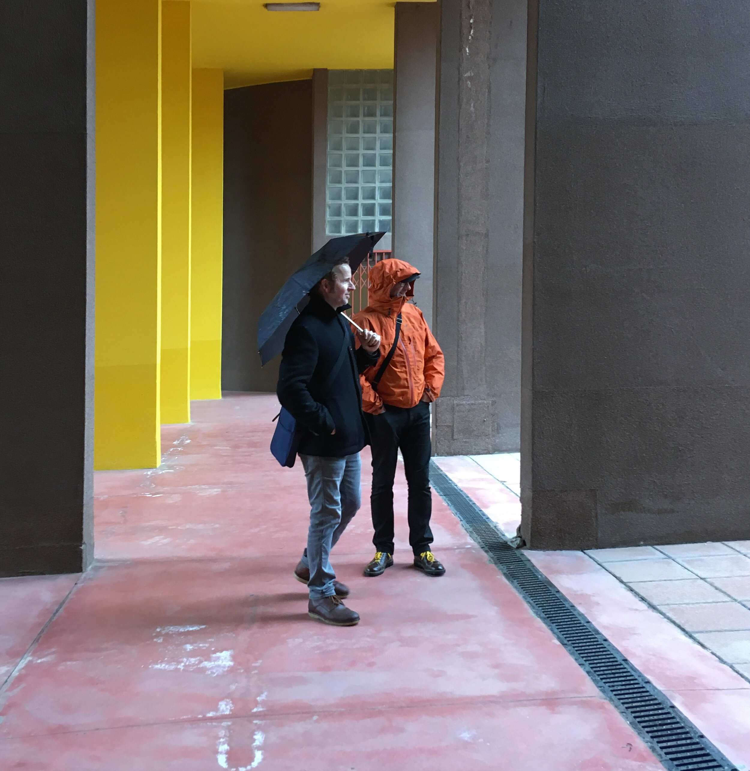
Andy and Matt Norman - enjoying the rain and social housing - November 2018
I asked Andy if he had a bucket list of architectural wonders? “I’m obsessed by Ronchamp by Le Corbusier. Even when i was student in Leeds in the 80s i had a postcard of it on my wall. It looks like it has dropped from outer space. I would love to visit it. I’d also loved to see more of Mies van der Rohe in the flesh”
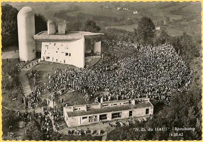
I promised Andy that if he isn't too busy recording and (eventually) touring that some time soon we’ll go on a pilgrimage to Ronchamp and i'll also take him to the Neue Nationalgalerie in Berlin one day.
Thanks to Andy for taking time out to speak to us.
Watch the video to CAROUSELS below
Report on Modernisation - BTF film from 1959
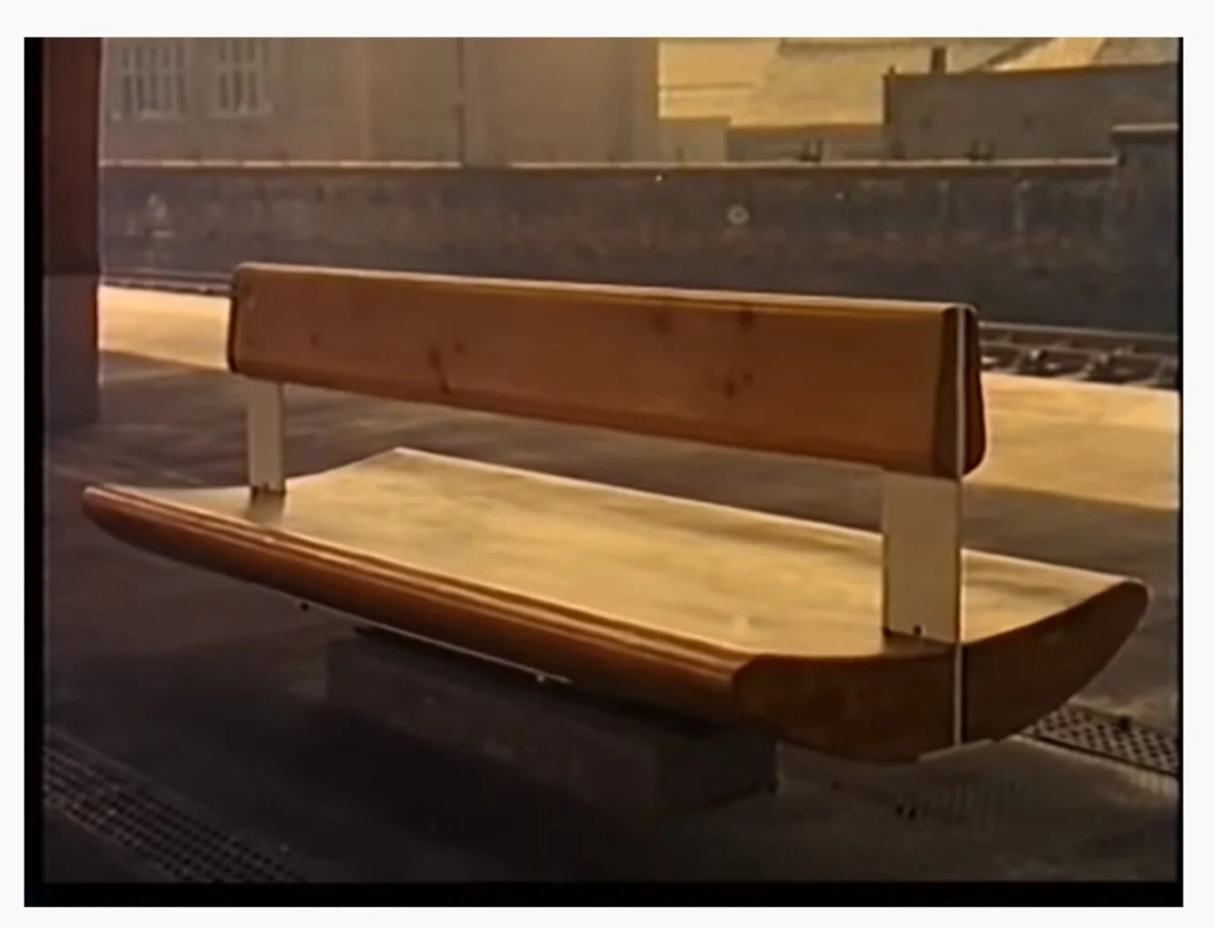
In troubled times i have been seeking out films and youtube videos that have absolutely nothing to do with modern life. I want to be taken to a more innocent and hopeful time and British Transport Films are not only perfect for some nostalgia but also Modernism spotting.
You know a film entitled ‘Report on Modernism’ from 1959 is going to yield some goodies but for Manchester fans and followers there are some real delights in this film.
Seeing as the whole line from Manchester Oxford Road to Crewe was modernised in the late 1950’s it was bound to feature. We see the now demolished Wilmslow signal box - the most modern in Britain at the time apparently. A tantalising glimpse of a train shed at Longsight made from laminated timber - as at Oxford Road. Dont know if this shed still exists but it looks fascinating. There are clips of East Didsbury station looking very sleek and crisp. Look out for the beautiful station names signs - possibly in black glass? Now all gone.
We see Radcliffe Central looking very European but again the vast majority of the station has been demolished and a miserly and miserable Metrolink stop is in its place.
Finally we see great footage of Oxford Road Station being built with its unclad roof structure and the demolition of the old London Road Station - to be replaced by Piccadilly.
There was a second part to the ‘Report on Modernisation’ two years later - also with footage of Oxford Road and Manchester.
Enjoy.
The Master of The View Master - Charles 'Chuck' Harrison
Whilst the circumstances surrounding the ‘Black Lives Matter’ movement are far from positive it is perhaps important to attempt to draw positives from it and a good way is for white people, like me, to educate themselves more on the contributions that black people have made to the things we hold dear.
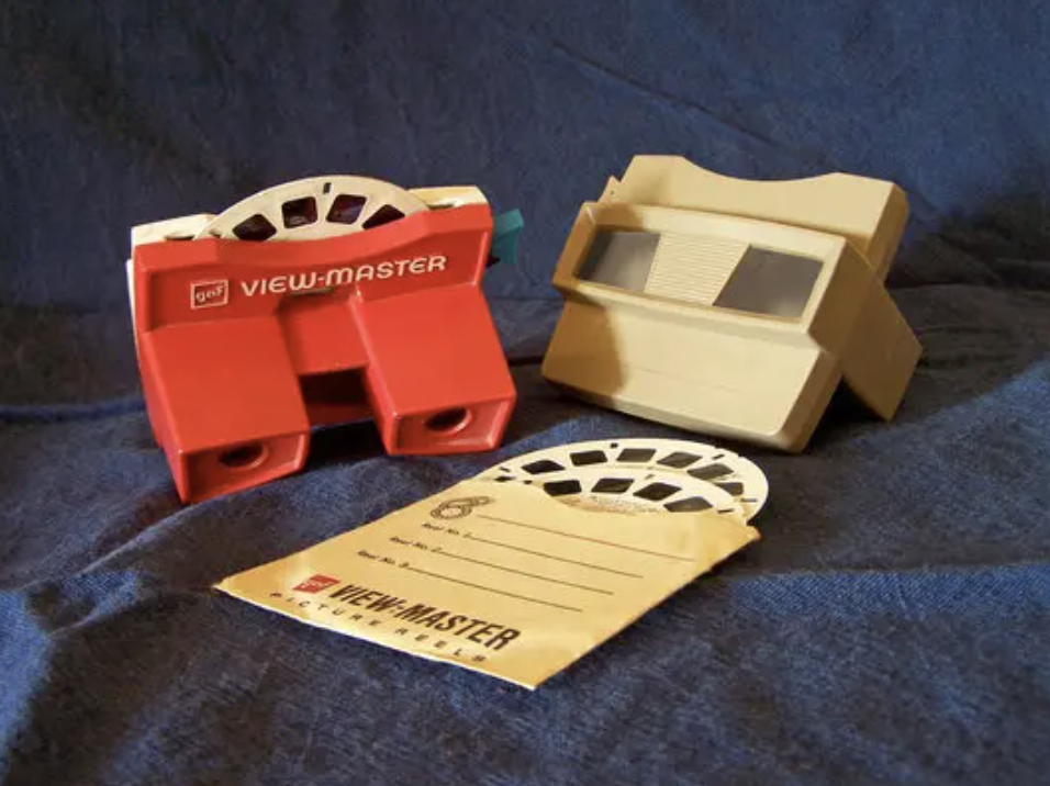
So we were delighted to discover recently that something we hold dear ‘The ViewMaster’ was designed by an African American - Charles ‘Chuck’ Harrison.
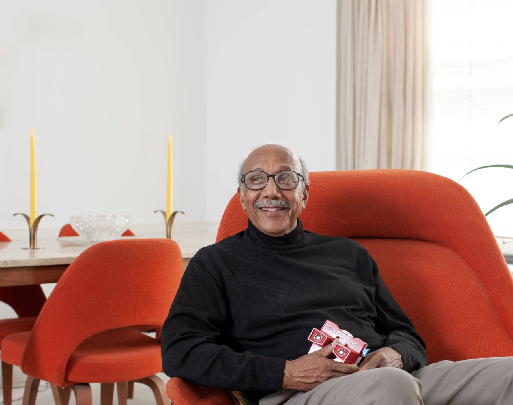
Born in 1931, his father was a teacher of Industrial Arts at Southern University and later a Professor at Prairie View A&M University in Texas - an historically black university. After studying a Bachelor of Fine Arts at the Art Institute of Chicago from 1949 to 1954, he was drafted into the US Army where was in the topography unit.
Initial attempts to secure work were hampered by his race so he worked on a freelance basis - with clients willing to accept his work but not willing to employ him. After impressing the Sears company with his designs he was finally given a position on the design team but not before he had redesigned the ViewMaster in 1958 , whilst working for Robert Podall Associates.
MOMA regards the View Master as a design classic and their description is thus :
“A mass consumer device marketed as a toy, the original View-Master came with thin cardboard disks, or reels, containing stereoscopic pairs of small Kodachrome photographs that when viewed through the apparatus created the illusion of three-dimensional scenes. Invented, manufactured, and sold by Sawyer’s Photo Services in the United States (a company specializing in scenic postcards, slides, and slide projectors), the contraption debuted at the 1939 World’s Fair in New York.
In 1958 a young designer by the name of Charles “Chuck” Harrison redesigned the View-Master at the Chicago firm Robert Podall Associates. His Model F reduced the bulk of the batteries in earlier View-Masters. His Model G, produced from 1959 onward, abandoned the original Bakelite for injection-molded plastic, which allowed for a range of colors and designs that revolutionized the product’s market appeal. Reels depicting the 1964 World’s Fair in New York, the lights of the Las Vegas Strip, and even scenes from outer space further cemented the View-Master’s place in popular culture.
In 1961 Harrison joined the staff of the department-store chain Sears, Roebuck and Company, where he would remain for thirty-three years. He was the first black executive at the company’s headquarters and one of very few prominent professional designers of color at that time. Aside from the View-Master, Harrison’s products included lawn mowers and power tools, pots and stoves, and the very first plastic trash can.”
Whilst his design for the ViewMaster has endured in popular culture it his perhaps his design of a plastic trash can that his work has probably impacted most on society. Trash cans traditionally had been made of galvanised steel and the sound of bins being knocked over and emptied was part of the urban experience. Harrison took advantage of the improvement in plastics, changed the traditional shape of round to rectangular and added wheels making then lighter, easier to use and cheaper. “No more clang-clang of metal before breakfast.” said Harrison of his proudest achievement.
Harrison designed hundreds of consumer products for Sears over the course of his career. When the Cooper Hewitt design museum in New York gave him its National Design Award for lifetime achievement in 2008 the citation read that he “improved the quality of life of millions of Americans through the extraordinary breadth and innovation of his product designs,”
Charles ‘Chuck’ Harrison died aged 87 in 2018
Watch 'The Pruitt-Igoe Myth' for free until July 31st
Here at The Modernist we try not to sweep under the carpet some of the failures of Modernism. Mistakes have been made and the Pruitt-Igoe Housing project in St Louis is often held up as a prime example by those who claim Modernism lacked humanity.
There were major flaws in the design of Pruitt-Igoe but there is a much more complex narrative around its failure - something this documentary explores.
The fact the vast majority of the tenants at Pruitt-Igoe were black also adds another, more prescient, dimension to the debate. This documentary tries to avoid any judgements on the architecture but it asks pertinent and enduring questions about social housing, poverty, de-industrialisation and race that will resonate in many cities across the world.
Norma Merrick Sklarek, ‘the Rosa Parks of Architecture’
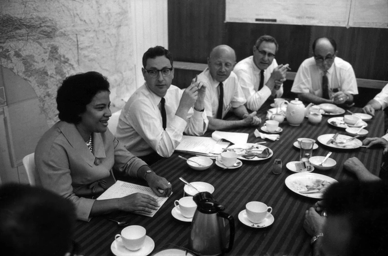
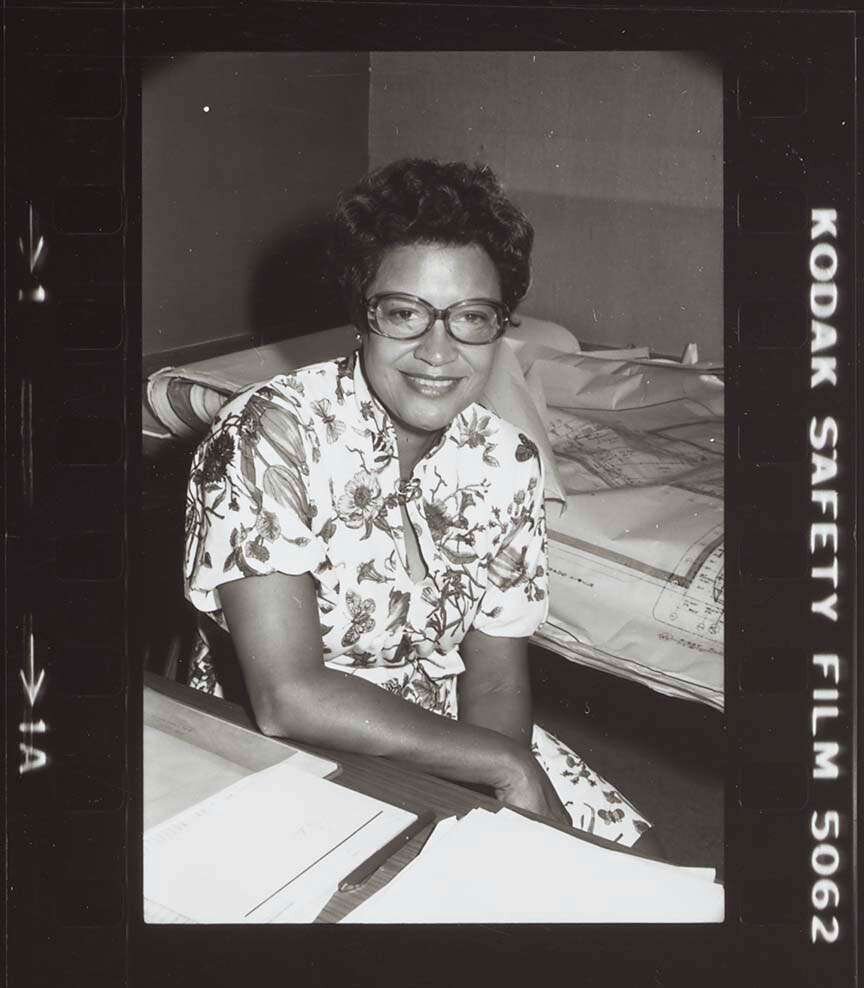
Norma Merrick Sklarek at the Los Angeles office of Gruen Associates: an ‘old-boys network’.
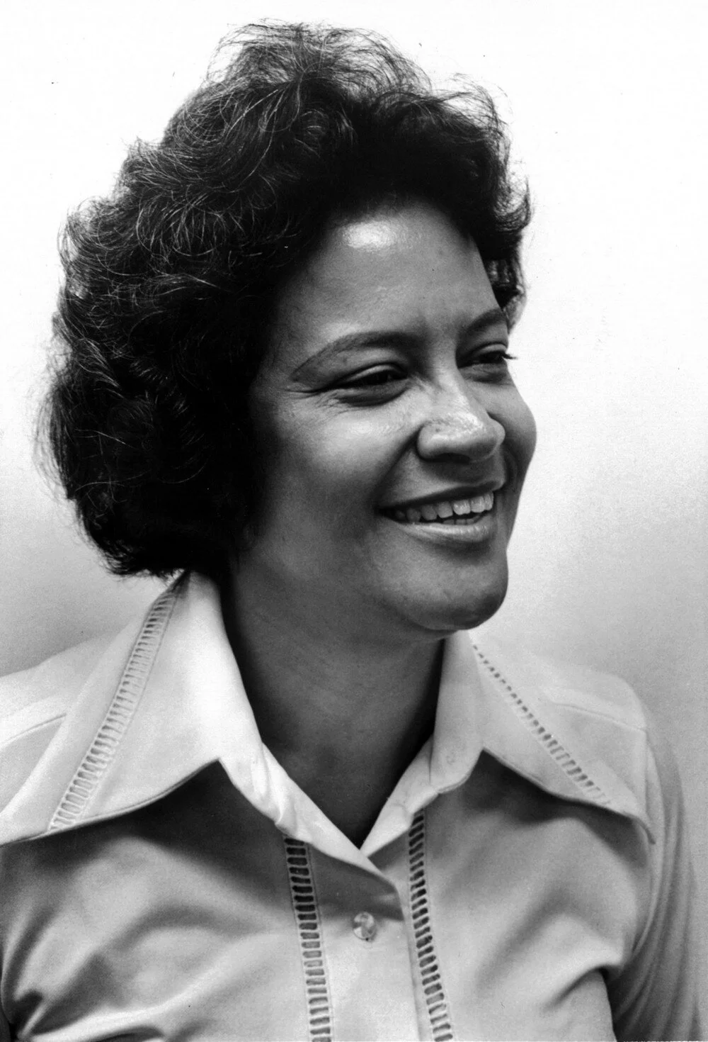
Norma Merrick Sklarek was born on 15 April 1926 in Harlem, New York to parents Dr. Walter Ernest Merrick and Amelia (Amy) Willoughby, a doctor and seamstress, who had moved to Harlem from Trinidad, later relocating to Brooklyn. Sklarek went on to study at Columbia University, graduating with a degree in architecture in 1950; she was the first African American woman to do so, and one of only two women in her graduating class. She then worked as a Junior Draughtsman at New York Department of Public Works from 1950 to 1954, during which time she applied to and was turned down by nineteen architecture firms. In 1954 Sklarek took the architecture examination, becoming the first African-American woman licensed to practice architecture in New York at the behest of her bosses at NYDPW, who she was substantially more qualified than). She was eventually hired by the twentieth architecture firm she applied to - Skidmore, Owings and Merrill - in 1955, where she stayed for five years. At this point Sklarek was also teaching evening architecture courses at New York City Community College and raising her two children as a single parent with help from her mother; no mean feat at the best of times, but especially so as an African-American woman in 1950s America.
It was in 1960, when Sklarek was hired by Gruen Associates in Los Angeles, California, that her career began to truly take hold. In 1962 Sklarek received her license to practice architecture in California (thus holding licenses in both New York and California simultaneously) and by 1966 she had become Gruen's first African-American female director. Sklarek collaborated on projects including the California Mart (1963), San Bernardino City Hall (1969), The Commons Courthouse Center in Columbus, Indiana (1973), the Pacific Design Center in West Hollywood (1975), the Fox Hills Mall (1975, now Westfield Culver City), and the Embassy of the United States in Tokyo (1976) - all credited to Argentinian architect César Pelli. Despite her experience and qualifications, Sklarek was classed as a project manager rather than designer, a situation that was depressingly common in the field of architecture; women would often remain unacknowledged for their work, with the situation being even harder for African American women such as Sklarek.
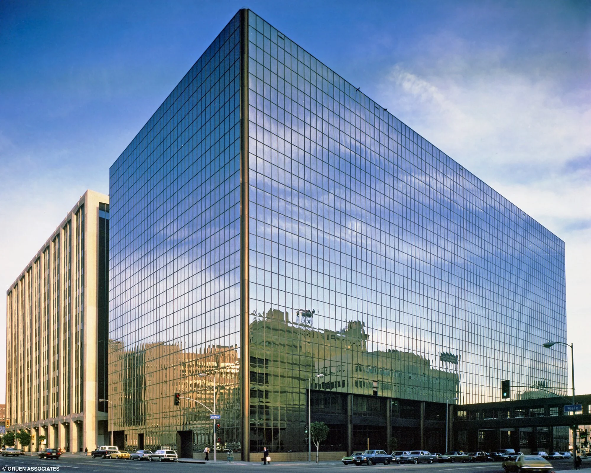
California Mart, 1963
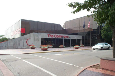
The Commons Courthouse Center in Columbus, Indiana (1973)
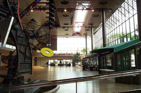
The Commons Courthouse Center in Columbus, Indiana (1973)
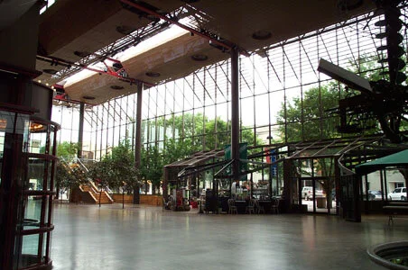
The Commons Courthouse Center in Columbus, Indiana (1973)
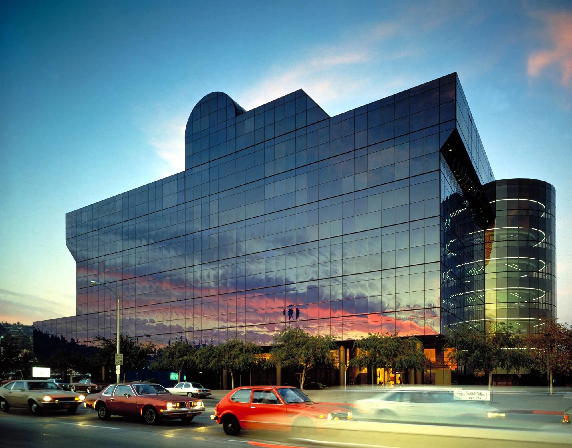
Pacific Design Center, West Hollywood, 1975
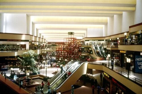
Fox Hills Mall, 1975. The first 3-level mall in California. Situated on a 50-acre site, the Mall with contains over 1,000,000 square feet, was originally anchored by three department stores, more than 132 specialty shops and a four-level, 2,450-car parking structure with direct access. Notable elements of its original design were a glass-and-steel "theme" staircase in the center of the mall, as well as the angled bridges which connected the multiple levels. The project received a Los Angeles Chapter AIA Citation for Design Excellence. (Gruen Associates)
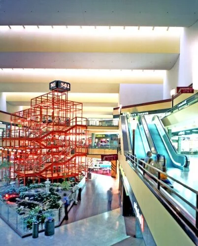
Fox Hills Mall, 1975
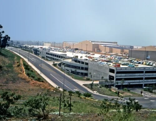
Fox Hills Mall, 1975
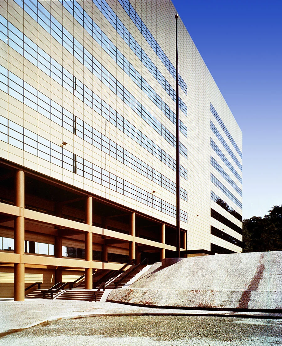
Embassy of the United States, Tokyo
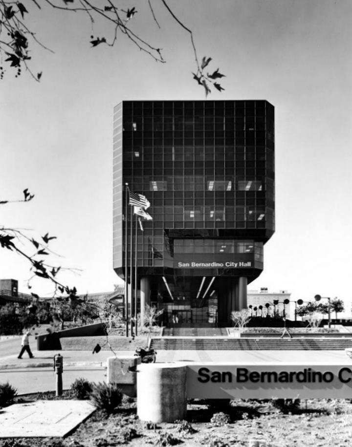
San Bernardino City Hall, 1969

LA Terminal One, 1984
Sklarek left Gruen Associates in 1980, and shortly afterwards became the first black woman to be elected as a fellow of the American Institute of Architects - twenty one years after she had been introduced, in 1959, as their first African American woman member. She took up a position that same year at Welton Becket Associates, where she was the company’s first ever female employee, and served as the project director for the $50-million construction of Los Angeles International Airport’s new Terminal One station, completed in 1984 in time for the summer Olympics that year. Sklarek said of working on the project: ‘At first, the architects working on the airport were skeptical because a female was in charge of the project, but a number of projects were going on there at the time and mine was the only one on schedule.’
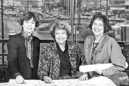
L-R: Margot Siegel, Norma Merrick Sklarek and Katherine Diamond
Sklarek left Welton Becket Associates in 1985 to set up Siegel, Sklarek, and Diamond with Margot Siegel and Katherine Diamond, forming what was thought to be one of the largest women-owned architecture firms in the USA at the time. The Los Angeles Times ran an article on the firm in 1986, stating: ‘When Los Angeles architects Margot Siegel and Norma Sklarek began practicing independently in the 1950s, women architects were about as rare in Los Angeles as buildings taller than the 27-story City Hall. But while the 13-story height limit was lifted in 1958, women architects are still unusual. Only 6.5% of the American Institute of Architects’ 50,000 members are women.’ Diamond, Sklarek’s partner, stated that the field of architecture was ‘definitely an old-boys network’ and that, while they hadn’t eliminated the problems of being a women-owned business, they had eliminated some of those obstacles because they could demonstrate their sheer talent and professionalism through their combined portfolios and work history.
Sklarek went on to join JERDE Partnership in 1989, taught at University of California at Los Angeles and served as director for the University of Southern California Architects Guild, all before retiring in 1992. Following her retirement, Sklarek was appointed by the governor to serve on the California Architects Board and served as chair of the AIA's National Ethics Council for several years. Sklarek was awarded the Whitney Young award in 2008 as an architect exemplifying the profession’s responsibility toward current social issues. AIA’s 2008 President Marshall Purnell (himself also an African-American) said of Sklarek in the Los Angeles Times following her death in February 2012: ‘She was excellent at putting the whole package together. She did not design most of the huge projects she supervised, not because she wasn’t capable, but because when she started out in the 1950s it was unheard of to have an African American female who was registered as an architect. You didn’t trot that person out in front of your clients and say, “This is the person designing your project.” She was not allowed to express herself as a designer. But she was capable of doing anything. She was the complete architect.’ Purnell also stated: ‘She made me possible. She is mentally the strongest person in this profession that I know. Everywhere she went, she was first.’
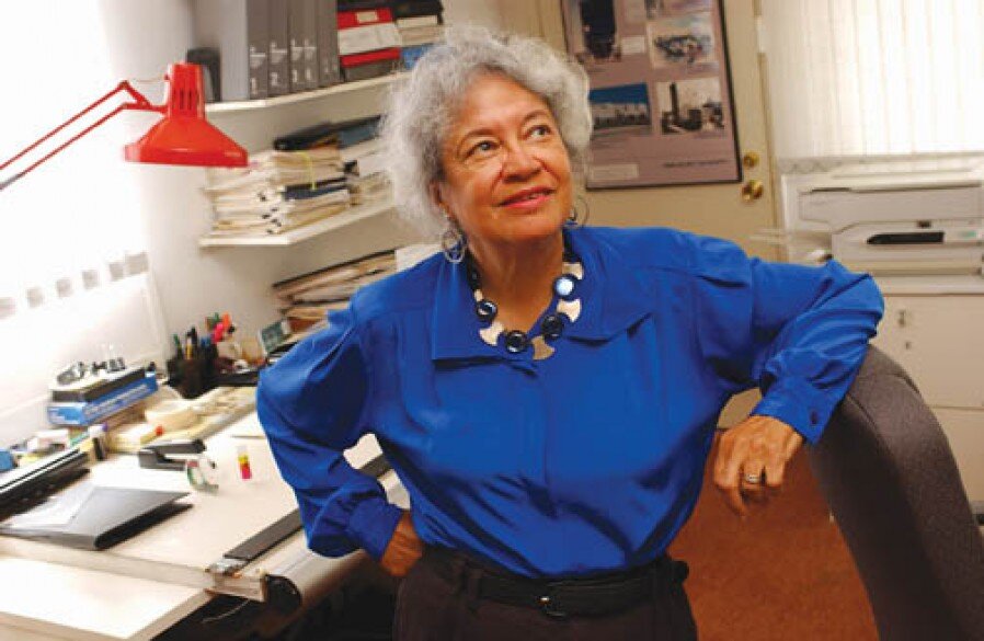
You can hear more of Sklarek’s story - told in her own words - thanks to a video interview conducted and made available by The National Visionary Leadership Project, a US-based organisation whose mission is to ‘record, preserve and share the stories of extraordinary African American elders who have transcended barriers, shaped American history, and influenced the world through the rich African American tradition of social change’. The NVLP have compiled a series of clips from the interview into a YouTube playlist, beginning with the first of ten here. We highly recommend watching all of them.
Live stream tour of Adolf Loos’ Villa Winternitz
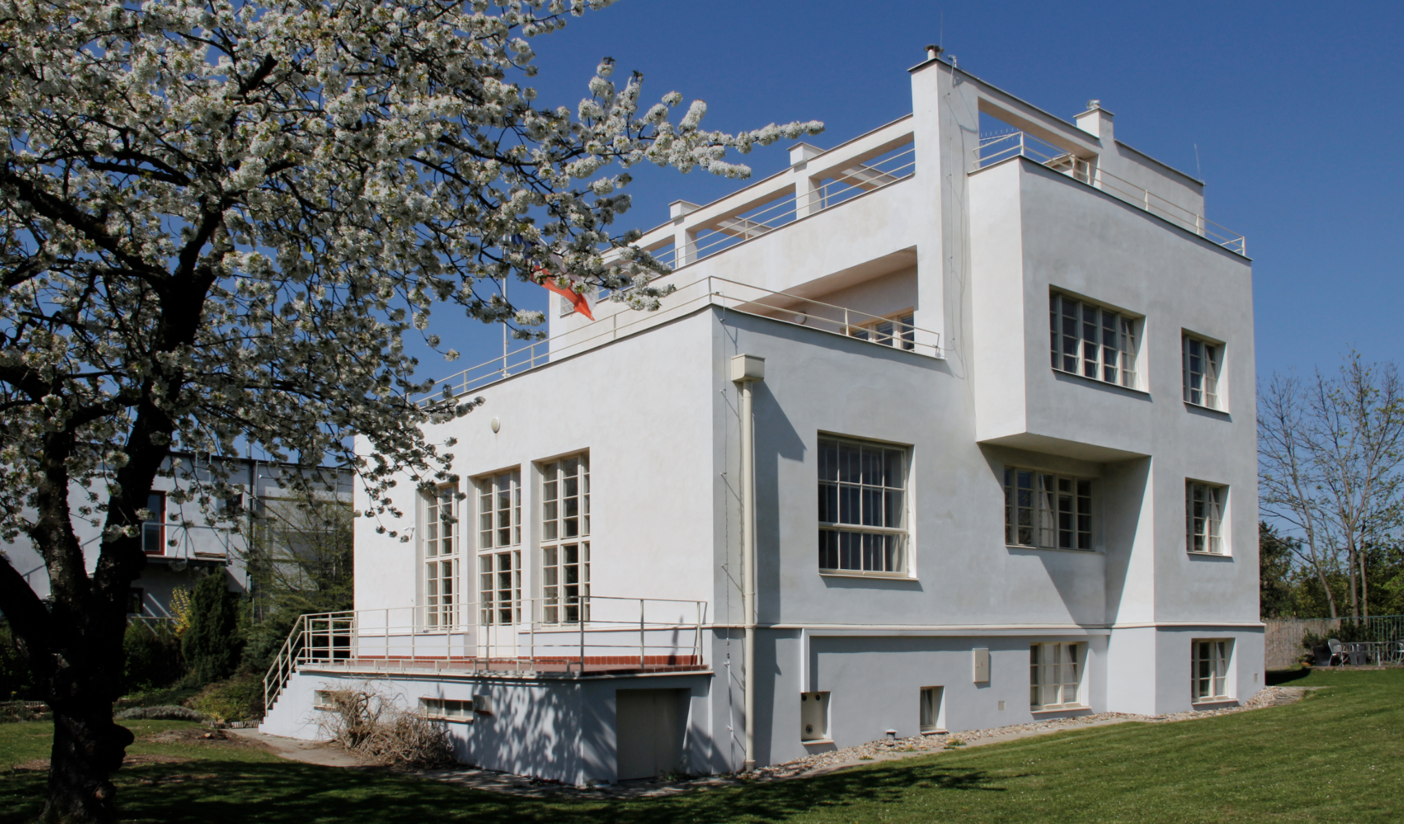
The nice people at the Czech Centre in London have been in touch to tell us about an online event they are holding on Thursday 18 June.
With most us not being able to travel the Czech centre are giving us a chance to travel to Prague with a live stream from the recently renovated Villa Winternitz designed by Adolf Loos in 1932.
Architect Adam Gebrian will guide you through the recently restored 1932 Prague Villa Winternitz, the last project of Adolf Loos, the Czech-born pioneer of modern architecture, revealing a powerful architectural concept still influential today and the tumultuous history of the villa and its owners.
Experience the overall effect of walking through a prime example of Loos’ Raumplan, an innovative spatial concept dividing a building into interconnected multi-level spaces. Discover a complex interior structuring the space into a sequence of stepped areas including an impressive double-height living room, a dining room and a drawing room with interior wall cut-outs framing views into adjoining rooms. This contrasts with the simple cubic shape and white, austere façade of the villa, divided only by terraces and windows and embodying the principles expounded by Loos in his seminal essay “Ornament and Crime”.
Follow THIS LINK to find out more and to register .
Subscribe and receive each quarterly issue at a reduced price.
adventures...
Its a travel magazine of sorts.. Out now.
the shop
In our online shop you can buy back issues as well as our other publications and some other of Modernist goodies.. have a look.
fresh tweets
new events


Commodo cursus magna, vel scelerisque nisl consectetur et. Donec id elit non mi porta gravida at eget metus.