
FAC 461 - Factory Records: The Complete Graphic Album - new limited edition
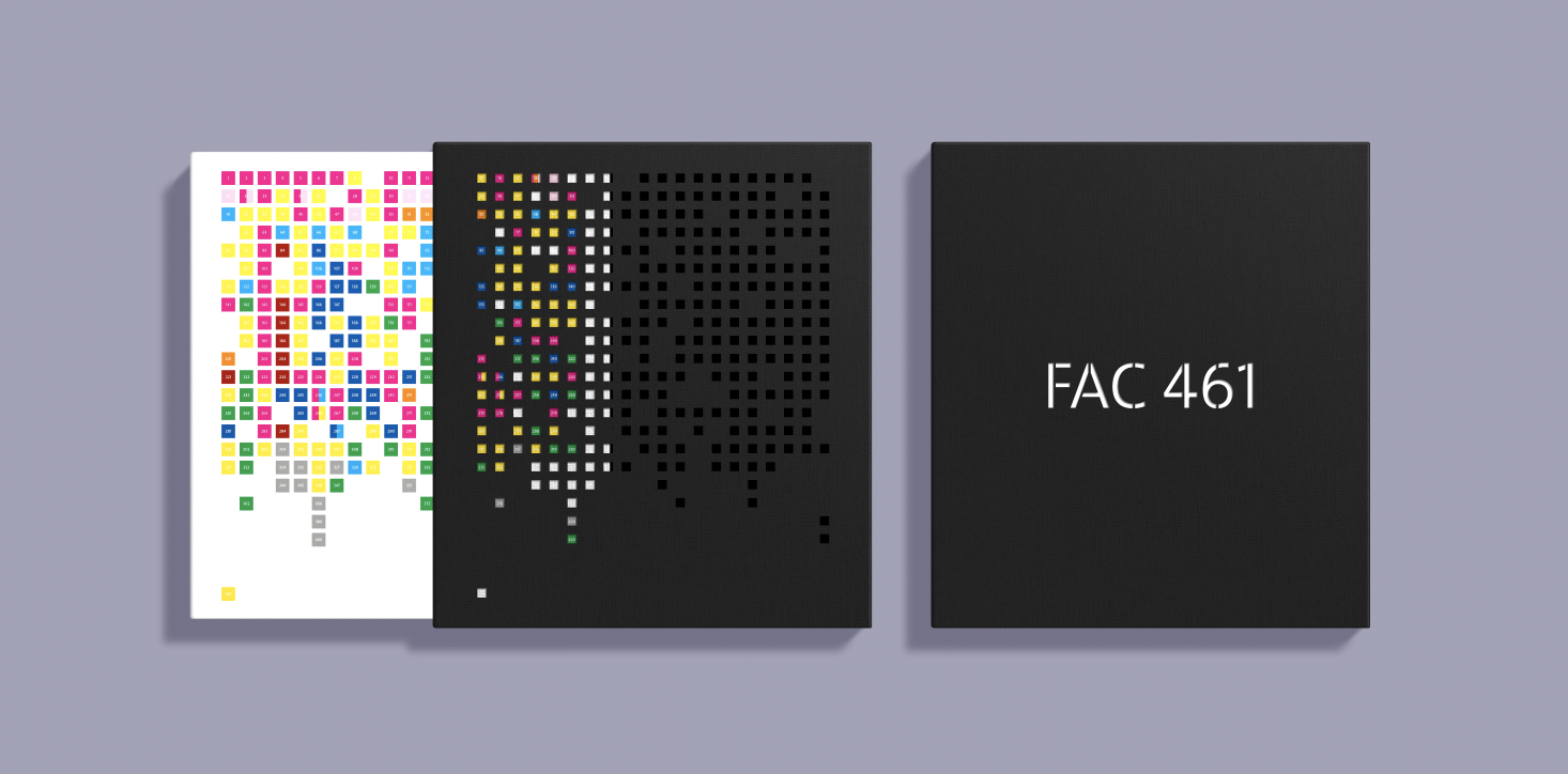
We were very proud of our recent PRAXIS exhibition and we couldn’t have done it without the help of Matthew Robertson, the author of Factory Records: The Complete Graphic Album who not only supplied many of the images but also came a did a great Q&A for us.
The book was a big source of inspiration and factual knowledge whilst putting the exhibition together and now VOLUME are releasing a beautiful new limited edition of the book.
This new re-issue comes encased in a specially designed, laser-cut slipcase that is a big nod to the die-cut sleeve of Blue Monday. The edition is numbered and limited to 461 copies.
This release was due to coincide with an exhibition at Manchester’s Science and Industry Museum but sadly that is on hold for now. This new re-issue is a must for all FACTORY completists and is available for the VOLUME website
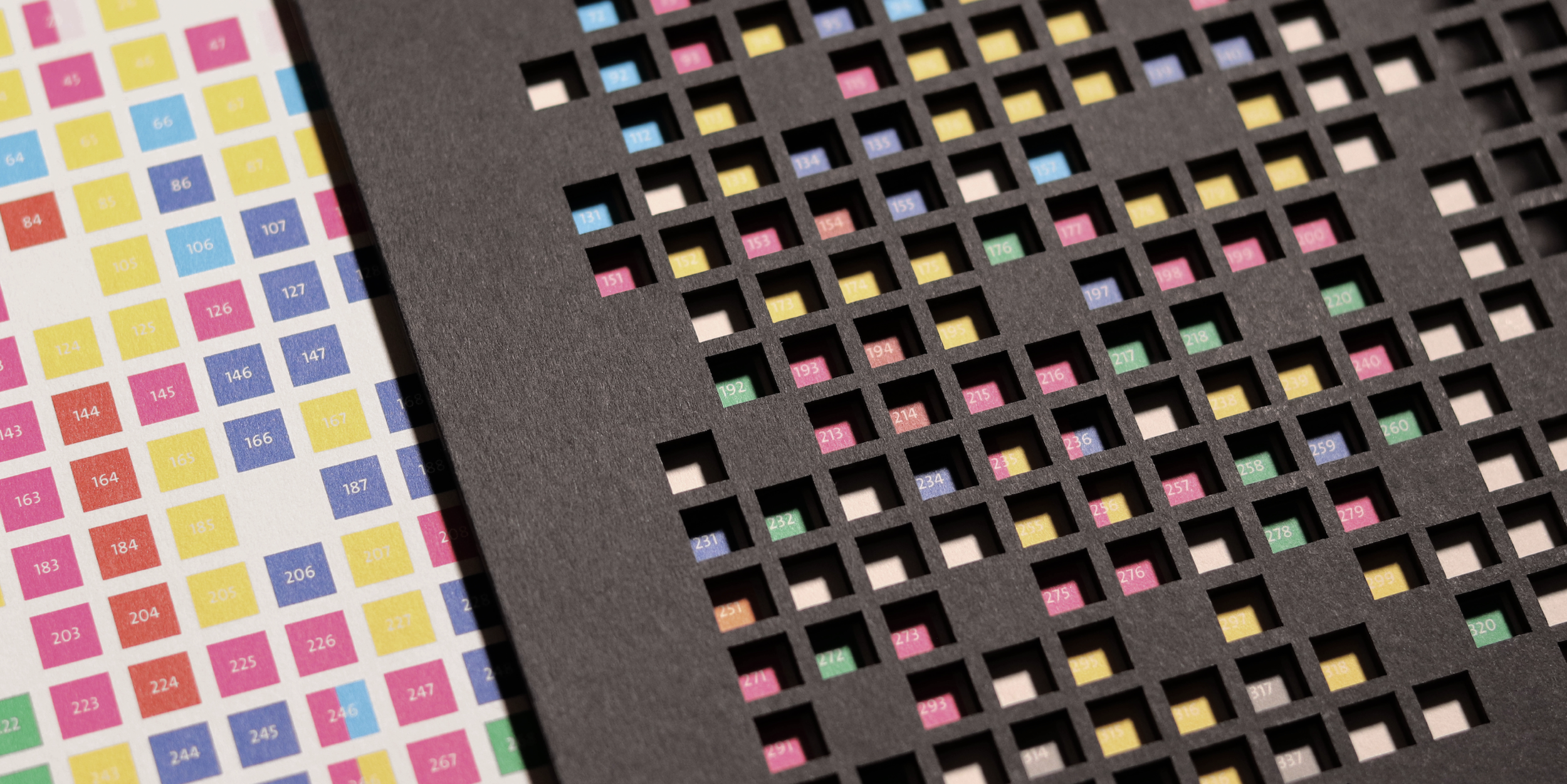

Beverly Loraine Green & Stuy Town, New York
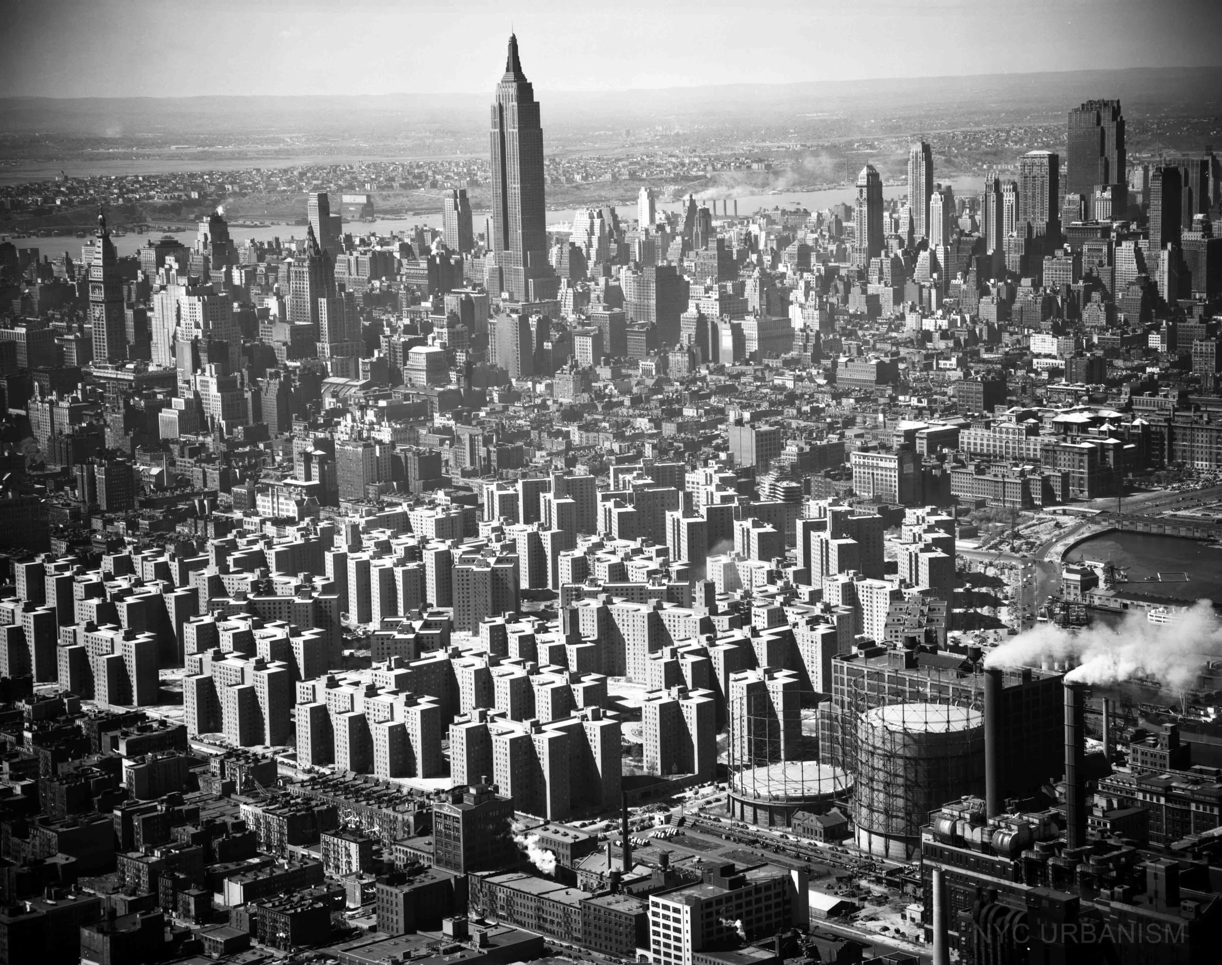
Stuyvesant Town, New York, NY
There are two interweaving stories that make up this post; the story of Beverly Loraine Green, reportedly the first African-American woman to receive a license to practice architecture in the USA, and the story of Stuyvesant Town-Peter Cooper Village (Stuy Town) in Lower East Side Manhattan, NY. While Greene only briefly worked on the Stuy Town development in 1945, both tell important, interlinked stories of the racial injustice faced by African-Americans in the US.
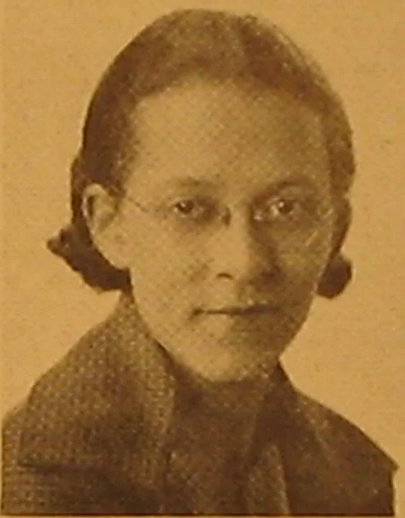
Beverly Loraine Greene as a student at University of Illinois at Urbana–Champaign
Beverly Loraine Greene was born 4 October 1915 in Chicago Illinois, an only child to parents James, a lawyer, and Vera, a homemaker. She went on to study at the University of Illinois at Urbana–Champaign, becoming the first African-American woman to receive a Bachelor of Science degree in architectural engineering in 1936, before going on to complete a Master of Science degree in city planning and housing. Greene was then hired by the Chicago Housing Authority, breaking race and gender barriers in the process, and received her license to practice architecture from the State of Illinois on 28 December 1942 aged just 27. Indeed, Beverly Loraine Green is reported to have been the first African-American woman to do so in the USA.
Despite her education and credentials, Greene struggled to secure work as an architect in Chicago due to racial prejudice, finding that she and her fellow black colleagues were frequently shunned by architectural firms and written out of the local press almost entirely. This resulted in a move to New York in 1945, where Greene applied for a role on the Metropolitan Life Insurance Company’s new development of Stuyvesant Town–Peter Cooper Village (often referred to as Stuy Town), a large-scale post-war housing project situated on a 72 acre site on the Lower East Side of Manhattan, NY.
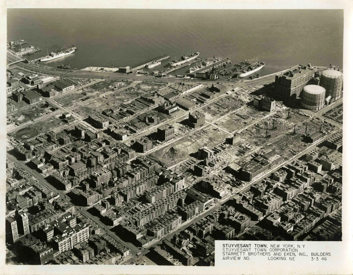
The former Gas House District, NY
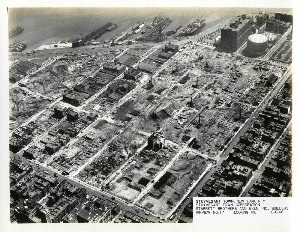
Demolition begins on the Gas House District, NY
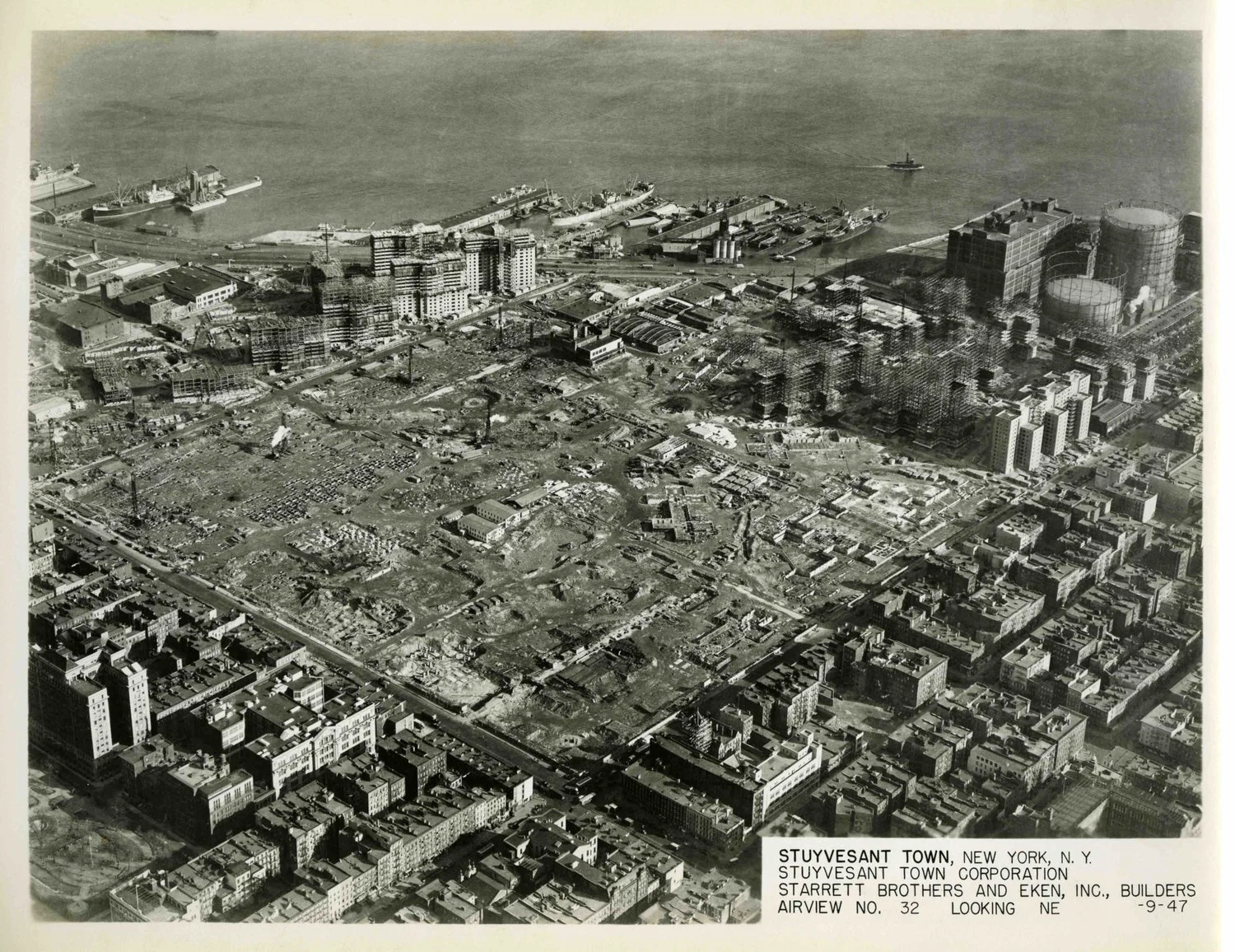
The cleared Gas House District site, ready for construction to begin on Stuy Town (see header photo)
Built on the former ‘blighted’ Gas House District, which had been demolished under the city’s slum-clearance scheme, the development was devised by Metropolitan Life which, at the time, insured one third of New York City’s population. The premise was that better living conditions would improve the company’s mortality numbers, thus increasing revenue for the company. Inspired by architect Le Corbusier’s use of green space, Stuy Town’s 110 buildings were designed to cover only a quarter of the site, dedicating the remaining three quarters to lawns, pathways, and playgrounds. In addition to reduced land coverage, the development housed only 302 people per acre, a drastic decrease in density compared with 1,100 people per acre across the site’s previous tenements at the beginning of the 20th century.
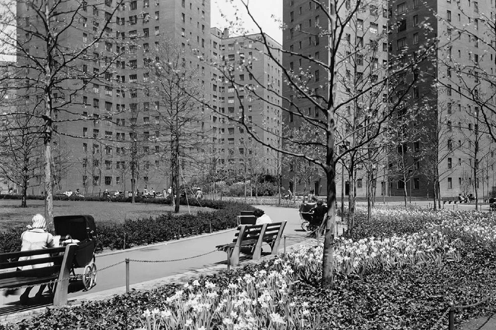
Stuyvesant Town in the 1960s
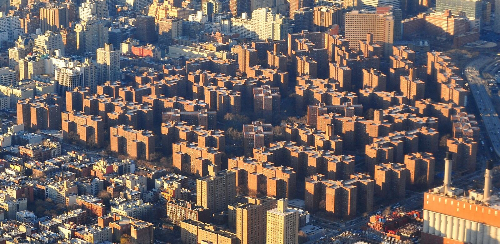
Stuyvesant Town (bottom and left) and Peter Cooper Village (top and right)
However this new, better quality of life wasn’t intended for all. According to Metropolitan Life’s president Frederick H. Ecker, African-Americans would not be permitted to live on the development; he told The New York Post, “If we brought them into this development, it would be to the detriment of the city, too, because it would depress all the surrounding property.” Prices were also set so high that only 3% of the former Gas House District tenants (which comprised a high number of African-Americans) would have been able to afford the rent, therefore adding another layer of discrimination. From the moment that tenants began moving in in 1947, the segregation ruling caused major conflict, with a group of tenants forming a committee led by resident Dr Lee Lorch, who together fought against the ruling with petitions, pickets and a failed legal challenge in 1949. It wasn’t until 1951, after years of protest and the death of Metropolitan Life’s president, that segregation was finally overruled and black families were permitted to move into the area. The battle and eventual success inspired an open-housing movement that led to housing discrimination being made illegal nationwide, becoming a landmark in de-segregation and racism in the USA.
As an African-American Beverly Loraine Greene herself would not have been permitted to live on the development in its early years, yet she broke barriers by not only being the first black or female architect to be hired for the project back in 1945, but being the first architect full stop hired for the project. That said, shortly after taking up the position, Greene won a scholarship to study urban planning from Columbia University and quickly left the project in order to return to education full-time, graduating with a Master of Arts in architecture. Upon graduation from Columbia, Greene then went on to work for Isadore Rosenfield on the design of healthcare facilities (including Unity Funeral Home in New York where Greene’s own memorial service would later be held), a role she stayed in until 1955. She also took on projects with Edward Durell Stone during this period, including the arts complex at Sarah Lawrence College and a theatre facility at the University of Arkansas. Furthermore, Greene also worked with the architectural firm headed by Marcel Breuer on the UNESCO United Nations headquarters in Paris, France (pictured below) as well as various buildings for New York University.
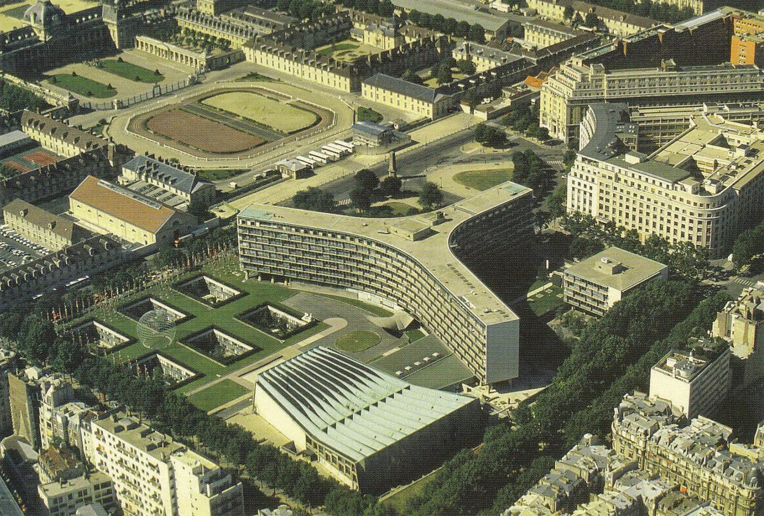
UNESCO Headquarters, Paris. Architect: Marcel Breuer, completed 1958
Sadly, Greene passed away aged just 41 on 22 August 1957, prior to the completion of UNESCO in 1958, as well as a number of the NYU buildings she had worked on, which were completed between 1956 and 1961. Her career was undoubtedly cut short; we cannot help but wonder what Greene might have gone on to achieve given the numerous barriers she had already broken as an African-American woman. Her legacy cannot be understated.
Johnson Publishing Company HQ
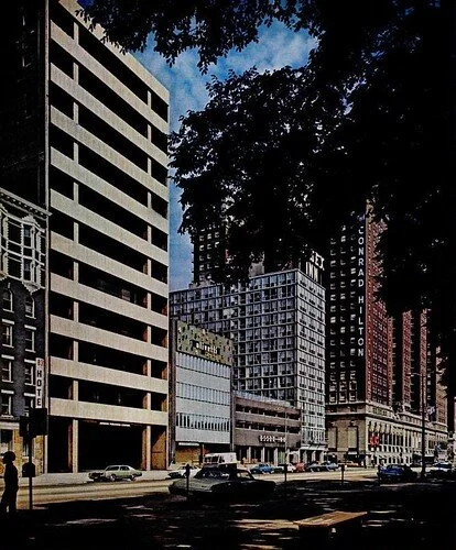
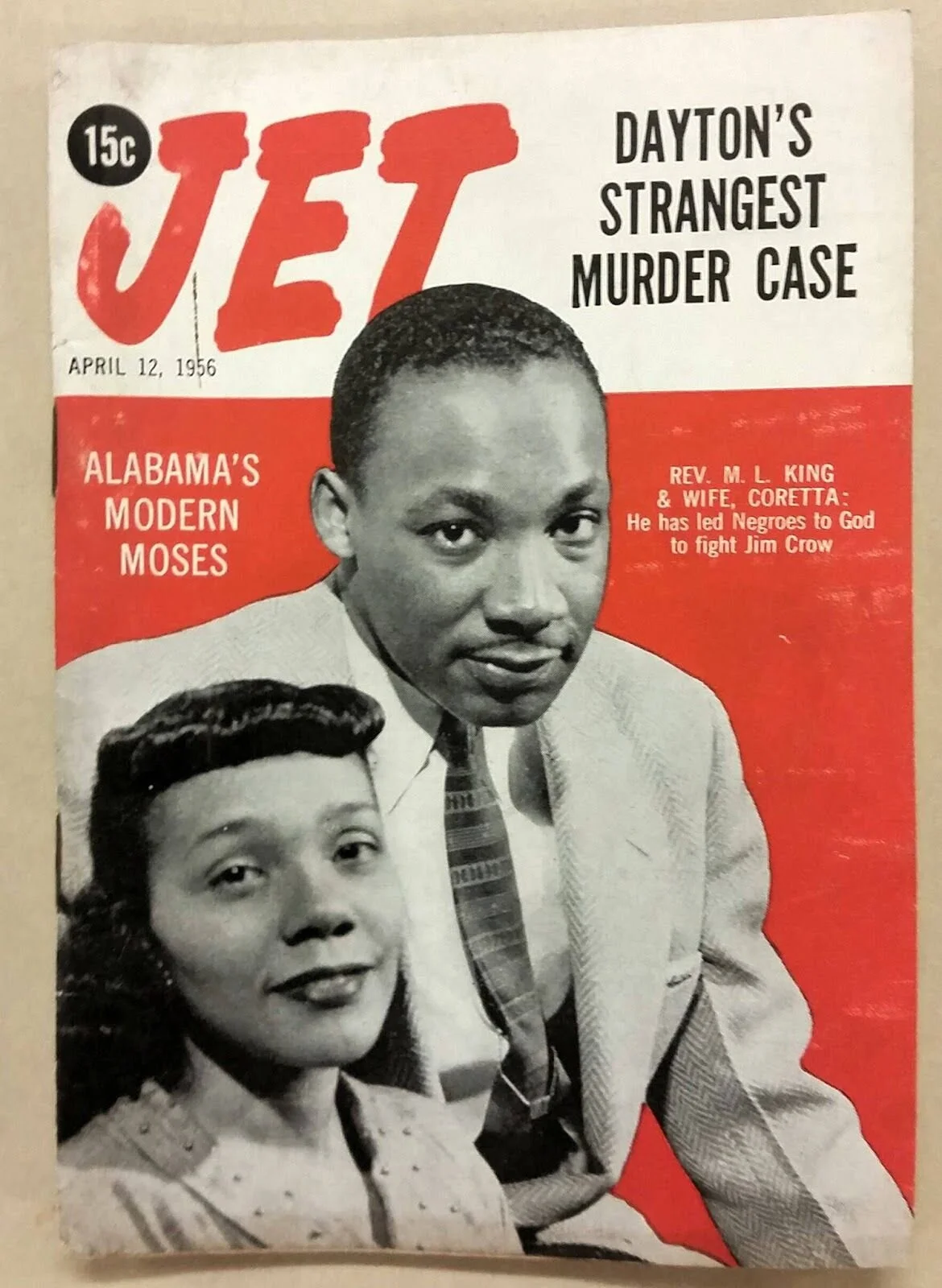
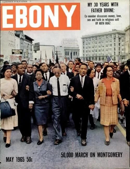
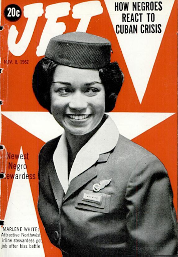
The Johnson Publishing Company was founded in 1942 in Chicago, Illinois by John H Johnson (b. Arkansas, 1918) with the publication of Negro Digest. Based on the popular Readers Digest, the publication was aimed directly at the African-American market, gaining 50,000 subscribers within its inaugural year.
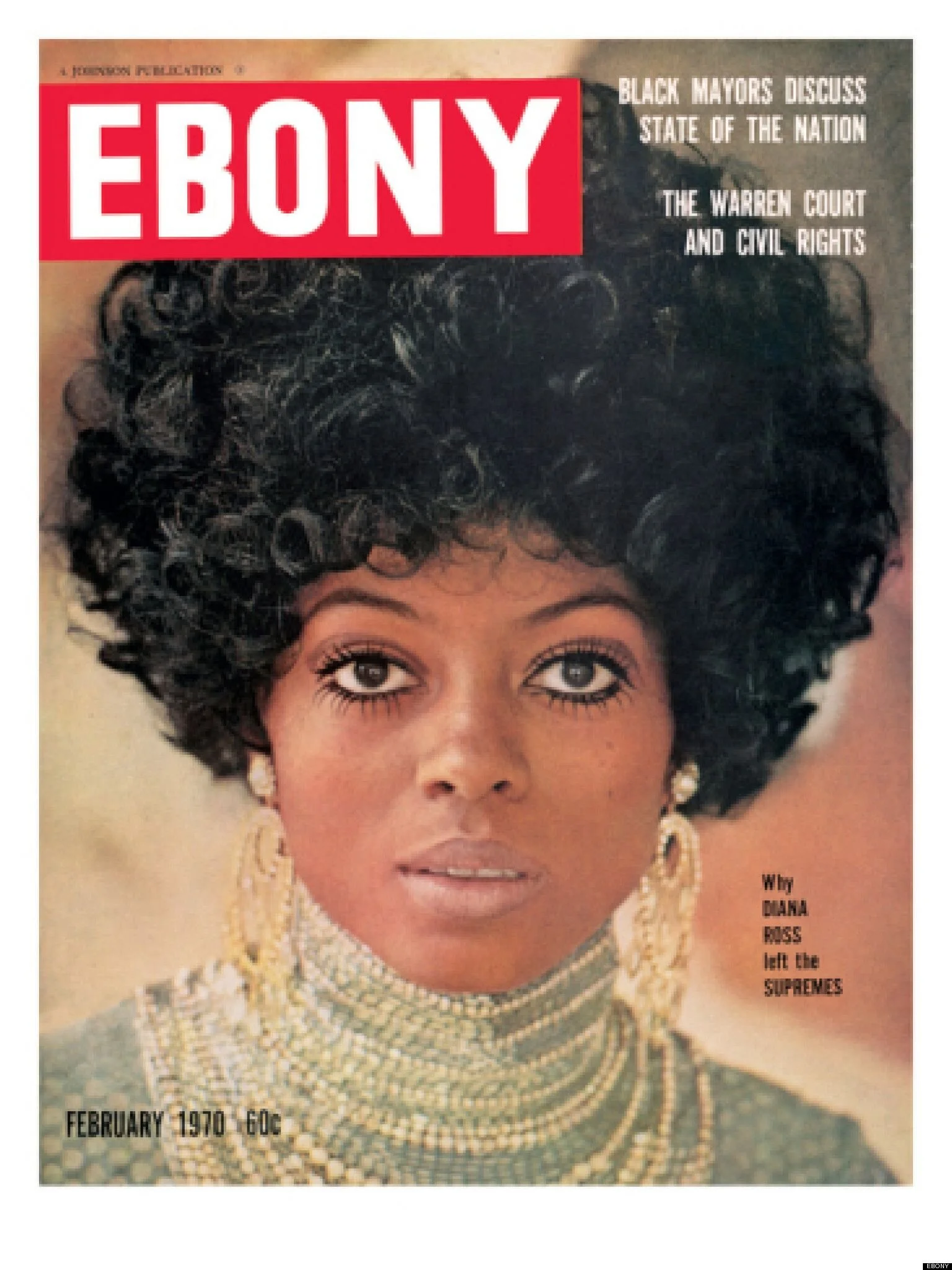
Ebony magazine was launched by Johnson soon after in 1945, setting out to address and celebrate African-American issues, culture and achievements and quickly growing to a circulation of 1.5 million, thus becoming Johnson’s flagship publication. In 1951 a weekly magazine, Jet, was launched aimed at a more populist African-American audience with a focus on news, culture and entertainment, as well as chronicling the Civil Rights Movement from its earliest years, including the murder of Emmett Till, the Montgomery bus boycott and the activities of Martin Luther King Jr. Alongside Ebony, Jet put Johnson Publishing Company on the path to becoming America’s most successful African-American owned company.
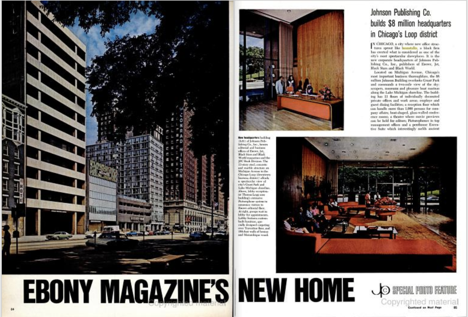
Such was the success of the company that in 1971 Johnson Publishing was able to move into a bespoke new office building at 820 S. Michigan Avenue in Chicago. Designed by the African-American architect John Moutoussamy (who studied under Mies van de Rohe at Chicago’s IIT College of Architecture) the exterior is a restrained and subtle modernist 11 storey office block. The site was the first African-American owned building in Chicago's downtown area and remains the only Chicago high-rise to be designed by an African-American.
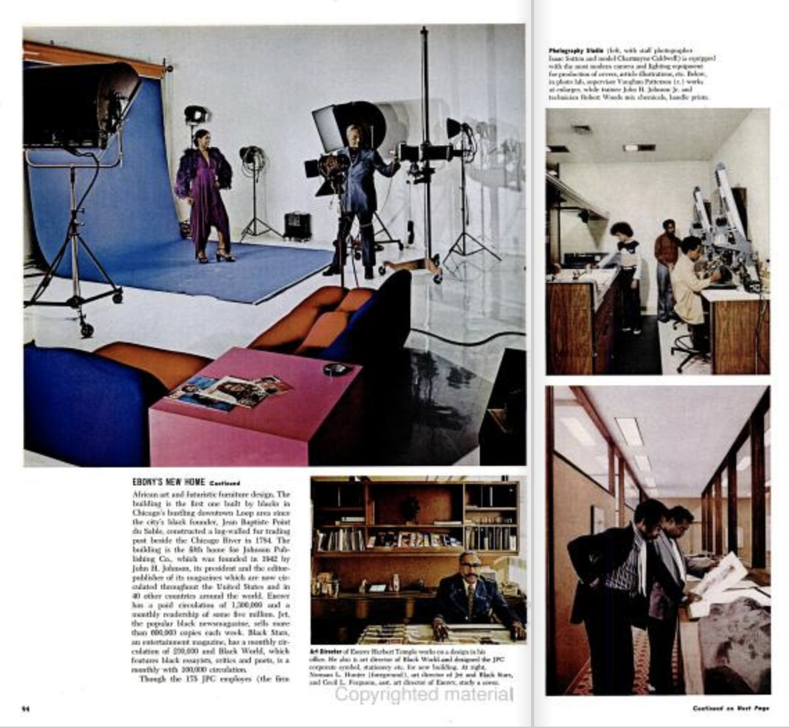
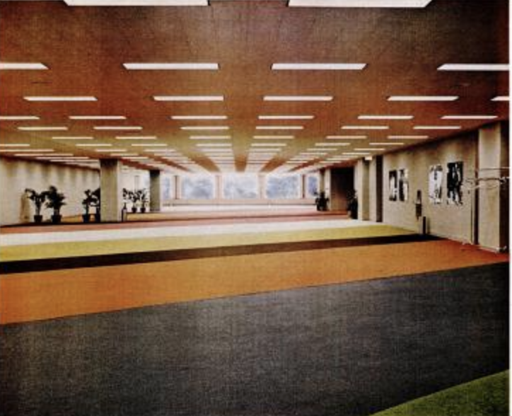
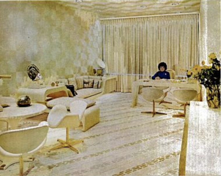
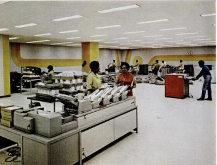
The Johnson Publishing interiors, however, were anything but restrained. Designed by William Raiser and Arthur Elrod, they were as flamboyant and vivid as Elrod’s own house* and capture perfectly the mood of the time. *If the name Elrod name rings a bell you may know it from his own house, The Elrod House, designed by John Lautner and which featured in the James Bond film Diamonds Are Forever.
Luckily for us, Ebony magazine featured an extensive photo story of their new headquarters in a 1972 edition of the magazine and we have featured some of the images displaying their fantastic interiors below. Johnson himself never saw the need to ‘renovate’ or update the interiors so they remained pretty much intact and well-maintained until JPC finally left the building in 2010 following a period of decline after the founder’s death in 2005. The Johnson Publishing Company filed for bankruptcy in 2018, with a group of arts and educational foundations currently working to secure a home for the archives.
The building was converted to apartments in 2017 and although some original features were retained, most of the untouched office space was lost. However the foyer remains as it was, and the legendary Ebony Test Kitchen (see bottom image) was removed and donated to the New York Museum of Food and Drink.
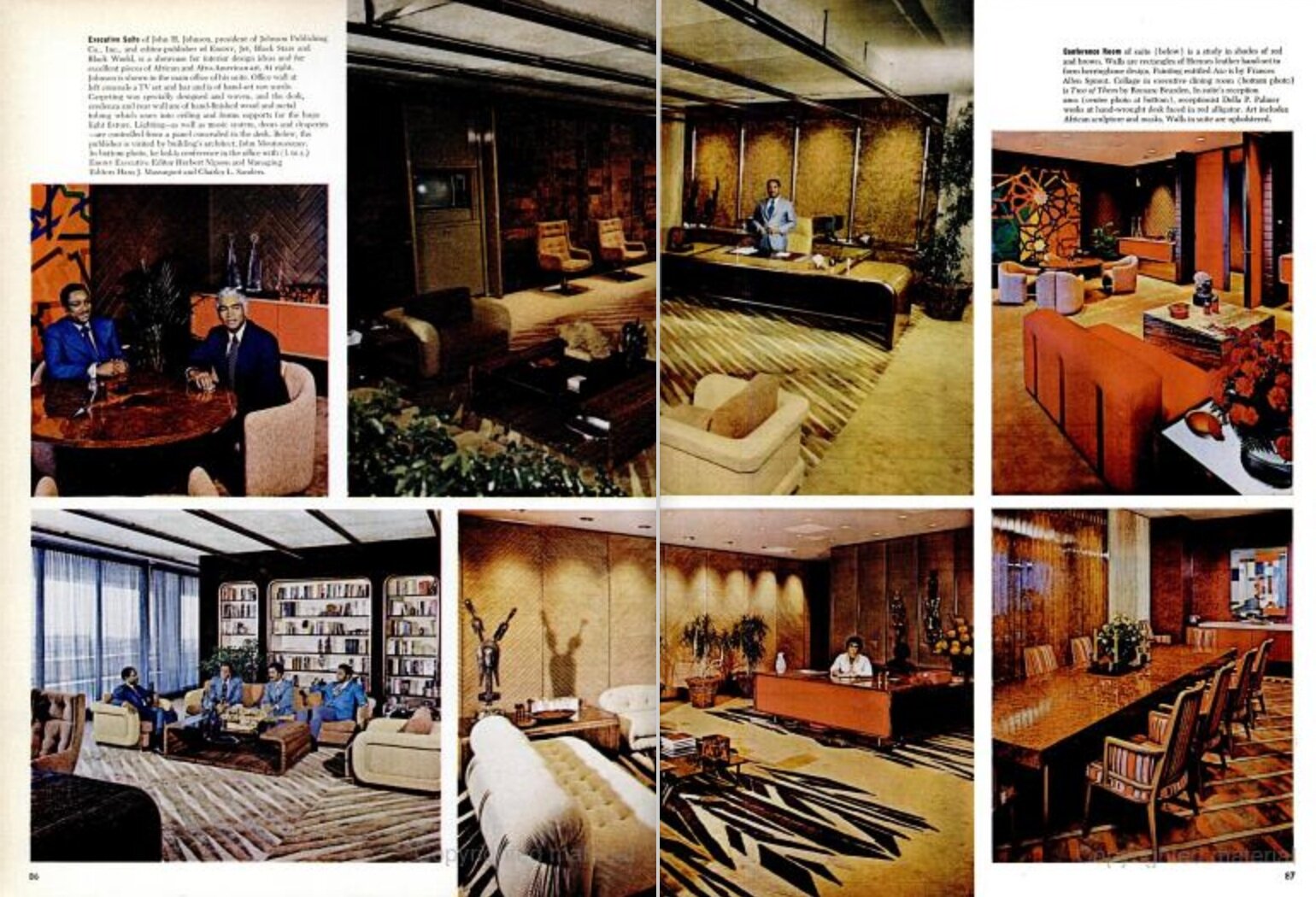
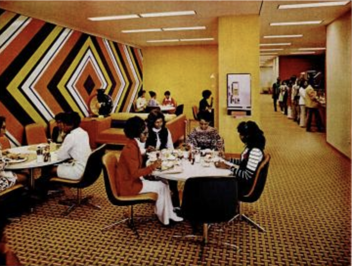
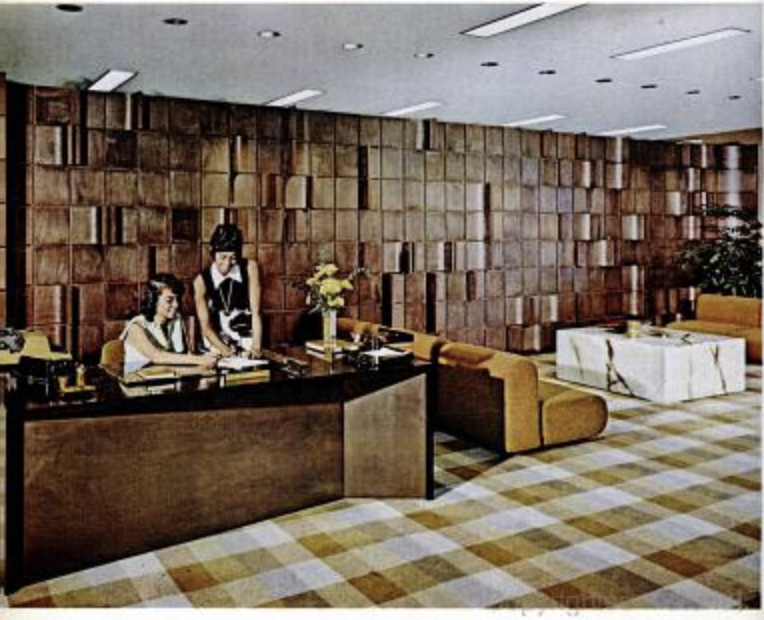
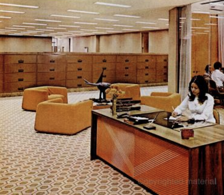
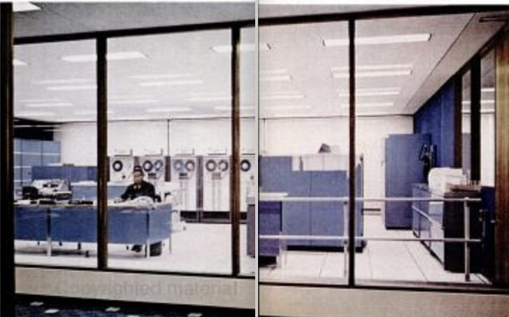
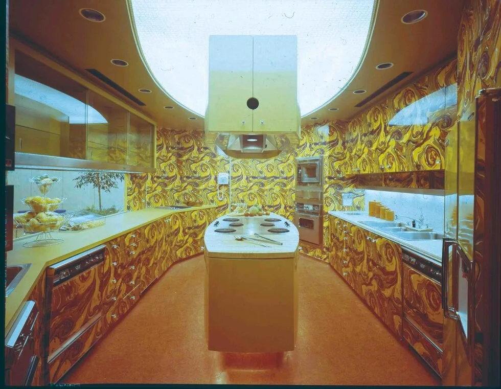
The Ebony Test Kitchen - removed intact and now in the New York Museum of Food and Drink
The Modernist: #blacklivesmatter
Recent events surrounding the tragic, incomprehensible death of George Floyd in Minneapolis, Minnesota and the resulting widespread protests have, as our readers and members will be well aware, sparked important discussions worldwide about the issue of white silence and privilege, cultural diversity and anti-racism.
This has forced us - like the vast majority of cultural institutions and venues across the western world, however big or small - to take a long, hard look at our output and really question whether we are doing enough. And the answer is no. It isn't enough simply not being racist; to be anti-racist we have to make active change, and one obvious, crucial way that we can do so at The Modernist is to shift the focus of our storytelling. We have to push harder for better representation, better inclusion.
From today onwards, we will begin a blog series on our website placing the spotlight on BIPOC (Black, Indigenous and People of Colour) within the world of modernism; architects, designers, publishers, artists and their communities. We will do this whilst planning for longer-term projects and events beyond the digital platform. We will continue to research and learn, and we will do our best to challenge the overwhelming whiteness of the subject at hand.
We hope that you will agree with the importance of this.
Bauhaus in Bristol
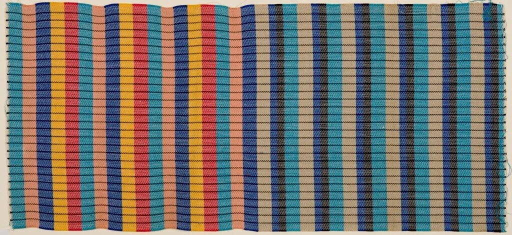
Sample of fabric for tubular furniture, Otti Berger. (Harvard Art Museums, BR52.86)
Last year we had the pleasure of visiting the Ken Stradling Collection in Bristol to see their exhibition Bauhaus in Bristol.
If you missed your chance of a visit then you can catch up on what went on on their blog pages here.
In the 1930s Bristol furniture manufacturer Crofton Gane was a passionate promoter of Modernist design. He built up a wide range of contacts and became a close friend of Bauhaus furniture designer and architect Marcel Breuer.
Gane commissioned a variety of work from Breuer including the Gane Pavilion for the Royal Agricultural Show in Bristol in 1936, regarded by Breuer as one of his two most seminal buildings alongside the UNESCO headquarters in Paris.
In Autumn 2019, the Stradling Collection commemorated this partnership and joined in the worldwide celebrations marking the centenary of the Bauhaus – history’s most famous art school.
The Bauhaus In Bristol exhibition explored how the ideas of the Bauhaus came to Bristol in 1935 via one of its most celebrated figures, Marcel Breuer and his association with Bristol furniture retailer Crofton Gane.
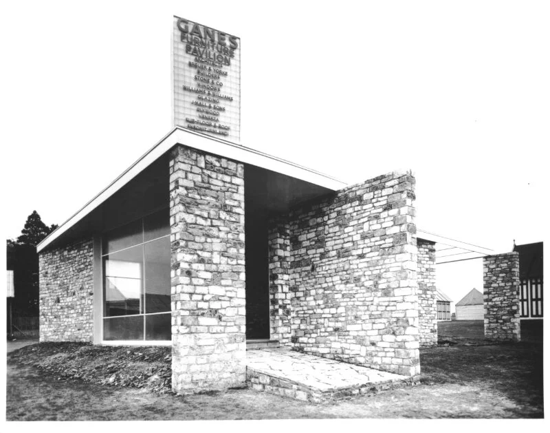
The Gane Pavilion, Royal Agricultural Show, 1936.
Once we get the chance, we’ll definitely be back to the Stradling Collection for another visit.
Stradling Gallery
Design Study Centre
48 Park Row, Bristol BS1 5LH, UK
issue 35 / journey/ summer 2020
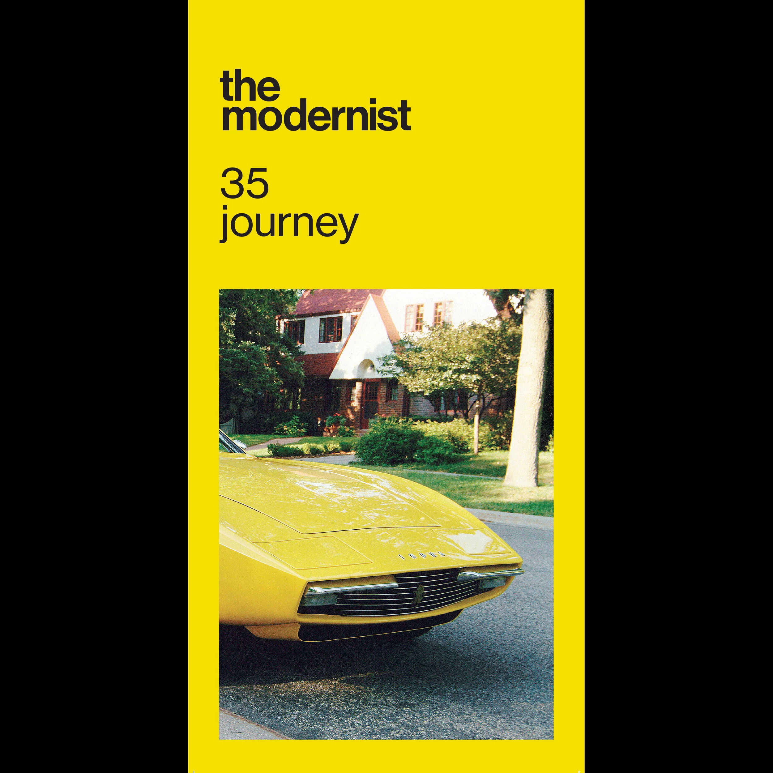
Consider this an idyll to escape into for just a moment. We hope you enjoy it.
When this issue was commissioned, the full extent of Covid-19 hadn’t yet hit the UK so the majority of us were living our lives as normal, blissfully unaware of quite how significantly things were about to change. By the time the March deadline given to contributors had come round, however, the non-key workers amongst us were already staying at home under lockdown, in isolation from one another and cut off from life as we knew it. Suddenly, the only type of journey most of us were making came in the form of one to the local supermarket, or within a couple miles’ radius of our homes under the guise of ‘daily exercise’. In the weeks since, our horizons have shrunk significantly, and the very act of journeying anywhere beyond our borders already feels surreal. One day, we say, but we still don’t know when that day will come.
CONTENTS
INTRODUCTION BY GUEST EDITOR Ashiya Eastwood
SOLACE IN DOLOS Vinca Power // WAITING IN COVENTRY & PRESTON Lauren Velvick // BON VOYAGE Sarah Howard // THE WAY TO SAN JOSE Sarah Feeney // THE CROSSING AT KYLESKU Nicholas Nilsen // BAT OUT OF HELL Peter Wyeth // A PRIVATE ROOM ON WHEELS Kate Schneider // ROADS Helen Angell & Richard Davis // KRAFTWERK: ROAD & RAIL Matt Retallick // ‘A LONG LOOK’: HENRY IDDON’S FORTON STORIES David Cooper // REMEMBER LLANDUDNO James Wise // ON LEE CIRCLE MAGIC Mark Banks
(Published June 2020)
135mm(w) x 280mm(h)
Chair Times

Chair Times
So, how long have you been sat sitting there?
Since March?
Time to get up off your bum and see the world?
OK, so it isn’t too easy is it? What with lock downs and quarantines, we cant get out to our favourite museums.
How about a film instead? Maybe a film about chairs, how does that sound?
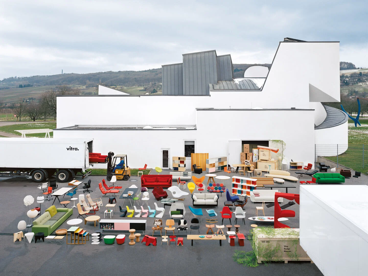
OK then, get yourself over to vitra to view Chair Times, A History of Seating – From 1800 to Today
“Chair Times” charts a course through an ocean of chairs. In the focus are 125 objects from the Collection of the Vitra Design Museum. Arranged according to their year of production, they illustrate development from 1807 to the very latest designs straight off the 3D printer, forming a timeline to modern seating design.
The film features many people whose vocations involve design and who are experts in the field, such as designers Hella Jongerius, Antonio Citterio and Ronan Bouroullec, architects and collectors Arthur Rüegg and Ruggero Tropeano, architect David Chipperfield, Director Emeritus of MAK Vienna/Los Angeles Peter Noever, Mateo Kries, Director of the Vitra Design Museum, Vitra Design Museum curators Amelie Klein, Jochen Eisenbrand and collection curator Serge Mauduit.
And your guide through the history of chairs is Rolf Fehlbaum, Chairman Emeritus of Vitra.”
A film by: Heinz Bütler
Production: HOOK Film & Kultur Produktion GmbH in cooperation with the Vitra Design Museum, 2018
Project Vitra
Fish + Ships x Culture ÷ Northern Grit = HULL
For those of you that follow our social media posts, and read our magazine, then you’ll know how much we love Alan Boyson’s glass mosaic ‘Three Ships’ in Hull. We were delighted therefore to hear of a new campaign that celebrates one of our favourite examples of public art, and at the same time helps a good cause. Hull-born artist, Esther Johnson, has designed two T-shirts and a bag to celebrate the city's entwined maritime and cultural legacy whilst raising money for foodbank organisations across the UK. Reece Shearsmith and five other Hull writers are supporting the ‘SHIPS in the SKY’ T-shirt fundraising endeavour, which has the slogan: Fish + Ships x Culture ÷ Northern Grit = HULL
You can take a look at the shirts and totes here , and you can watch the Hull writers reading Philip Larkin’s poem The North Ship here - if you want to know more about how the project came to be, please scroll below.

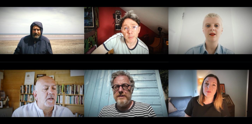
Film maker, Esther Johnson, edited lockdown readings of Philip Larkin’s, ‘The North Ship’ from Vicky Foster, John Godber OBE, Jennifer Hodgson, Reece Shearsmith, Matthew Sweet and Dean Wilson into a short film to celebrate Alan Boyson’s iconic image and highlight her ‘SHIPS in the SKY’ charity collaboration with ‘1 of 100’ (known for partnerships with musicians, artists and DJ’s). Reece Shearsmith said:
“No one should face poverty and hunger alone. Trussell Trust and FareShare help make a massive difference to people who, for whatever reason, now need help from their local food bank. In a fair world we wouldn’t need food banks, but they provide an invaluable and dignified life line and we should all do what we can to help support them.”
Johnson’s evolving arts and social history project, ‘SHIPS in the SKY’ is garnering an increasing local and national reputation, and centres around Hull’s empty former Co-op/BHS building featuring Alan Boyson’s ‘Three Ships’ mural (the UK’s largest mosaic with over a million tesserae, commissioned by the Co-op in 1963) as it’s emblem, and now the design for her T-shirt. Hull-born author and broadcaster, Matthew Sweet said of the mural:
“The Three Ships have been moored in Hull all my life. They’re a symbol of the city, and a symbol of modernity. But it’s not a simple, sunny image - if you’re from Hull you know that those ships suggest the possibility of danger and risk as well as prosperity.”
Esther gifted her drawings of the ‘Three Ships’, and her favourite fish from Boyson’s ‘Fish’ mural - also in the building - to adorn two designs of an organic cotton, climate neutral T-shirt and a tote bag. ‘1 of 100’ are donating 30% of their profits to the two national foodbank organisations. Esther explained:
“When Richie asked me to collaborate, it provided a brilliant opportunity to help folks in Hull and across the UK”.
The Trussell Trust have three branches in Hull – one close to the ‘Three Ships’ on neighbouring Waltham Street, and FareShare have a Hull and Humber branch, which in turn supports other charities like Lucy Beaumont’s brilliant Backpack Buddies. She continued:
“The film and T-shirt imagery celebrates our city’s rich culture and history, and Larkin’s adventuring, and hopeful poem, The North Ship, is one of my favourite poems of his and so fitting for our current times. Our six writers each put their individual stamp on reciting and filming the poem. I hope it does a really good job of spreading the word.”
Richie Hume of ‘1 of 100’ continued:
“I’ve been following Esther’s arts project and also the mural preservation campaign, and I’ve been itching to collaborate; the Three Ships is such a strong, proud, resonant image. The men of Hull were still risking life and limb to put food on the nation’s tables when the mosaic was finished in 1963. Esther’s two designs take inspiration from the mural and original artwork by Boyson and also the neon sign from the last nightclub in the building, Romeo’s & Juliet’s.”
May is an important month for the ‘under threat’ mosaic; the original Co-op on the site was bombed in the May 1941 Hull Blitz (Hull was the second most bombed city outside of London in WWII, with 95% of houses suffering bomb damage). The Grade II Listing appeal for the ‘Three Ships’ was made in May 2016 and finally granted in November 2019. The protracted campaign involved an open letter, put together in just under 48 hours, signed by 238 prominent local and national arts professionals.
Following Listing, Hull City Council are conducting further tests to definitively address presumptions about asbestos contamination in the mural, and also have the offer of free advice from three independent experts.
The Philip Larkin Society said:
“Our tweets about Larkin’s early poem, The North Ship, often make the connection between the content of the poem and the remarkable ‘Three Ships’ mural. Although Larkin’s poem was written well before he arrived in Hull, there is a striking connection between the two. The Philip Larkin Society is thrilled that ‘SHIPS in the SKY’ have chosen this poem to underpin their project and have found such wonderful writers to record an original reading. One of the ‘The North Ship’s’ themes is about taking the difficult path in life, and the HULL HERITAGE ACTION GROUP campaign to preserve this piece of public art has been an enormous challenge. The Philip Larkin Society is very proud to be able to support all involved.”
Alan Boyson’s son, Matt, said:
"It's difficult to know what Alan would have thought about the current reaction to his work in Hull because he neither spoke much about his work nor his feelings towards it. However, he did have very clear ideas about art and these he readily expressed and I think he would have to admit that one thing that art can do is create a sense of community belonging. This is what the Three Ships in Hull seems to have done and what better way to pay tribute to him, the mural, and the community than to let his artwork play a part in helping others through donations to the Trussell Trust and FareShare, from sales of T-shirts featuring his work."
Esther concluded:
"It's a sad testament of our times that food banks are necessary. I've volunteered and donated to food banks and seen the direct difference that food donations can make. There are folk up and down the country working hard to help others in more need than themselves and I hope the film and charity‘SHIPS in the SKY’ T-shirt and tote are able to help too."
12 Views of Kensal House - After Hokusai
In 1984, Peter Wyeth directed and produced the film ‘12 Views of Kensal House’. In our blog post today Peter looks back at the film, and the influence of Japanese artist Katsushika Hokusai. If you wish to pursue the film, it is available on the BFI Player, and you may also like to watch the 1937 film on Kensal House here
12 Views of Kensal House
Kensal House was the first modernist block of flats built in Britain for workers. Designed by a team led by Maxwell Fry, it was opened in 1936. Modernist blocks appeared in the 1920s elsewhere in Europe, and at a far larger scale, but Britain was often behind the curve with Modernism.
‘12 Views’ was made in 1984 for the Arts Council of Great Britain, a 55’ documentary “biography of a building”. It was runner-up for the Grierson award for documentary of the year and was revived in 2015 in a big Hayward exhibition ‘History is Now’, selected by the artist & film-maker John Akomfrah, who called it “the heart of the exhibition”.
What is the connection between a now down-at-heel block of flats in Ladbroke Grove and Hokusai?
Working on the documentary, I came across ’12 Views of Mount Fuji’ in the bookshop of the British Museum. Hokusai painted over 100 Views of Mount Fuji, but it was the little BM book that alerted me to his extensive exploration of perspective.

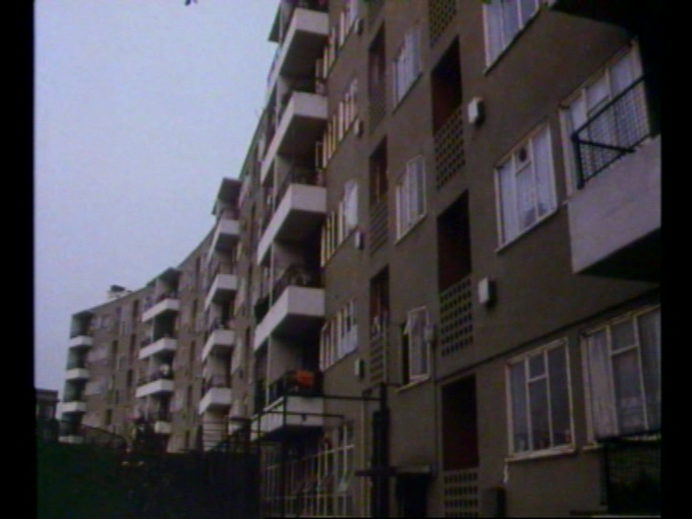
Kensal House Inner Curve
In some of the illustrations Fuji takes up most of the page, in others it is small and in the background. Hokusai must have travelled widely, through 360 degrees around the sacred mountain, to find a this vast variety of views. In some, peasants are the foreground focus, the mountain almost a dot in the background, and in the best known picture, the balance is reversed, Fuji the only feature, looming large.
While Hokusai’s method allows him to illustrate a range of stories involving the varied characters he shows, from peasants to samurai, by the same token it becomes a survey of Japanese society of the period. He etches a 360 degree portrait of Japan with Mount Fuji as the pivotal point around which that society rotates.
It is a literal exercise in perspective in shifting physical viewpoints, but it is also symbolic in portraying a sample of Japanese society whose activities have them travel within sight of Mount Fuji.
Hokusai’s perspective is not the traditional Western one. A flattened, two-dimensional aspect attracted the earliest modernists, for example Van Gogh who collected Japanese prints, and through him the influence passed to Picasso.
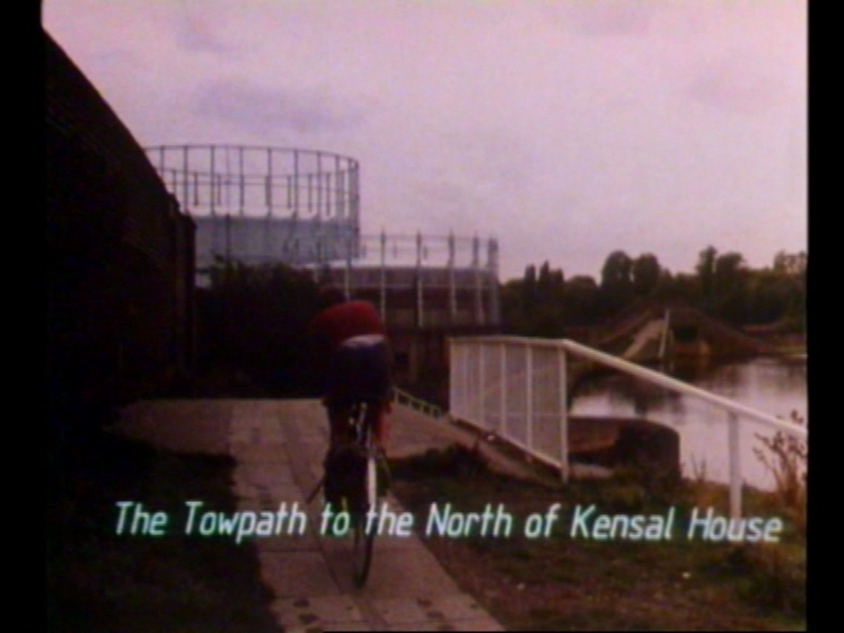
The Towpath to the North of Kensal House
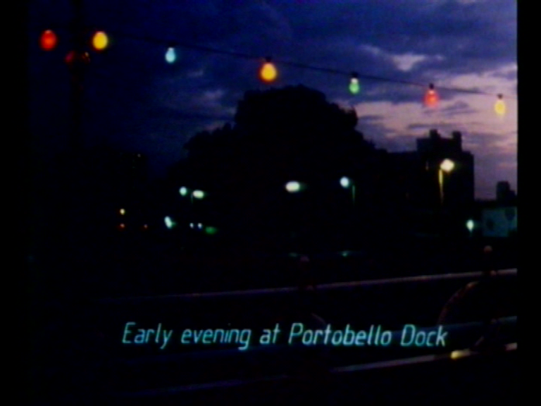
Early evening at Portobello Dock
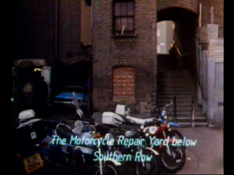
The Motorcycle Repair Yard below Southern Row
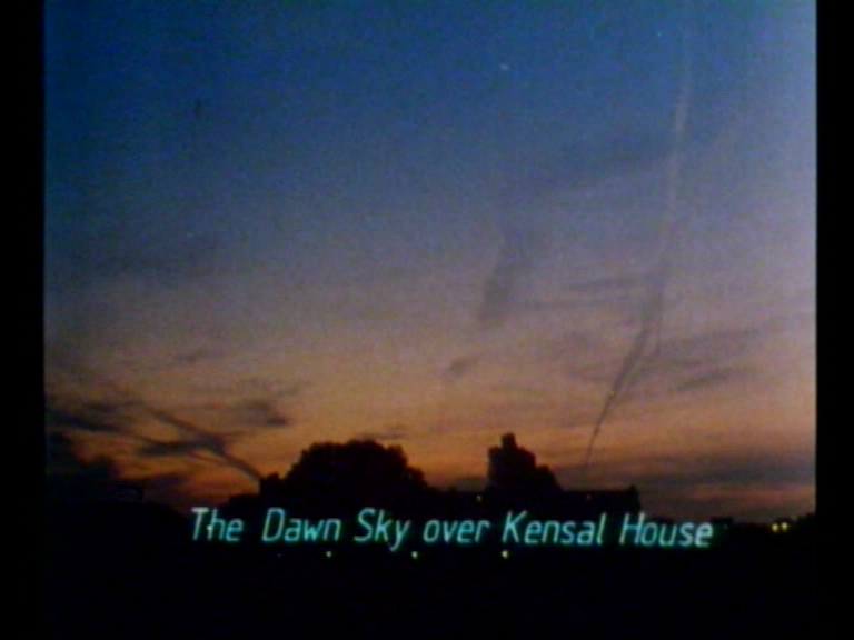
The Dawn Sky over Kensal House
Needless to say, Kensal House is neither sacred nor a focal point of our own society, but the idea was to take the idea of perspective and apply it to the building.
What Mount Fuji and Kensal House have in common is in being a fixed object around which lives with different points of view, both literal and metaphorical, circulate.
While Hokusai’s illustrations suggest stories involving the characters he portrays, with a documentary film there is the luxury of sound, not least interviews with people involved with Kensal House in a variety of ways.
The building is both a receptacle and generator of the experiences of those who have lived there in the past and at the time the film was made, and the outcome of historical strands in architecture, social policy and housing, expressed by the architect and various commentators, both live and from the archives. As well as bringing such elements out later in interviews, those ‘points of view’ had a literal visual origin.
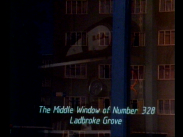
The Middle Window of Number 328 Ladbroke Grove
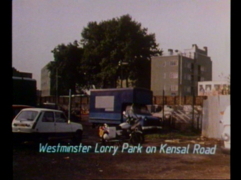
Westminster Lorry Park on Kensal Road
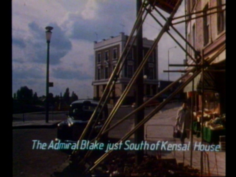
The Admiral Blake just South of Kensal House
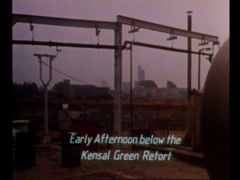
Early Afternoon below the Kensal Green Retort
In the first instance it was a visual image that came to mind, a bird’s-eye view rotating around the site of the building, with residents coming and going not just in the present, but in a kind of stop-motion, back through its history to the day of its opening, then back further to the methods and ideas of its construction and its choice as a site by the gas company that built it as a PR exercise (promoting ‘mod cons’ like gas irons, gas fridges and modern gas lighting, today curious anachronisms).
The theme of seeing an object from different places had both a literal and a metaphorical resonance for a film about a block of flats.
The literal element would be represented by shots selected around the building and its environs, with titles echoing Hokusai’s formal titles for his ‘views’, but enjoying the decidedly non-sacred context, for example: ‘The Motorcycle Repair Yard below Southern Row’ which has a fragment of the flats in the background, and ‘Early Afternoon below the Kensal Green Retort’ which has nothing of the flats; a kind of modernist refusal of being entirely literal with this set of ‘views’ (and a small echo of another Japanese favourite, Ozu, in film-titles like ‘Early Spring’ and ‘Autumn Afternoon’).
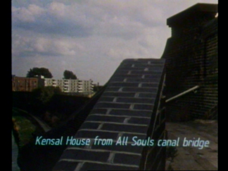
Kensal House from All Souls canal Bridge
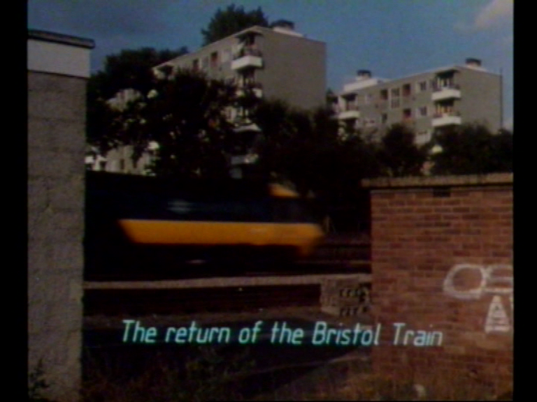
The return of the Bristol Train
The metaphorical belongs to the splendid people who agree to be interviewed: from the architect who designed it (with Elizabeth Denby, the housing campaigner), to the trio of women who had lived there from day one, one of whom was still there almost fifty years on, a bunch of students for whom it was not the “dream” of the earliest residents, but now virtually a slum block (just what the first residents had left behind), a commentator on the ideas it both inherited and represented (Stephen Bayley), and two shopkeeping sisters from opposite the flats, who still stocked the gas lighting mantles fifty years on - as they put it, the last local stockists.
The staging of the interviews had a modest echo of Hokusai in being where possible flat-on, shot from right in front of the interviewee - seen most clearly with the early women residents who had memories going back to its opening in 1936.
Each of these contributors saw Kensal House from a different perspective: be it heaven or hell, at its most extremely diverse. The most poignant was portrayed through an empty flat: a wife who lost her sight in the war and later died, and her husband who couldn’t get over her absence, came home, washed and dressed in his best, lay on the bed and turned on the gas. The resident’s voice-over adds “I didn’t know him well”.
Indeed a biography of a building, and mostly of the people who knew it - from far or near - an exercise in perspective - after Hokusai.
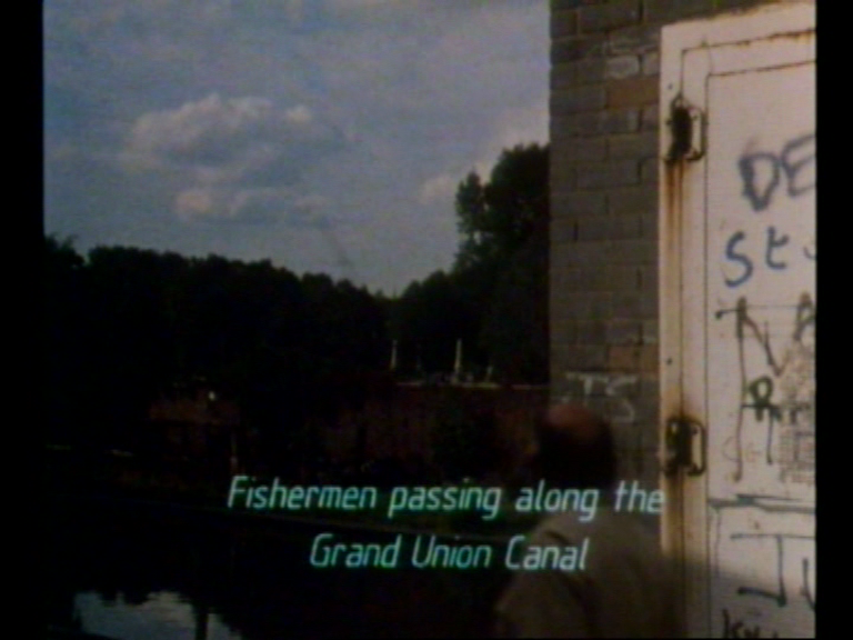
Fishermen passing along the Grand Union Canal
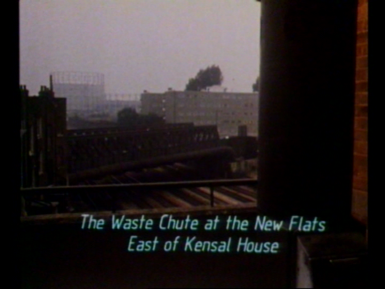
The Waste Chute at the New Flats East of Kensal House
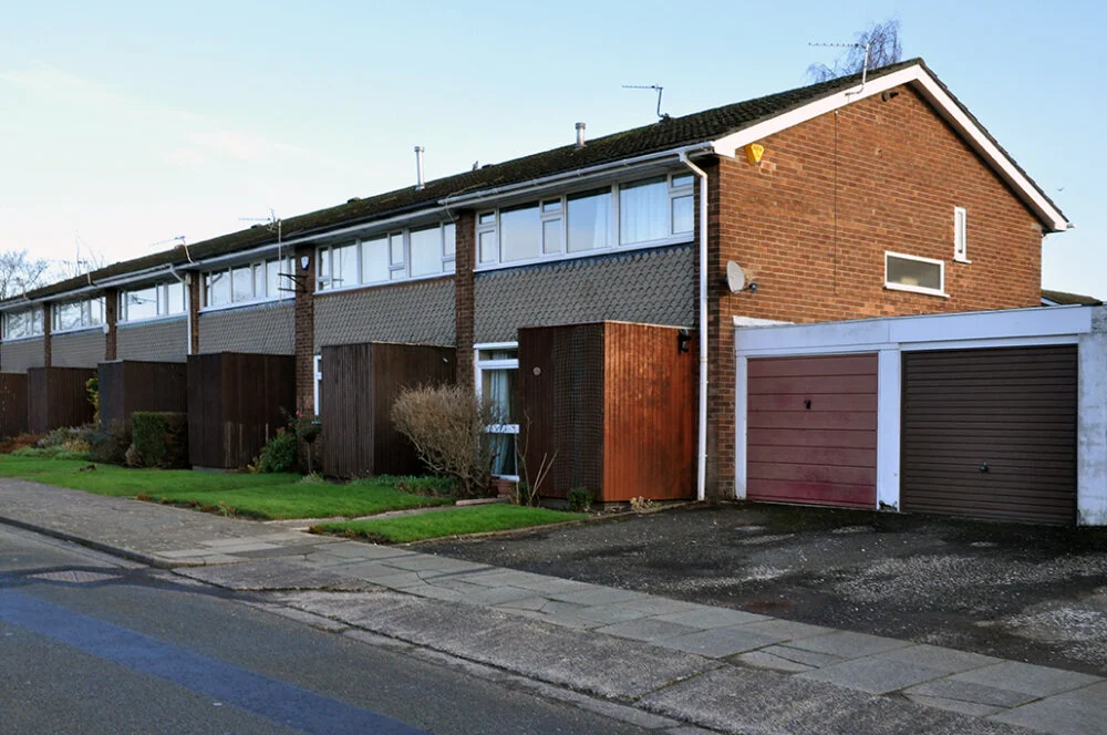
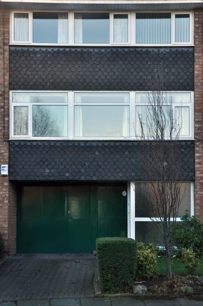
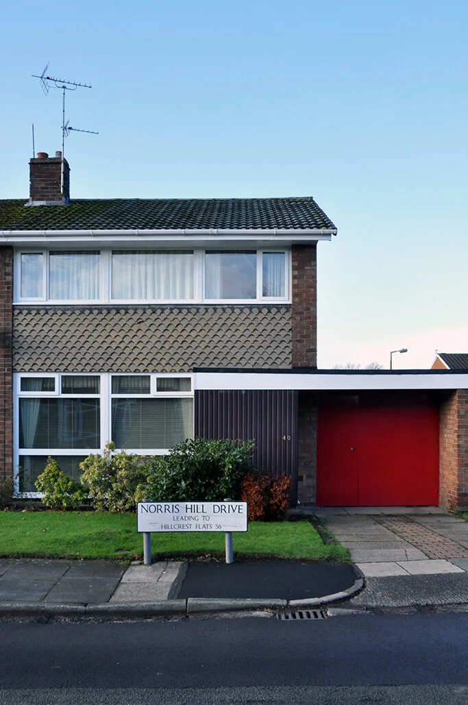
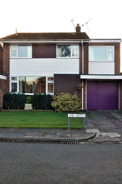
Norris Hill (2015)
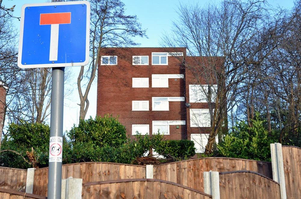
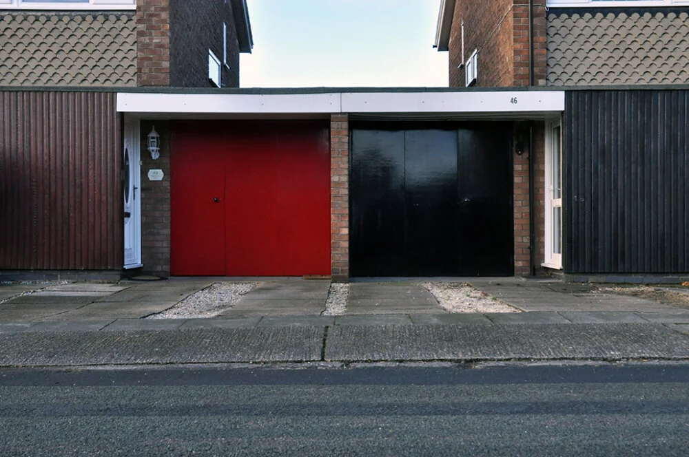
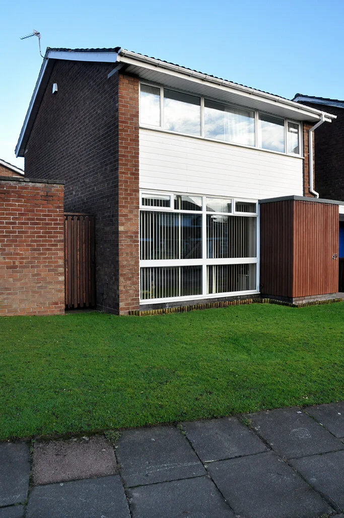
Keen blog followers will recall our post this time last week which saw the intrepid Steve Marland take a look at the modernist homes of Chorlton-cum-Hardy. Many of you noticed the similarities to the houses of Norris Hill. Of course, Steve has his finger firmly on the modern pulse, and in January 2015 he took these photos of Norris Hill, another from our archives.
Just to the north of Deneway Estate lies another small, charming and perfectly formed sixties housing development at Norris Hill similarly, built in the Span style. Designed by BDP and constructed by Hampson and Kemp Ltd in 1964, it won a Good Housing Design competition –
“A competition promoted by the Ministry of Housing and Local Government in collaboration with the RIBA to encourage ‘a high standard of design, layout and landscaping in housing schemes’. Winning schemes had to satisfy an exacting examination.” The Architects Journal 10 September 1964 – many thanks to Saffron Wynn-Jones for confirming this.
At 148 dwellings with 20 dwellings per acre, there are a mix of terraces, mews terraces low rise blocks and quasi-semis, some grouped around greens and squares. Very few survive intact, the ubiquity of UPC, replacement cladding, historically inappropriate front doors and addenda proliferate widely. They do I feel, however still present a polite and convivial plan for suburban living.
Manchester in a Skip (Part 2)
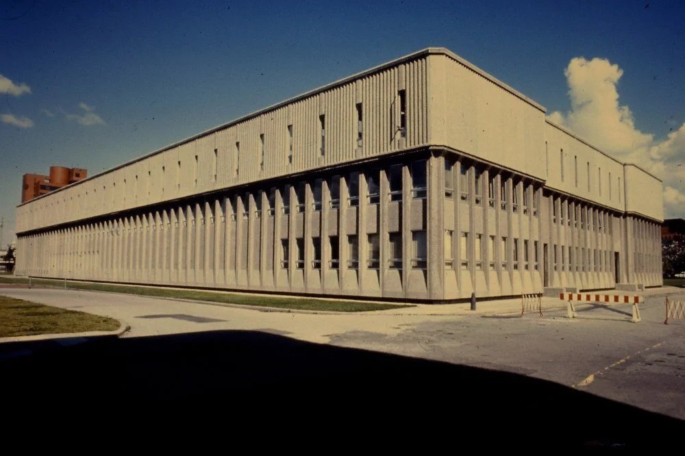
This is the second part of our look at the recent history of Manchester, through photos that Eddy found in a skip back in 2015. Kept in a carrier bag under his bed, these slide transparencies taken in Manchester, show Manchester University buildings, including the lost Maths Tower, the now lost Precinct and a few students doing their thing in sideburns and suspenders.
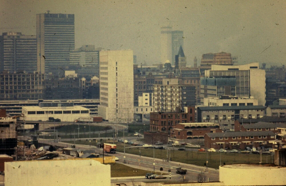
Manchester City Centre
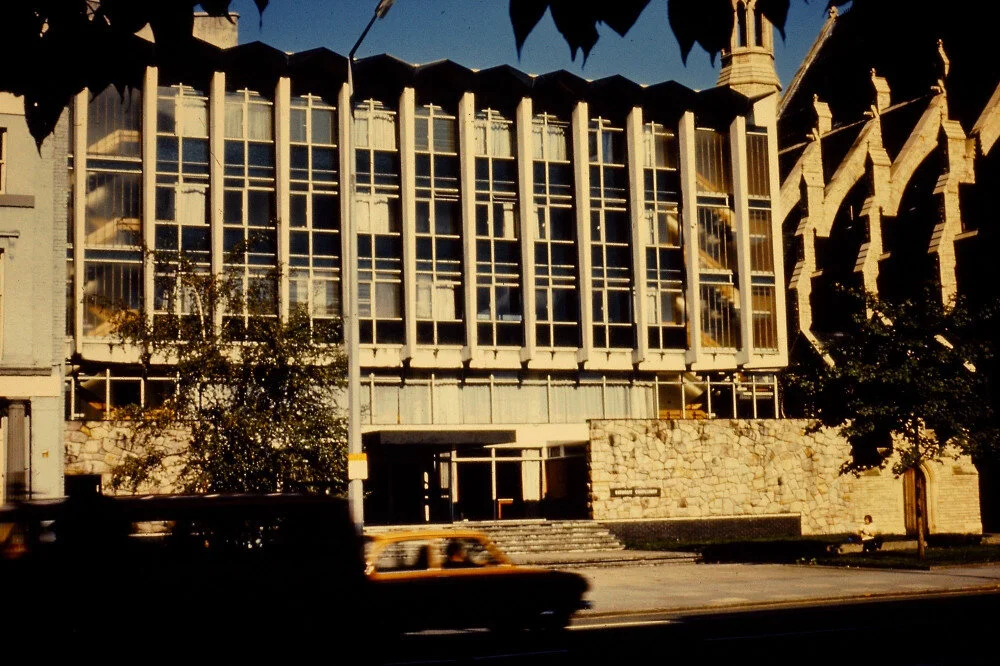
Catholic Chaplaincy
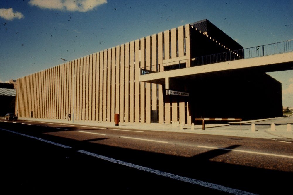
Computer Building
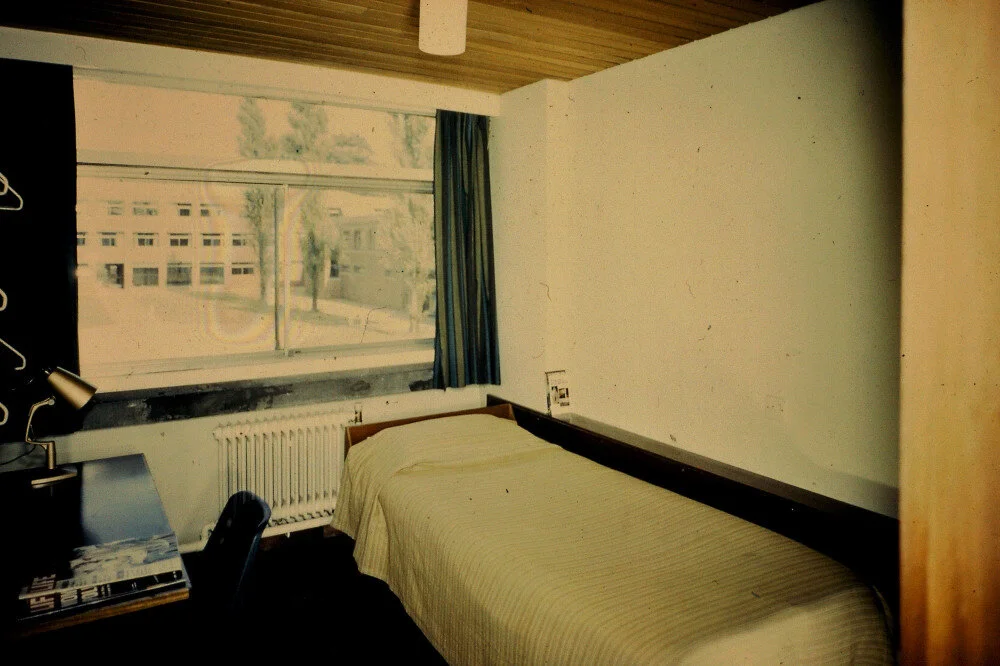
Room in Student Halls
Kantorowich
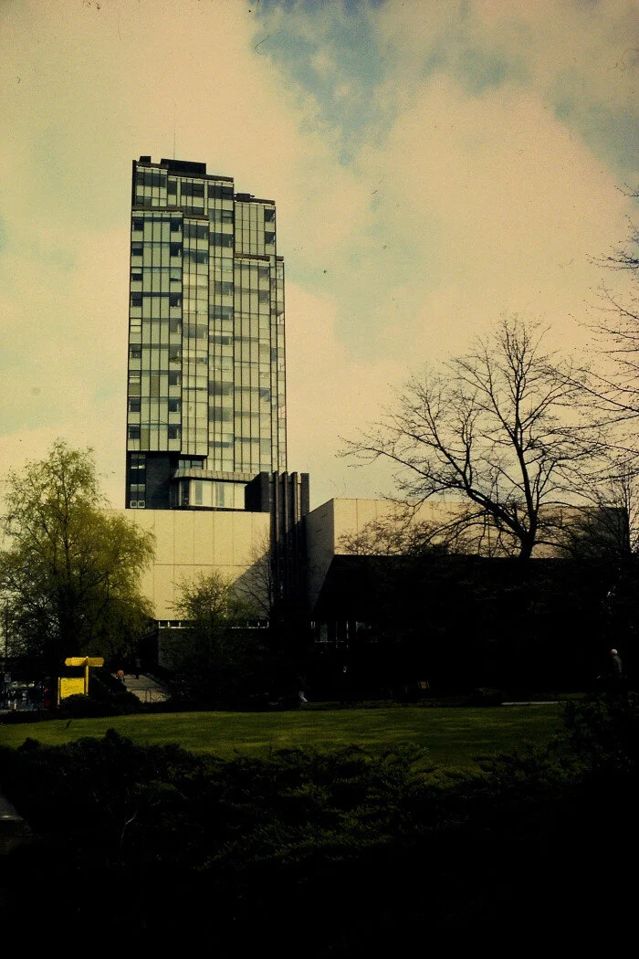
The Maths Tower
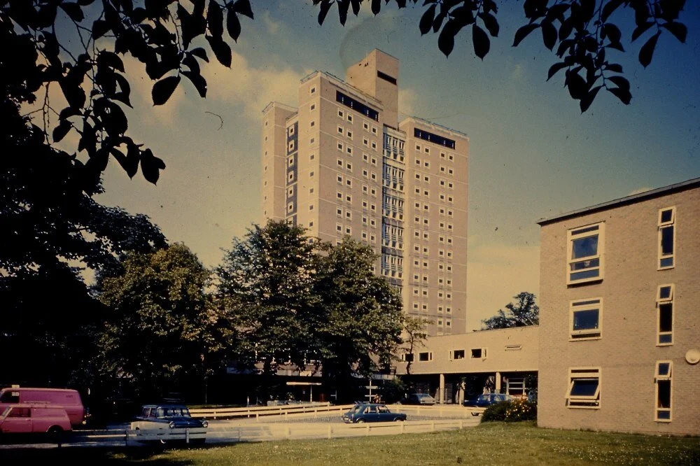
Owens Park
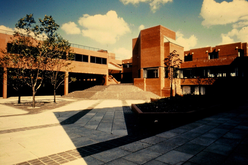
Precinct
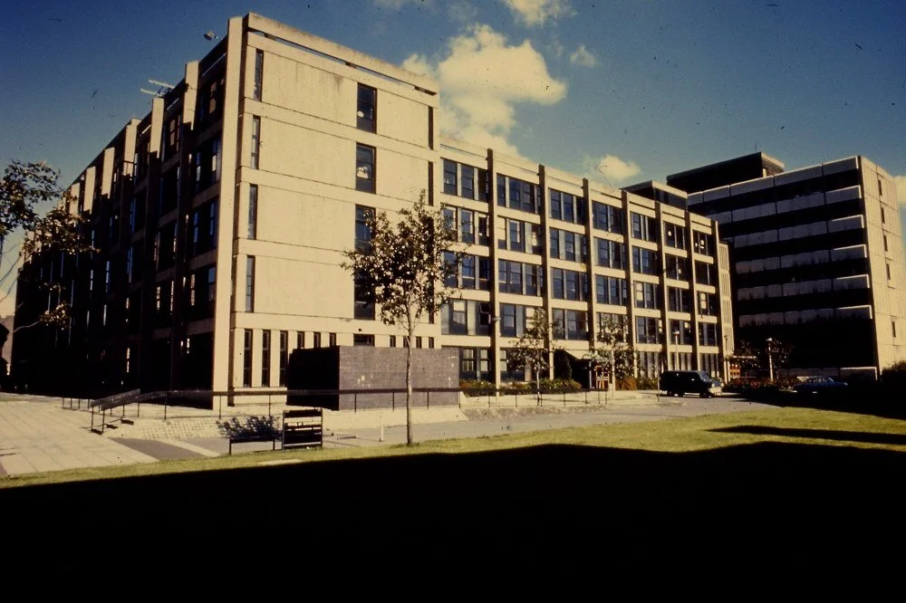
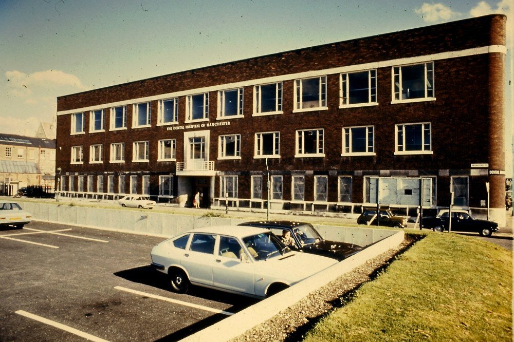
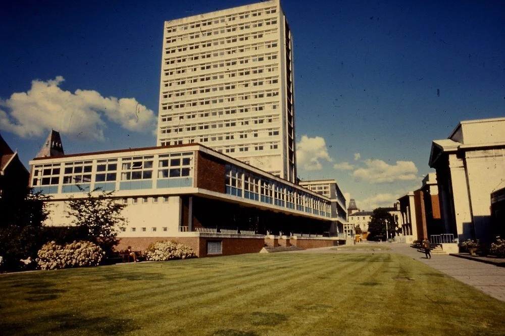
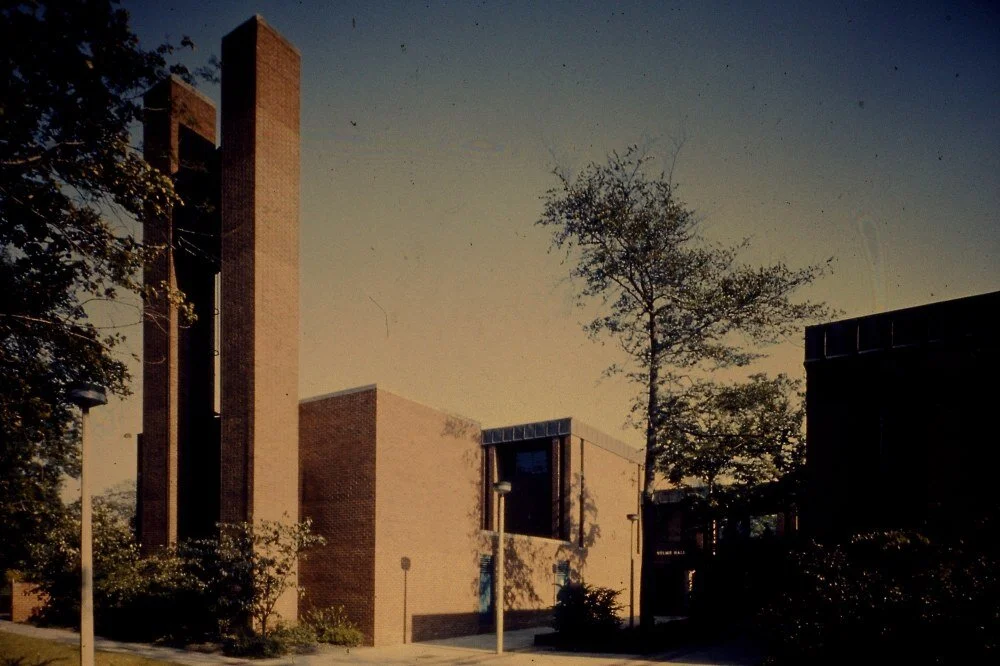
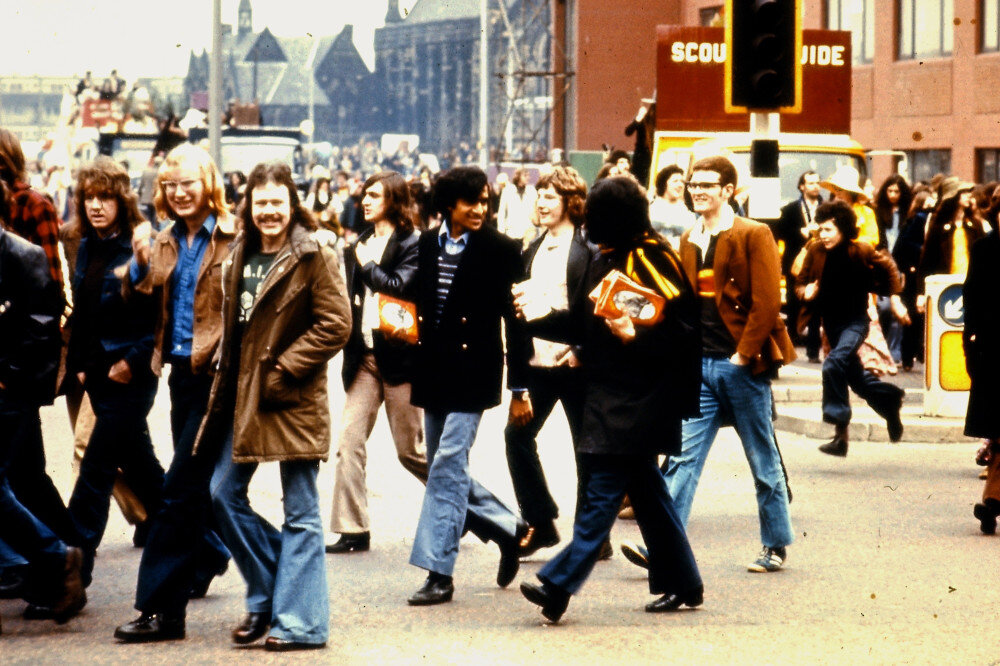
Student Rag
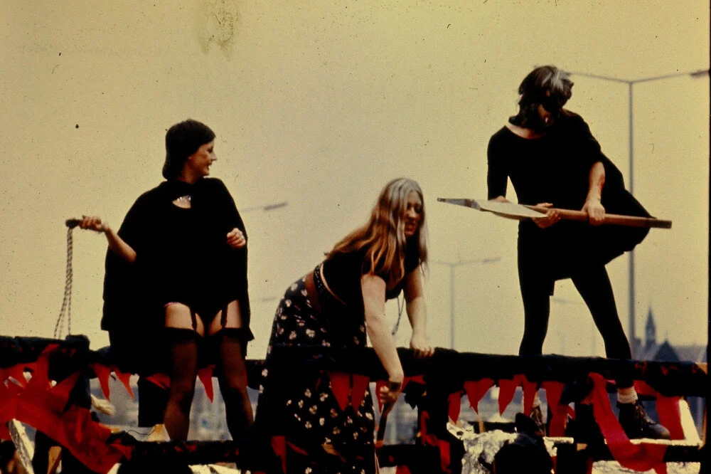
Student Rag
issue 34 / juxtaposition / spring 2020
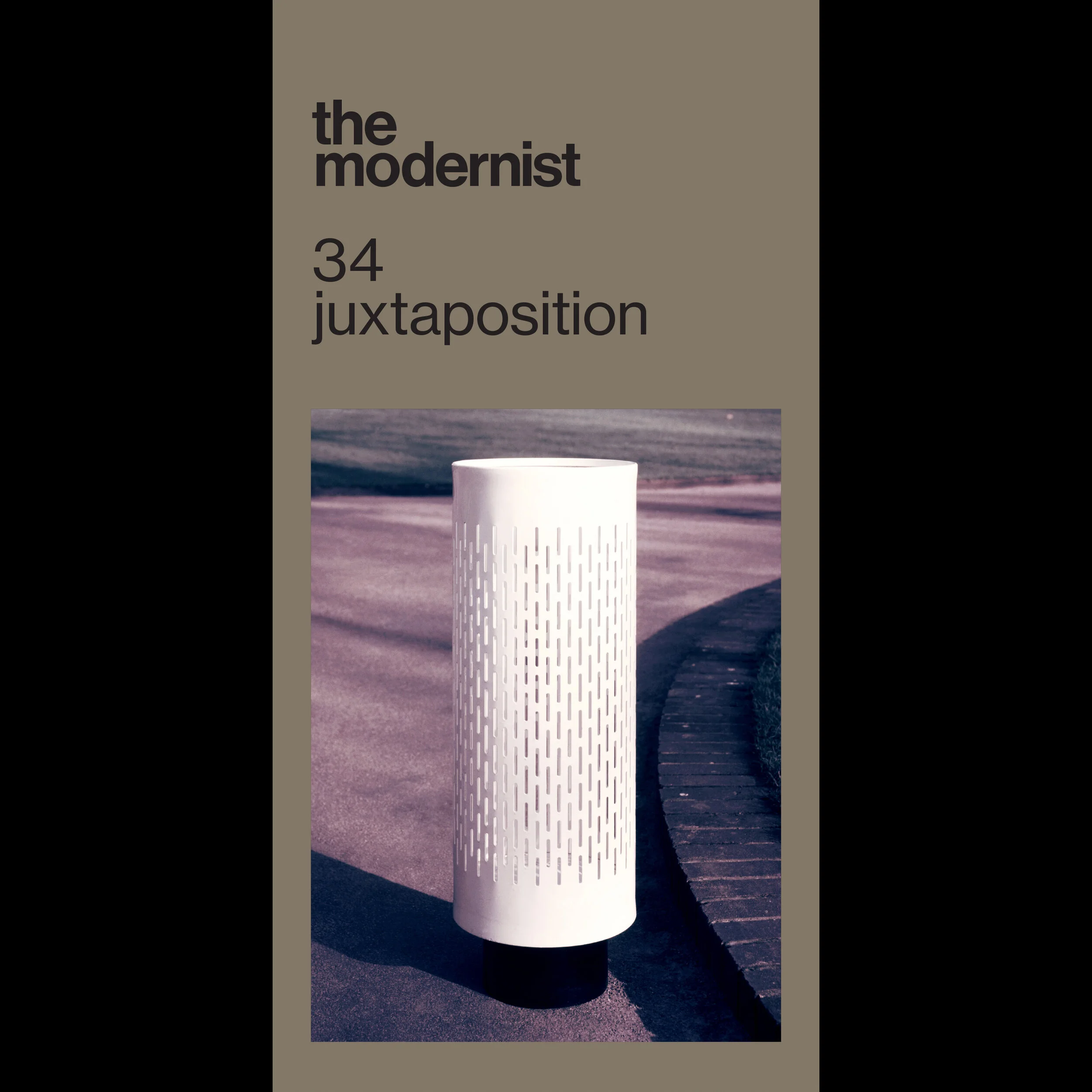
In the enduring search for the peaceful rural ideal it can be easy to forget that the ‘rural’ acts as a conduit for the modern. Through their role in transport, militarisation or energy production, these pastoral, bucolic or rugged areas have evolved their own architectures and infrastructures. A dam halfway up a mountain, for example, is a surprise – a startling juxtaposition – but as with so many edifices it is there for one reason: to help us live.
The rural modern also deals with the consequences of this life, be it a litter bin for our detritus or a concrete bus shelter designed to protect us from the Hebridean elements. Larger structures become part of identity, embodying a community role which transcends their function. As symbols of working and social life, their memory persists long after the structures themselves have gone. The recent demolition of Ironbridge B’s cooling towers – designed to blend with the landscape – will stand as testament to this. Whilst its industrial revolution neighbours are preserved in the nearby gorge, these modern structures are cleared to make way for a new modern: it is up to us to preserve these as best we can – through our words, memories, images and interpretations, something which will become more pressing as an increasing number of post-war examples reach the end of their working lives.
Join our contributors as we explore the diversity of rural modern juxtapositions, covering everything from domestic architecture to concrete ‘listening ears’ in the process.
Manchester in a Skip (Part 1)
In 2015, Eddy found these photos in a skip. They are a wonderful glimpse of our recent history, initially archived in a carrier bag under his bed, these slide transparencies taken in Manchester in the early 1990s show a pre IRA bomb era when the Arndale was yellow and Marks & Spencer’s had a wavy canopy. The bomb supposedly made way for the redevelopment of the city centre, the re-cladding of the ‘hated’ Arndale Centre and the sad loss of that cheery undulating concrete at Marks & Sparks. The buses may have been orange and Ford Capris were de rigueur but some things aren’t so different. Let’s just say … tram tracks.
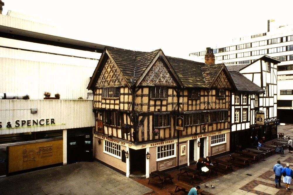
Shambles Square and Marks & Spencer
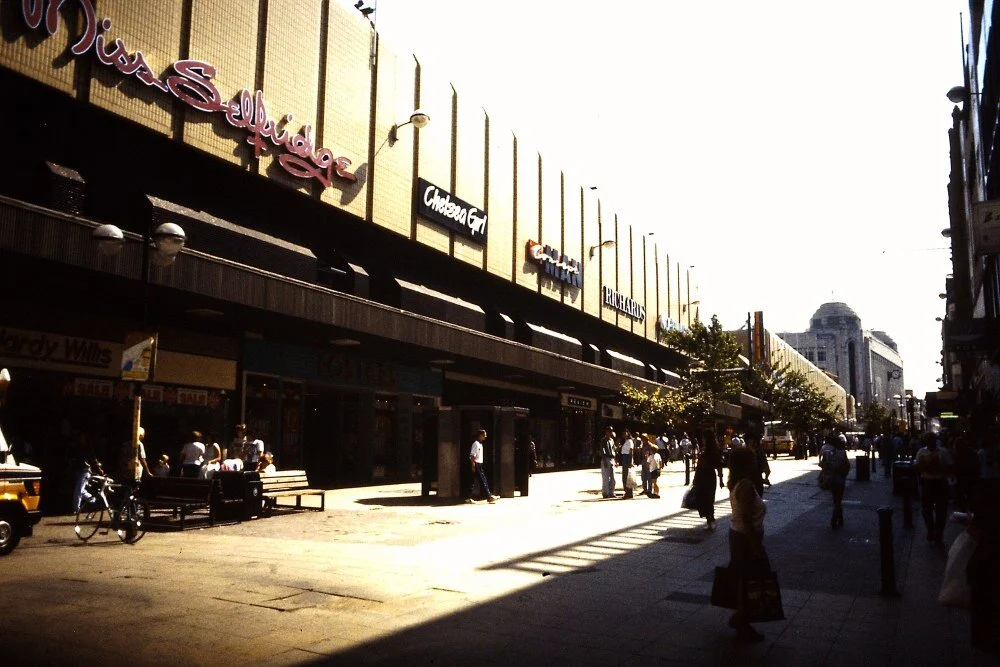
Arndale / Market Street
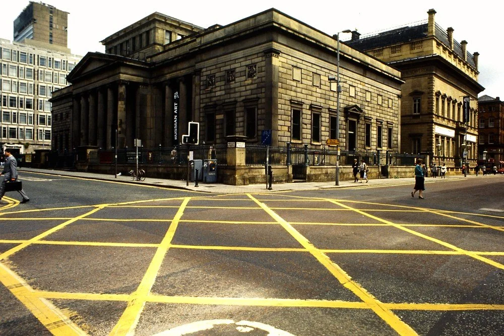
Manchester Art Gallery
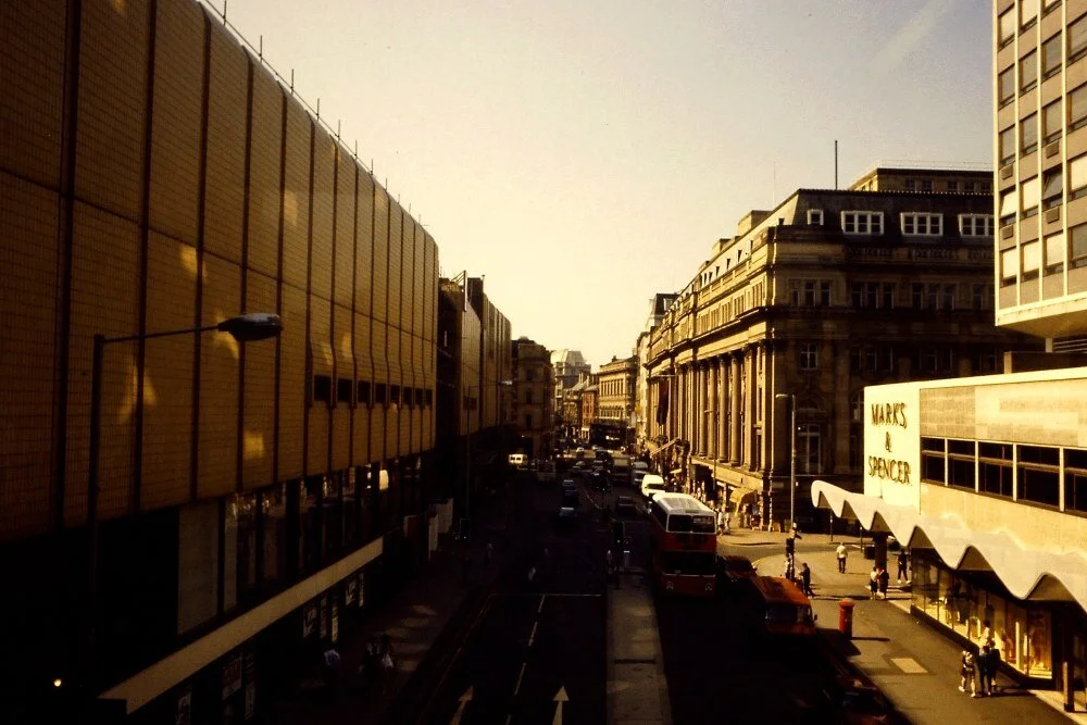
Arndale / Marks & Spencer, Corporation Street
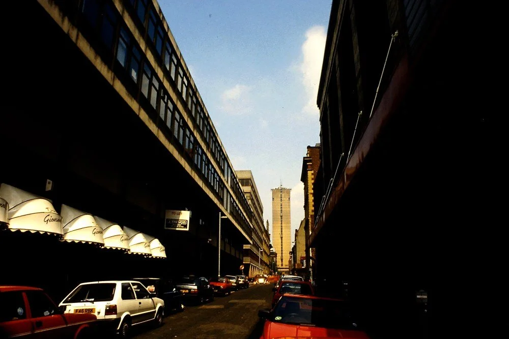
Elizabeth House / Piccadilly Plaza
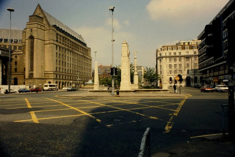
St Peter’s Square
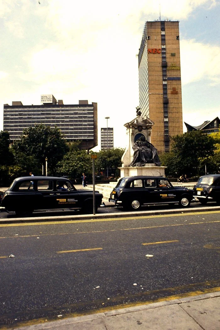
Piccadilly Gardens / Piccadilly Plaza
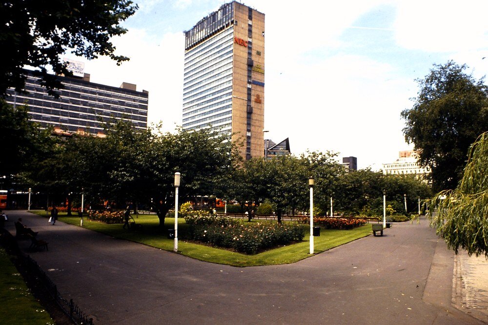
Piccadilly Gardens
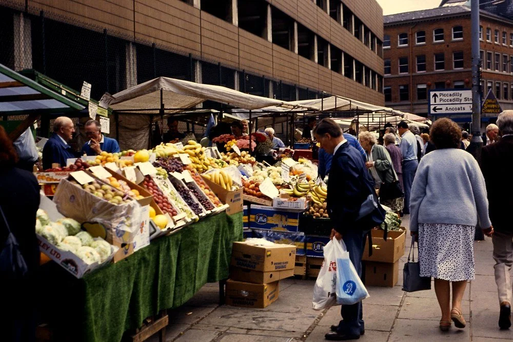
Church Street
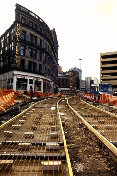
Shude Hill track laying
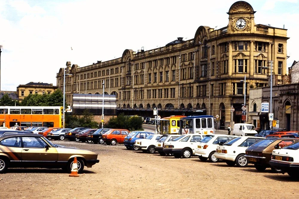
Victoria Station
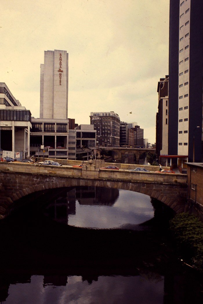
Victoria Bridge
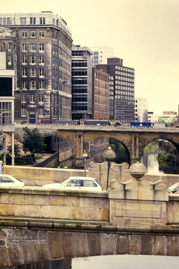
Victoria Bridge
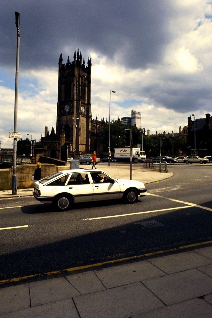
Manchester Cathedral
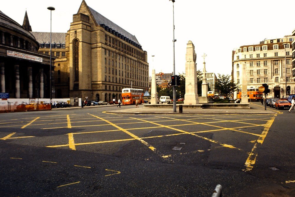
St Peter’s Square with GMPTE buses
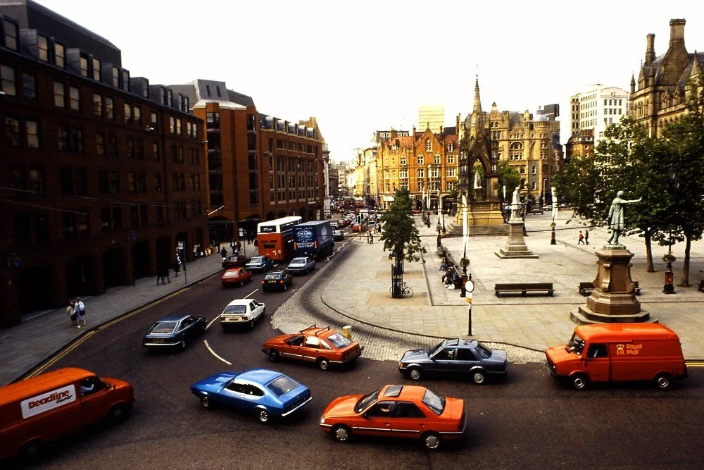
Albert Square
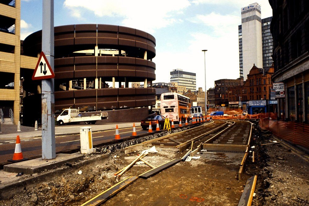
Arndale Car Park
Stirling in Runcorn
Our blog post today revisits an article written by Matthew Witfield for Modernist Mag #2 BRILLIANT, published in 2011, and now available as a digital download - if you enjoy this article, then please download the magazine, your support is much appreciated.
James Stirling is seemingly everywhere in 2011, nineteen years after his death and at the centre of a critical re-evaluation that has seen major exhibitions and publications in the UK and North America seek to confirm his position as one of the world’s most important post-war architects. Usually viewed as a post-modernist, Stirling always rejected the label as he sought continually through his career to explore new directions in modernism whilst undoubtedly intending to forge a relationship with older design paradigms. This is the puzzle and the joy of Stirling’s work – always, there are a set of references to consider, followed quickly by the pleasure gained from seeing just how they have been integrated into a novel design concept.
The northwest of England contains just one surviving Stirling project, the conversion of one corner of Jesse Hartley’s Albert Dock warehouse in Liverpool for the Tate Gallery of the North in 1984, radically remodelled in 1998 as Tate Liverpool, with only vestigial remains of the original design. An early social housing scheme of 1957-59 in Preston, designed with James Gowan, is now demolished, whilst the winning 1992 design for Salford’s Lowry arts centre by Stirling and his partner Michael Wilford involved extensive revisions after his death that created what is a largely Wilford building.
One further northwestern project was demolished in stages between 1990 and 1992, the Southgate housing scheme in Runcorn New Town, developed from a design concept in 1967 to a final phase completed in 1976. Here was an apparent failure from the Stirling canon, lapsing quickly into a state of disrepair and disregard to be demolished within fifteen years of completion and never enjoying full approbation from architectural critics even when new, at least in Britain. In typical Stirling fashion, however, the scheme was actually a triumphant concoction of success and failure that still tells us something useful about the experimentation that was possible in public housing before 1979 and about the particular talents of a man who was more concerned with setting an agenda for everyone else to follow than in creating failsafe designs unworthy of controversy.
In historicist terms at least, Stirling’s inspiration at Southgate was the urbanity of Georgian Britain with the estate structured around a sequence of squares and recurring design elements on the elevations used rhythmically as in the formal 18th-century terraces of Bath or Edinburgh, underlining an entirely civic approach. This was a natural design response to the brief by the Runcorn Development Corporation that this should be a high density housing development, immediately adjacent (and physically linked by highwalks) to the hub of the new town’s services, Runcorn Shopping City. As an inner residential district, Southgate was intended to make a contribution to the idea that the new Runcorn could be a town in the fullest, noblest sense, and not just a patchwork of undistinguished suburban fragments.
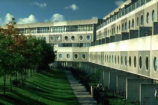
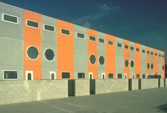
With this ideological framework in place, and a commitment to classical planning devices and elevations superficially apparent, Stirling devised a scheme that in fact subverted these historic precedents as well as some contemporary architectural norms. Behind the regular facades of phase one were a mixture of maisonettes and flats over and under-sailing one another across five storeys, the sort of arrangement seen in numerous post-war slab block developments. A system of open deck access was stitched into an estate-wide network of highwalks between blocks, the circulation model established at Sheffield’s Park Hill in the late 50s that still had currency in second generation new towns like Runcorn and which Stirling interpreted in a grand manner, providing generously splayed concrete posts which lent the walkways a solid grandeur and, by turns, civic legitimacy. The first phase of the development saw the employment of a system-building approach as demanded by the development corporation in order to minimize costs. Concrete frames cast in-situ were filled with pre-cast concrete panels whilst multi-coloured coloured glass-reinforced plastic (GRP) cladding was used extensively to enliven elevations and introduce a hi-tech note to the scheme, one of the earliest uses of such a material in the UK. The second phase of Southgate acted firstly to correct the perceived planning failings of the first, with a single unit type – larger houses – built in terraces, each with ground floor access and private gardens. These new units were now built entirely with GRP over timber frames, creating uncompromisingly modern forms – colourful, smooth and rectilinear – giving rise to the local sobriquet of 'legoland'.
Other than the neophile use of GRP and the overall impression that this might be housing for new planetary exploration as much as for a new town in the north, Southgate gained distinctiveness from its emphatic, legible geometries, not least in the large circular windows used across both phases. Multiple references are called to mind by this inventive elevational device, from the nautical (not to say cosmonautical) inspiration of the nearby Mersey and the imagined seafaring blood of the new town's overspill population, to a spirited exploration of classical Vitruvian geometrical theory spliced with some Kandinski and the interplay of colour and form.
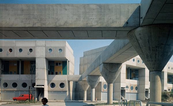
Failure is too often the focus of our analysis of post-war public housing, but in the case of Southgate the rapidity of its decline is an unavoidable subject. There were a limited number of original design failings, not least the unpopular maisonettes in phase one sandwiched in the middle storeys of the blocks without any private outdoor space, but largely the estate was the victim of an original budget that was far too low to create sufficient quality for such a high-density scheme – poor insulation and a disastrous district heating system being particular issues – and, more significantly, a wrong-headed lettings and management policy that quickly translated limited maintenance problems into vertiginous social decay. Demolition was, by 1989, thought more cost effective than refurbishment, in the context of the New Town Corporation being wound up and seeking to draw a line under its liabilities.
It might also be noted that truly innovative mass housing from its 1970s pomp consistently struggles to find cheerleaders for conservation when even solvable problems arise. Aesthetic timidity is translated very easily to political cowardice, and what remains as a result, effectively, is architecture that is published and analysed rather than built and lived, like far too much of James Stirling's work. The loss of Southgate was a loss not just for Runcorn but for the entire second generation of new towns and to British architecture as a whole. Whilst Milton Keynes contains more surviving (though often very altered) 1970s housing schemes of note and has enjoyed some recent conservation success with its exquisite shopping centre, Runcorn has now become a footnote in this wider story of innovation, little visited or written about. Academic exploration of this period in architectural history is gathering momentum and all 1970s housing has now been eligible for listing for two years – the survival of Southgate would surely have made it one of the major monuments to this significant period and a key site of architectural pilgrimage in northwest England. As James Stirling's reputation has grown rather than diminished in the short period since his death, meanwhile, the loss of one of his key mid-period works is felt all the more keenly, especially in Runcorn where a landmark bridge and the sublimely exciting chemical works are still not sufficient to give the town a solid architectural reputation. The sense of loss over Southgate is one that is sure to swell further over time, contributing much to the conservation debate on public housing from a still under-researched period.
The modernist homes of Chorlton-cum-Hardy
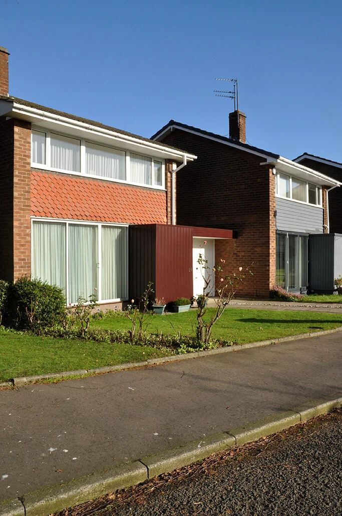
It’s time for another archival delve, and today we’re blowing the dust off this post by Steve Marland from February 2015. Steve cycled over to Chorlton-cum-Hardy as he wanted to look ‘at something different’.
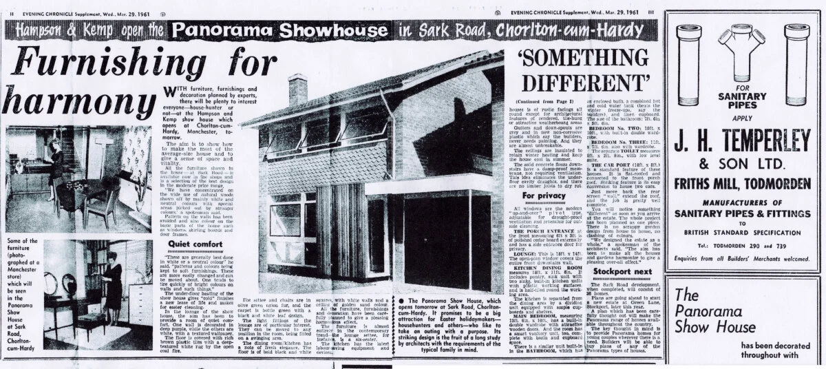
“With Furniture, furnishings and decoration planned by experts there will be plenty to interest everyone – house hunter or not – at the Hampson and Kemp show house which opens at Chorlton-cum-Hardy, Manchester tomorrow.” Manchester Evening Chronicle Wed 29th March 1961
A precursor to the Stockport development at Norris Hill, these Panorama Homes in Sark Road were opened for viewing by the stars of Rose Marie – David Whitfield, Sally Ford, Elisabeth Henry and George Moon.
But what makes the Panorama Show House, as the builders have named it – so special? Could it be the settee and chairs in olive green nylon fur and the carpet in bottle green with a black and white leaf design, perhaps the kitchen floor of bold black and white squares and a ceiling of golden sand? Or simply the sense of space and vitality!
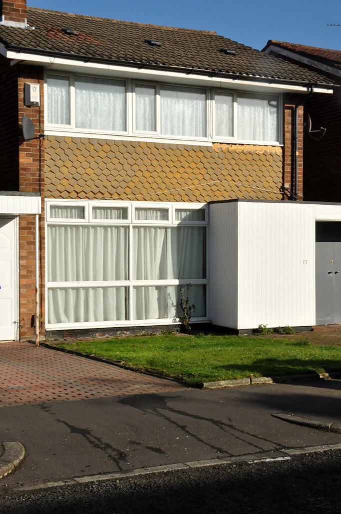
This mixed development has survived in a knockabout fashion, glazed areas bricked up, flat porch roofs pitched and blocked with uPVC doors, cladding and window frames replaced. Front gardens become freestyle display areas for an exciting array of wheelie bins, debris and motor vehicles.
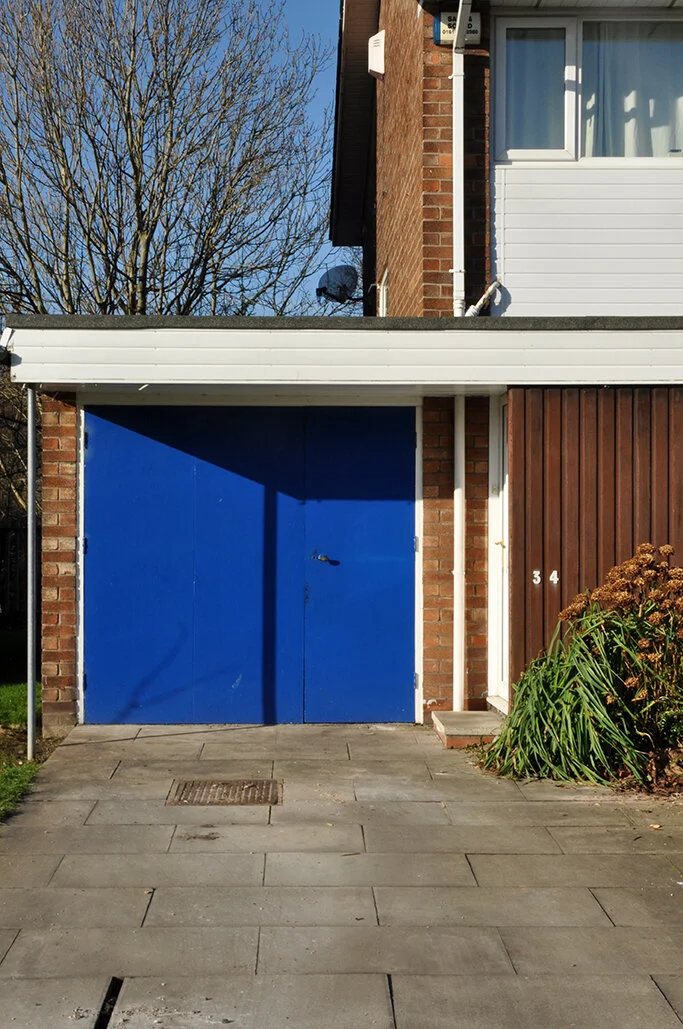
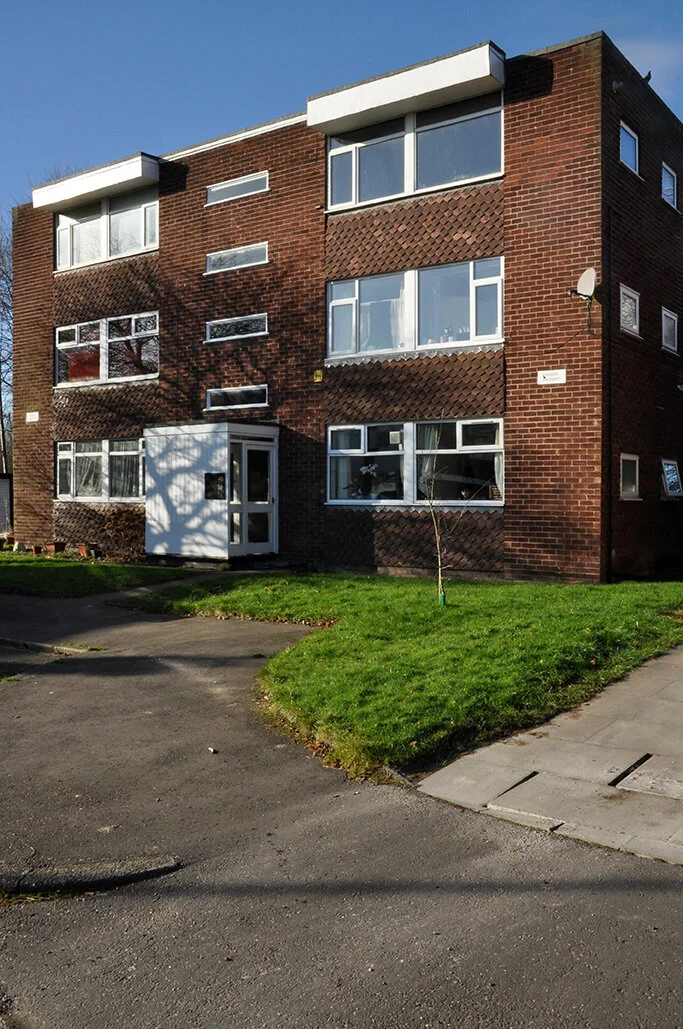
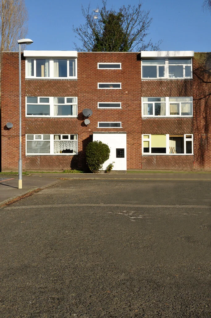
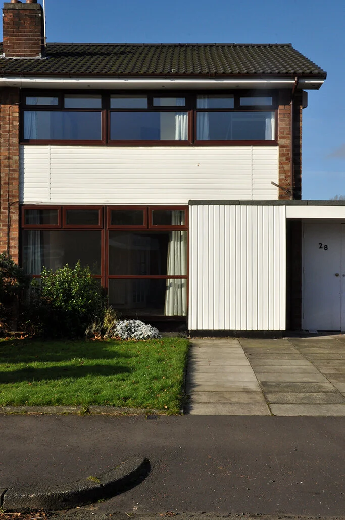
Merseyway Shopping Precinct
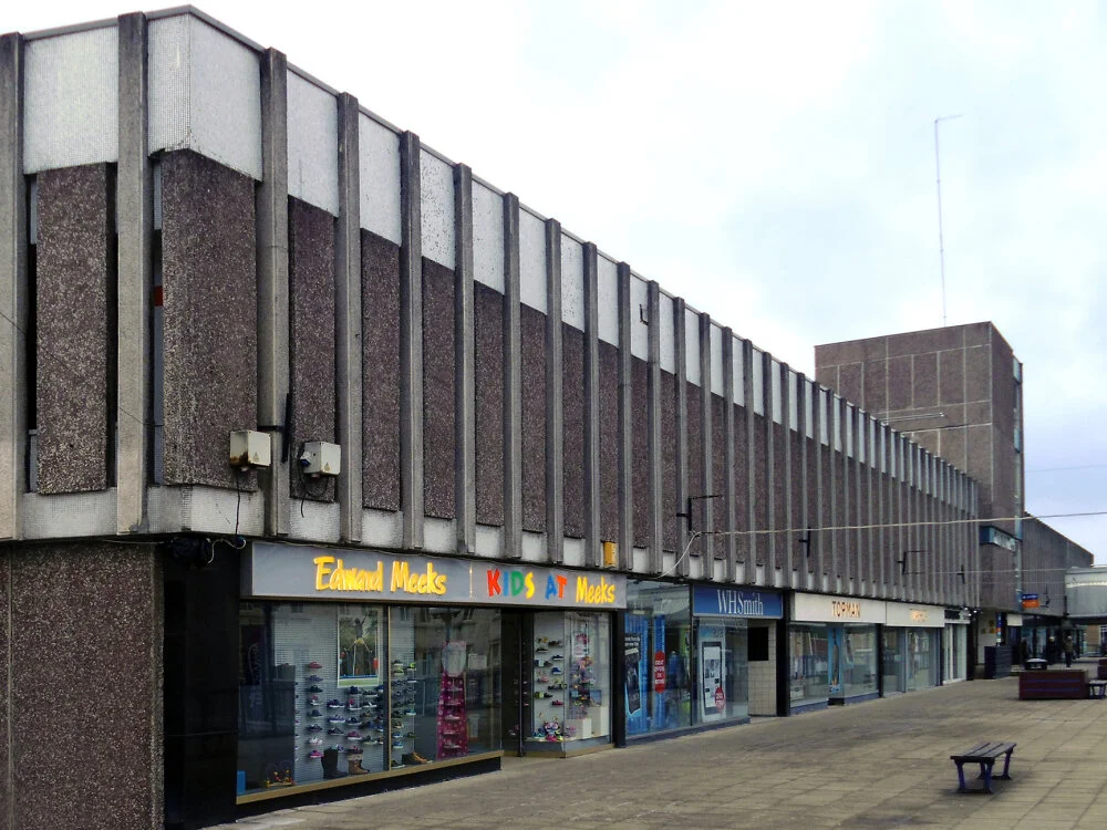
Our post today is from our blog archives, from March 2015, when the intrepid Steve Marland had a snoop around the Merseyway Shopping Precinct in Stockport. Beneath the precinct, the precinct…
The tireless Steve Marland revists a childhood haunt, his latest mooch see’s him rediscovering the precinct below the precinct…
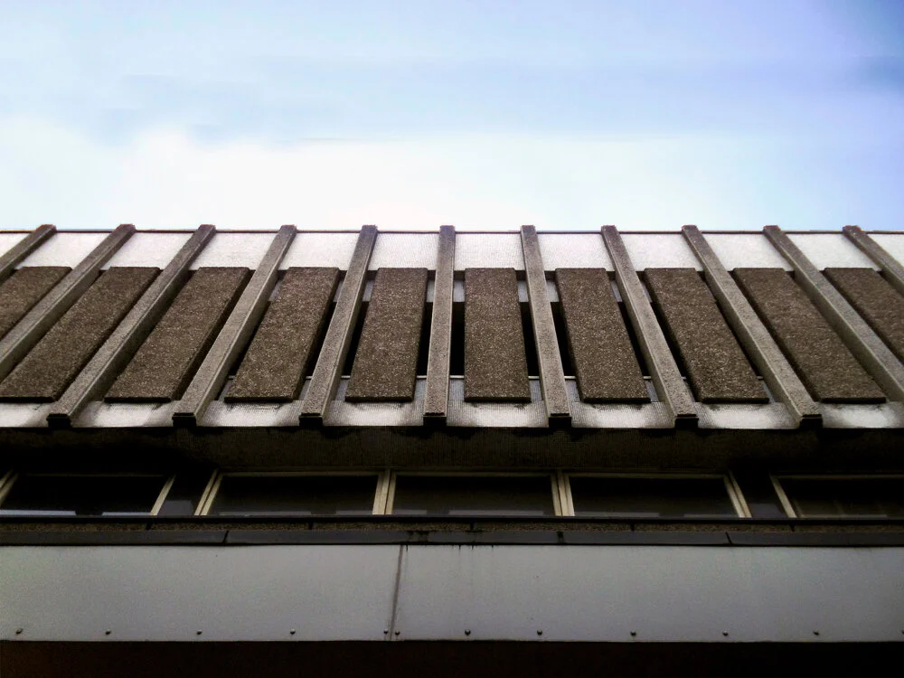
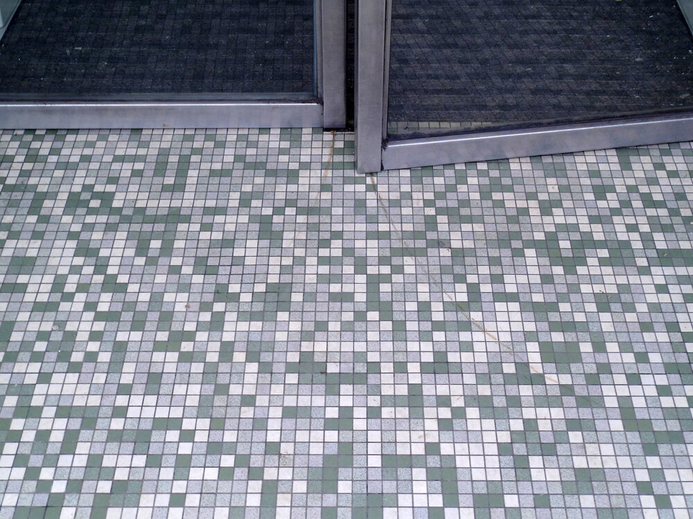
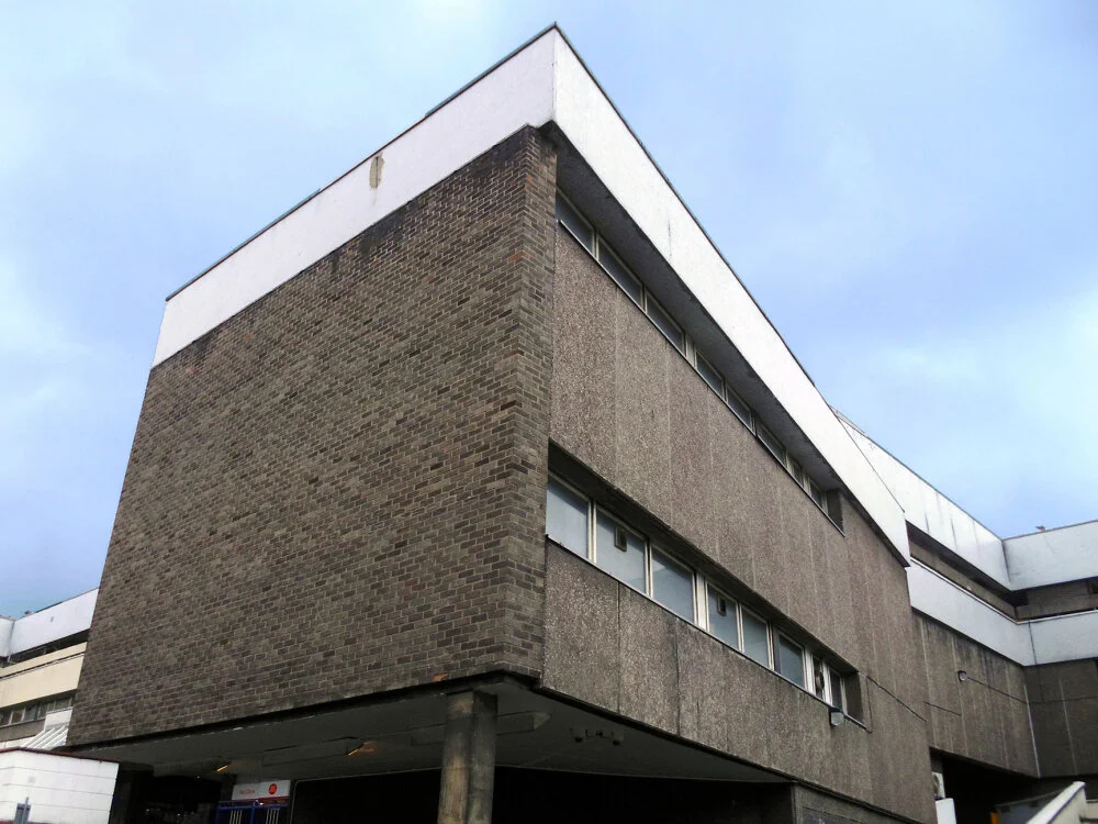
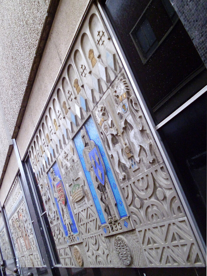
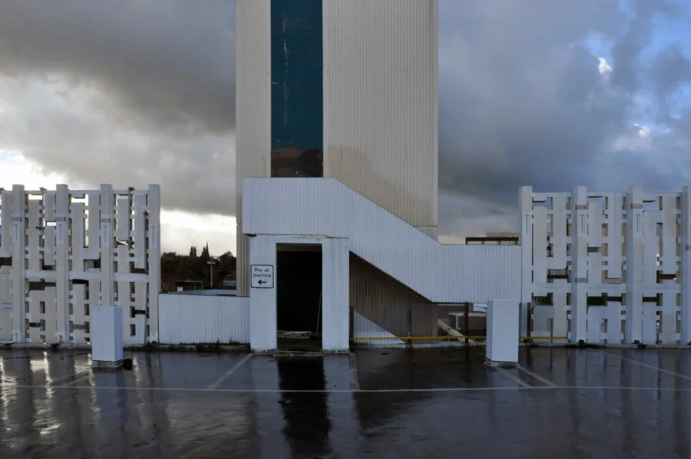
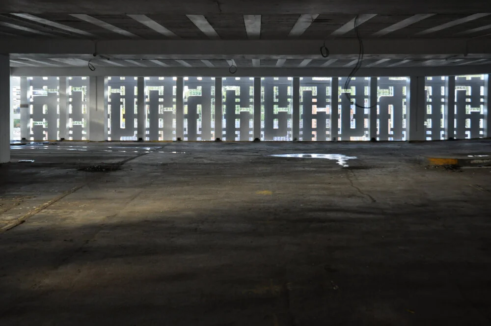
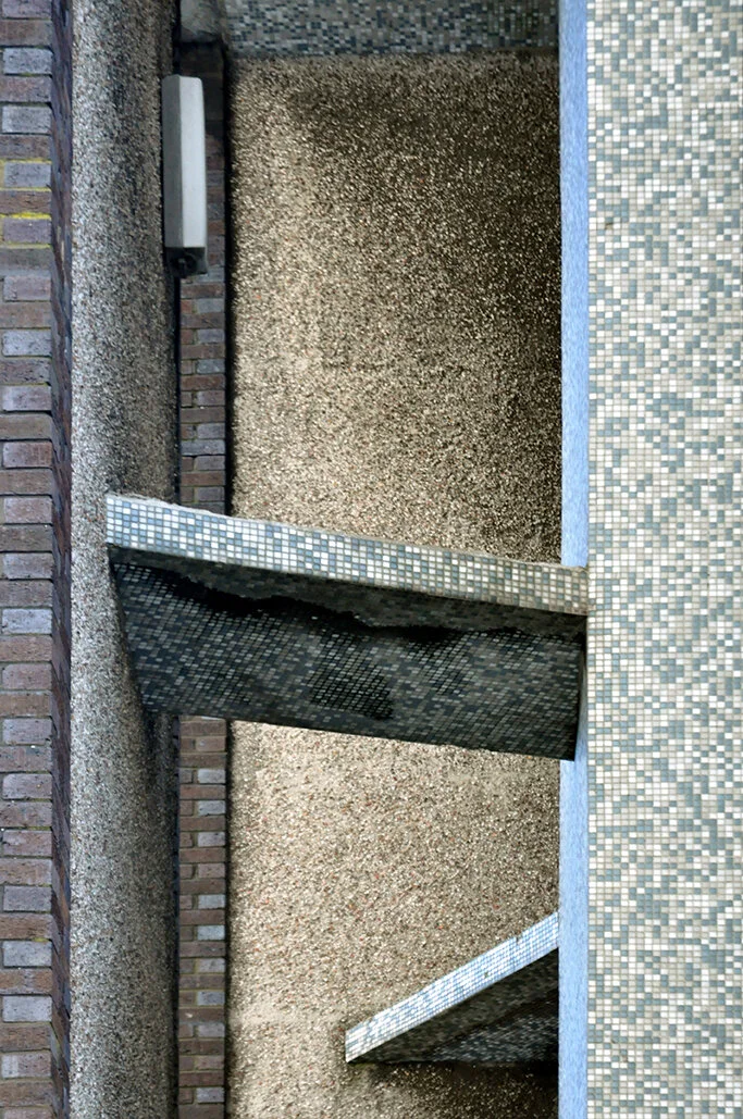
Opened in 1965 as one of the country’s first pedestrianised shopping developments, Merseyway was for me as child, a thing of great wonder. Combining the varied features of the surrounding Victorian architecture with something new, exciting and vibrant. Its covered walkways had feature lighting, display cabinets and public sculptures. Split levels linked by open stairways and escalators. Following several redevelopments it has lost much of its integrity and even shamefacedly whitewashes its concrete facade with a thin veneer of cream render. Dig a little deeper though, and you will discover the precinct beneath the precinct. The mosaic and relief of WH Smiths upper entrance, striking articulations of skillfully mixed surface and materials, possibly the most exciting pierced, modular, cast concrete car park screen in the world, and the BHS side wall featuring a history of the town. Above us the sky. Take a walk, hike, and look – access all areas. For further information click here: Archive images click here:
What is Mainstream Modern?
Our archival throwback today sees Modernist advisor and good friend Dr. Richard Brook introducing his project Mainstream Modern in February 2015. The website is a fantastic resource, and well worth checking out:
Mainstream Modern is a resource, an archive and a live project.
This website began life in 1998 when I began taking photographs with the aim of making an architectural guide to concrete in and around Manchester. The act of visiting a building and taking photographs is subject to many uncertainties, not least of all in the north-west of England – the rain. Like all good schemes, this one had no plan, no limits and no real deliverable objective until I was given two really good pieces of advice. One, to join the Twentieth Century Society and the other, to apply for a RIBA Trust Award to help define and complete my study.
Between 2007 and 2010 I worked to write a history of the architecture and planning of the post-war period in Manchester and to record and write guidebook type commentary on ninety-five selected buildings within the former county boundary of Greater Manchester. Only twenty copies were ever printed; most are with friends and family, though one copy is held by the RIBA Library in London. It’s not a book as such – the prose and syntax leave a lot to be desired – but it was the foundation and departure point for lots of new research. Thus, the first ninety-five buildings on this site are from that study, but I have travelled across the UK taking pictures and will slowly add new descriptions and images as I have the time to research, write and edit. I am working my way slowly around the North and further afield when time allows. As I find additional material about existing content I’ll add images and develop the texts.
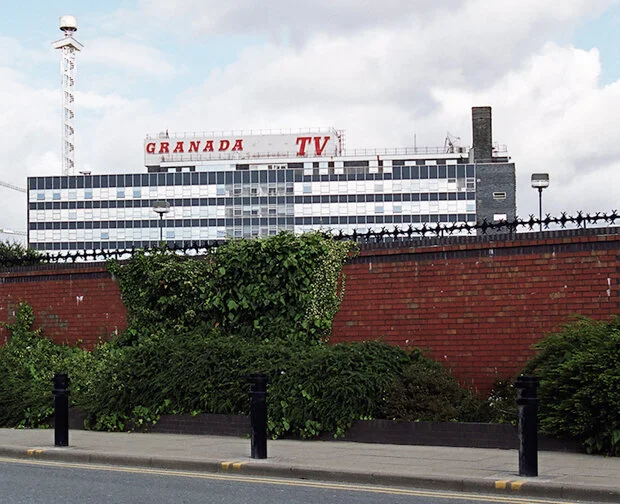
In terms of how to define the content of Mainstream Modern and criteria for inclusion, there are no strict rules, other than I have to have some form of fascination for a building, masterplan, artwork or unbuilt architectural project that features. Not only is it highly subjective, but is also an abuse of a term employed by Reyner Banham. It is used here as an umbrella that covers all of the above listed artefacts that are modern (usually after 1910), and not necessarily (though sometimes) of the avant-garde. There is a particular focus on post-war architecture and more predominantly the period 1960-73. This is in part due to the geographical area of the study, centred on Manchester, but expanding across the North, Midlands and Scotland to date. Manchester was a renewal city, not a recovery city.
Controls over building and resources were not lifted until 1954 and Manchester, like other post-industrial cities, did not see significant reconstruction until the 1960s. The oil crisis and financial collapse of the early 1970s curtailed further development and coincided with local government reforms that affected several metropolitan areas in 1974. This is relevant to another feature of content that will be prominent ? the local authority architect. Many departments under the guidance of County or City Architects had their heyday in the 1960s and into the 1970s, Lancashire included. As well as architecture of the welfare state I like industrial and functional buildings, system buildings and concrete. I enjoy the work of Gillepsie Kidd Coia, Lyons Israel and Ellis, Powell and Moya, Ryder and Yates, Chamberlin Powell and Bonn, John Madin, Peter Womersley and a host of less renowned regional practices and offices that I aim to present through Mainstream Modern.
I have used many resources and archives in my studies. Invaluable is the RIBA online search facility, a great engine and a comprehensive catalogue professionally administered. The journal collections of All Saints, John Rylands and Joule Libraries in Manchester have been, and remain, important to my work. As are the local studies collection and archives of the city and county, the MMU Visual Resource Centre and Special Collections. Many individuals have been kind with their time, advice, support, expertise and knowledge and I have tried to recall every person in the list of acknowledgments on the site. The most important person in this endeavour is Nina, her unwavering understanding of my peculiar hobby and its value to my work, the evenings and weekends when I have vanished or sat silently editing images.
Words and pictures by Richard Brook, Principal Lecturer at the Manchester School of Architecture.
Richard has made regular contributions to our magazine, The Modernist, and has led a number of our walking tours since the inception of the Manchester Modernist Society.
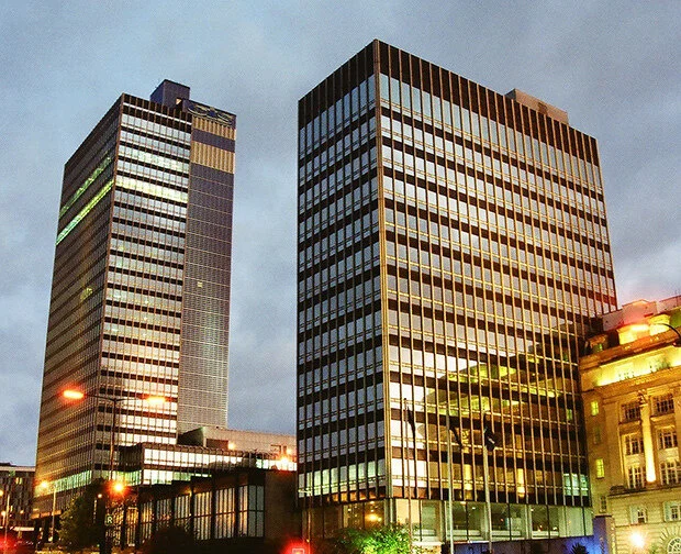
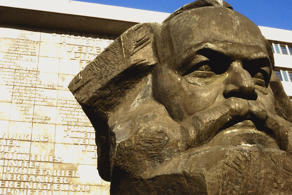
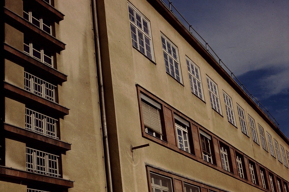
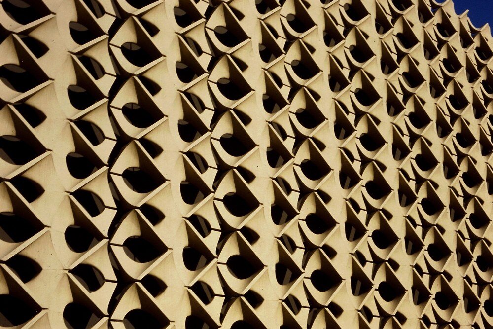
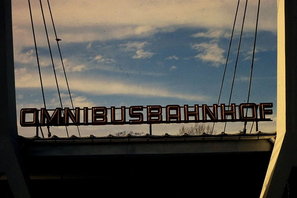
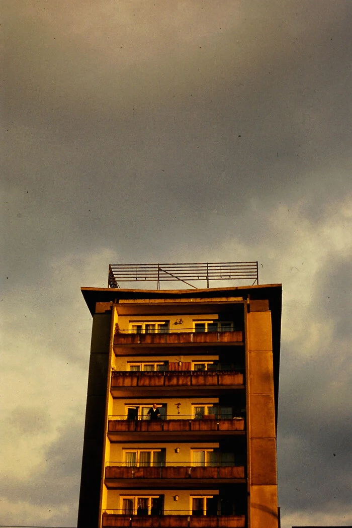
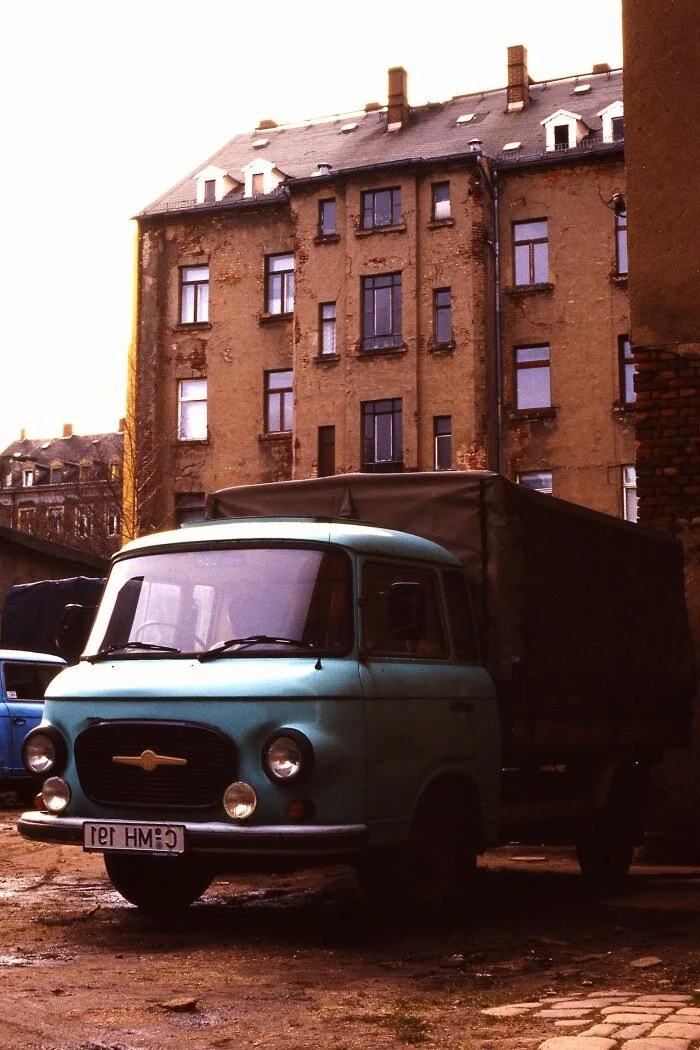
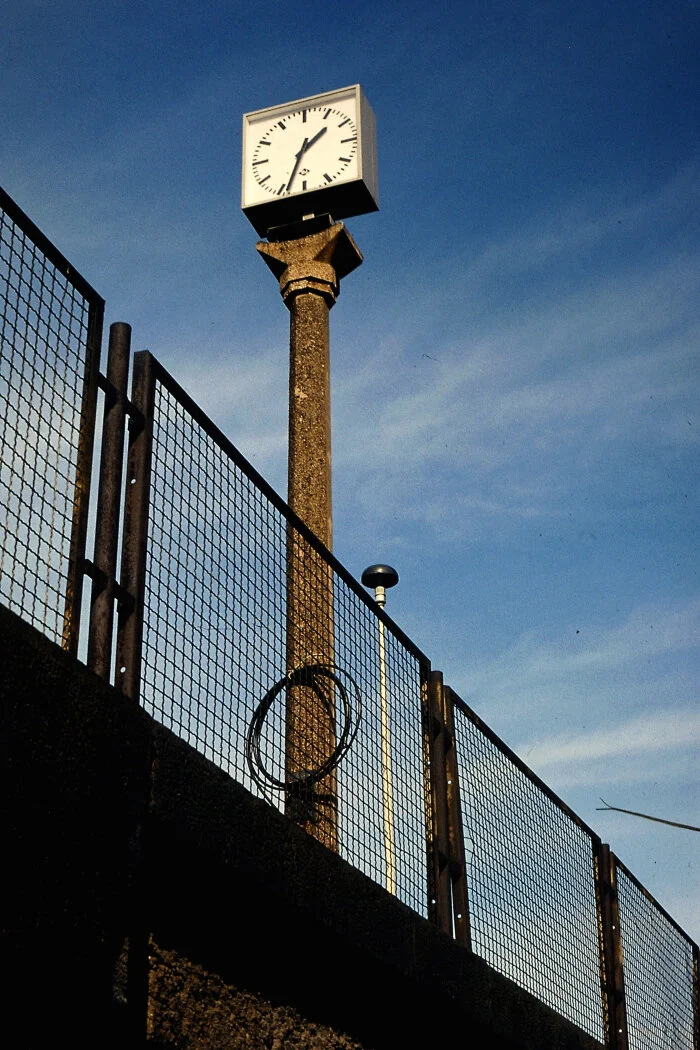
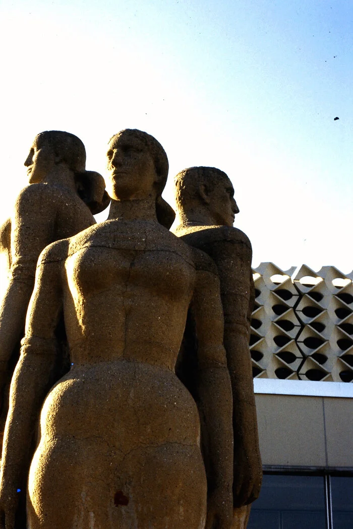
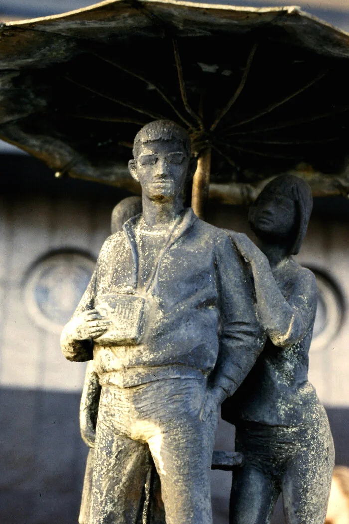
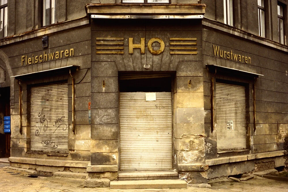
Karl-Marx-Stadt (1995)
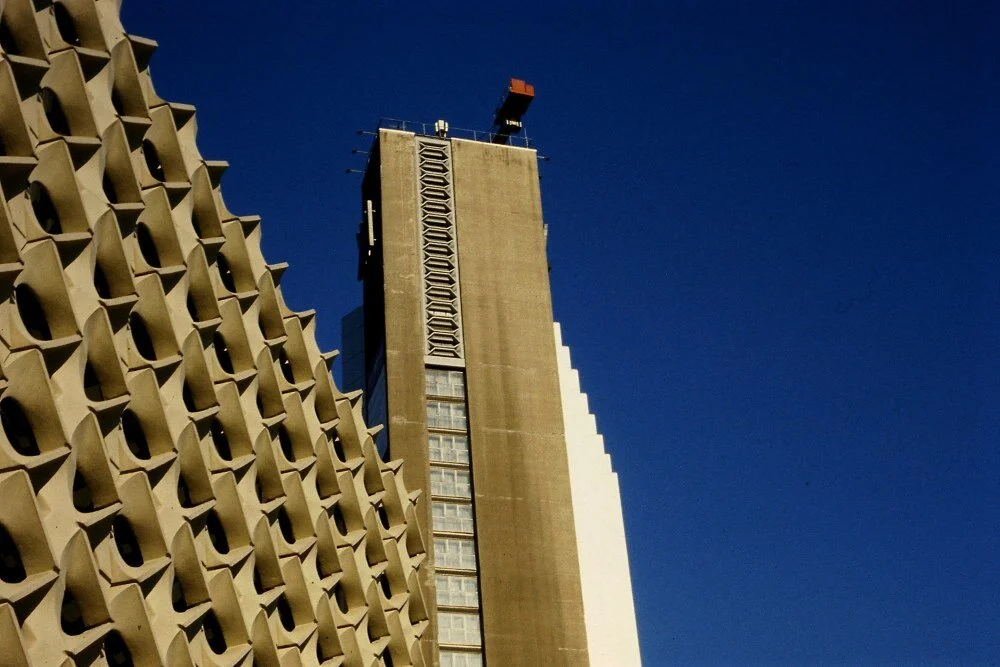
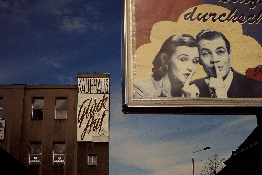
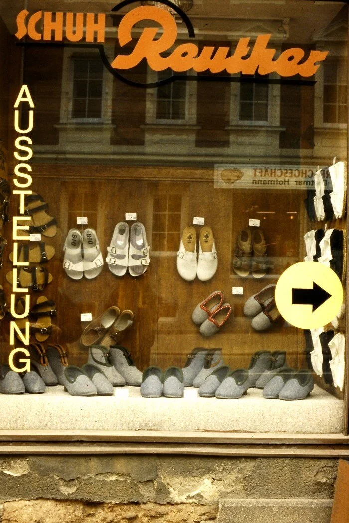
In 1995 Jack went to Chemnitz, or as it was known in the times of the DDR, Karl-Marx-Stadt. Here’s a visual record of that trip.
“Well, l have to go to a circus in Karl-Marx-Stadt.” says Roger Moore’s James Bond in Octopussy.
Well, I went to Karl-Marx-Stadt in 1995 and there was no circus, but Kenny Ball and his Jazz Men were due to play at the magnificent 1974 Stadthalle and the large bust (and it is a very large bust) of Karl Marx, looked down sternly over the town. (Kenny Ball wasn’t the reason for my visit, I’m not that cool.)
Karl-Marx-Stadt, formerly known as Chemnitz and latterly known as Chemnitz is one of Manchester’s partner towns (along with Leningrad and Cordoba). In 1995 this German city was commemorating the 50th anniversary of having been smashed to pieces by the allied air forces. On the 13/14th of February 1945, 717 RAF bombers attacked this industrial town followed by 760 British bombers on March 5th.. and being situated close to Leipzig and Dresden didn’t help. By May of that year Chemnitz was occupied by Soviet troops.
Chemnitz had had a strong history of architectural Modernism, the 1930 Schocken Department Store by Erich Mendelsohn being perhaps the most famous example. The Nazis later forced Salman Schocken to sell off his department stores. Much of the civic centre was rebuilt in the post-war Socialist years and many 19th century apartment blocks and industrial buildings also remain.
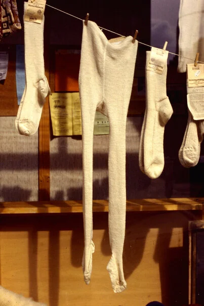
In 1995 the post-war GDR buildings were largely in-tact and some remnants of the Socialist years lingered on, there was the shop that sold only thick white woollen tights and still plenty of Trabants on the roads. Anyway, here we revisit Chemnitz of the 1990’s, Modernist, Socialist, 19th Century, white tights, Trabants and all.
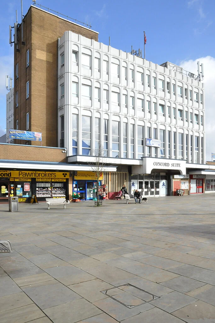
The Concord Suite: Droylsden
Over the next few weeks we’ll be revisiting our past blog posts, because some things are worth repeating. In April 2015 Steve Marland (the one and only Modern Moocher) took a trip to Droylsden for a look at The Concord Suite:
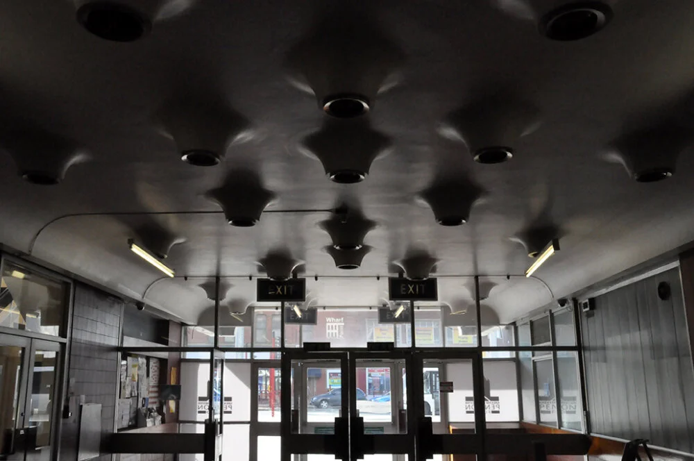
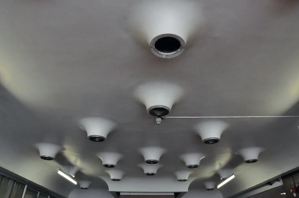
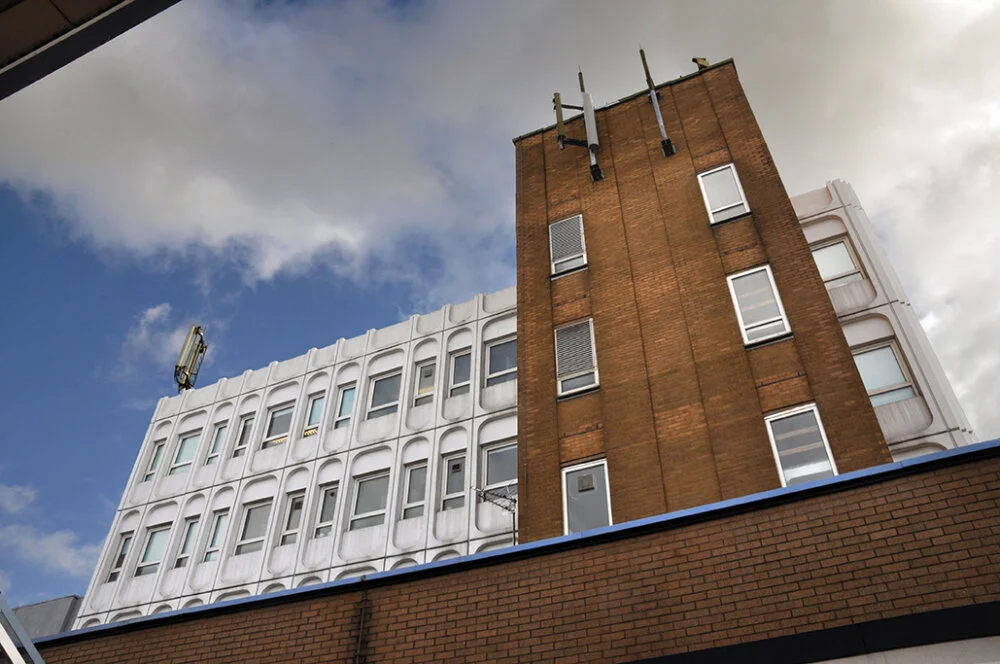
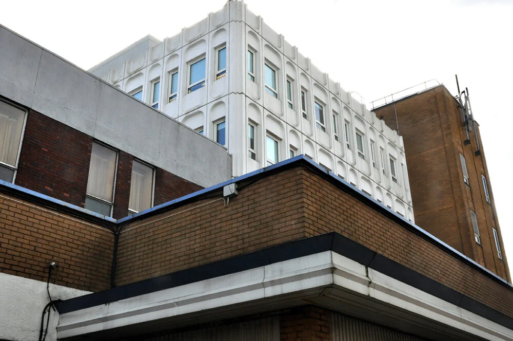
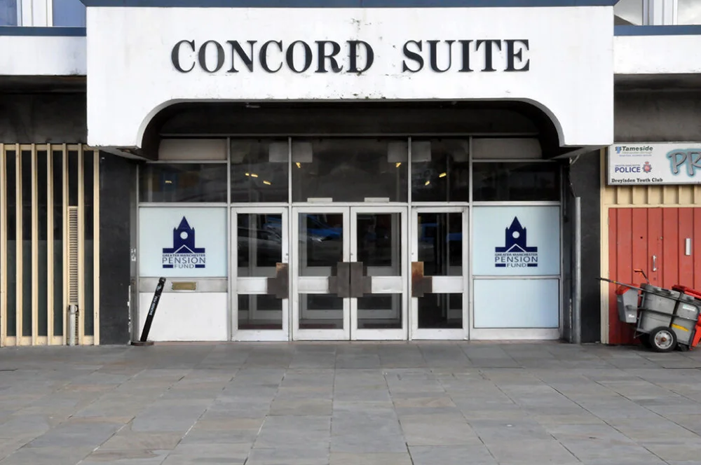
Let loose with a Metrolink ticket, our supersonic Steve sped up to Droylsden to check out the “harmonious” Concord Suite… the wise people of Wikipedia tell us – “The Concord Suite was built in the early 1970’s to house Droylsden Council. The word Concord comes from the town’s motto Concordia, meaning harmony”
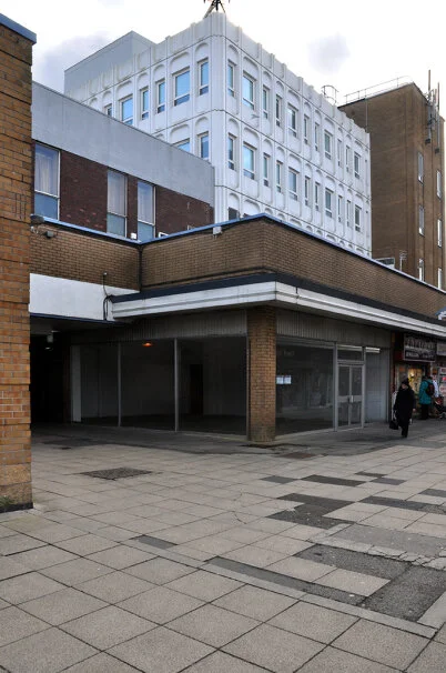
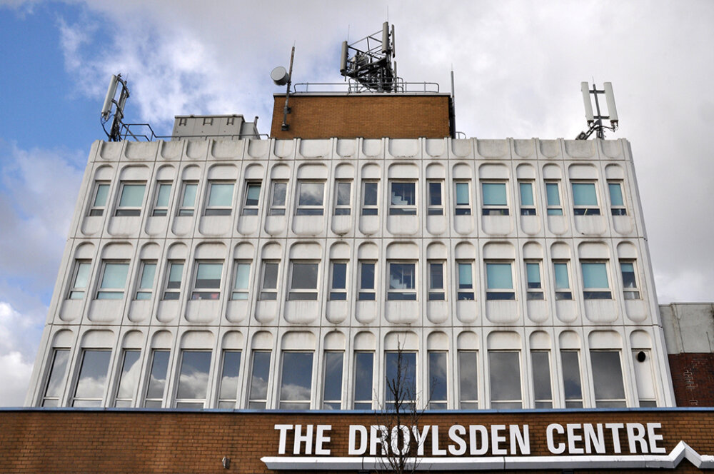
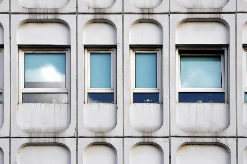
I’ve passed by for almost all of its life, marvelling at its white modular space age panels. The wide paved piazza frontage affords the lucky viewer a full appreciation of its futuristic whole, a giddy mix of brick, glass and concrete optimism. Civic architecture has never seemed so sunny.
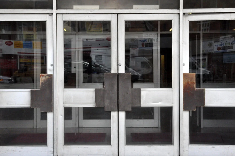
The interior lighting is straight out of 2001, white organic and fully functioning – the upstairs function room is available for functions at the junction of Market Street and Ashton New Road. I saw The Fall there for the first time shambolic and suitably feisty.
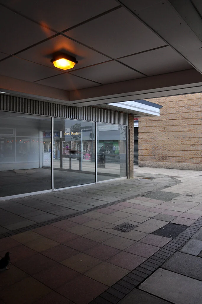
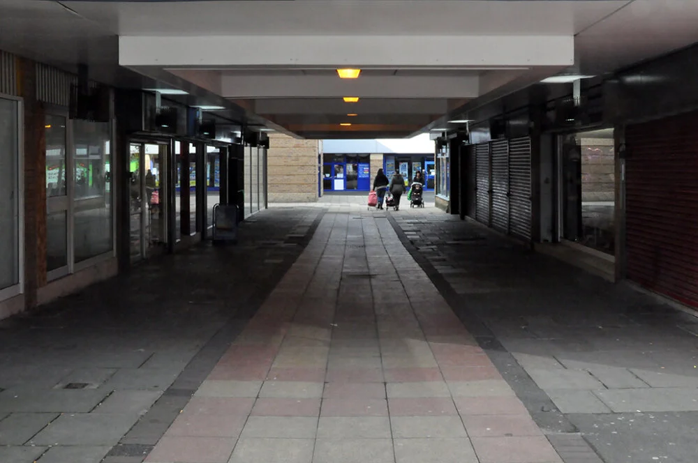
Renamed the Droylsden Centre on one side, it houses the regulation issue of charity shops and empty units. The main building is home to the Greater Manchester Pension Fund, soon to relocate to a new build across the road. The Concord will then provide a home for the workers leaving the soon to be demolished Tameside Council Offices in Ashton.
The tram stops here.
From The Archives 2 (2019)
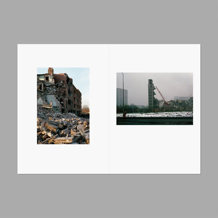
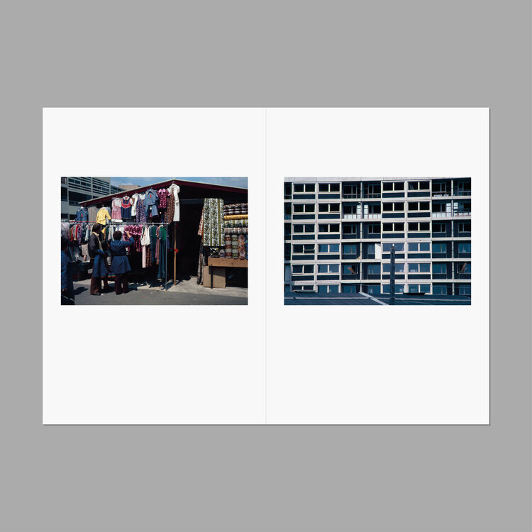
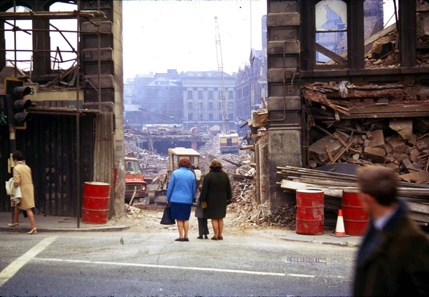
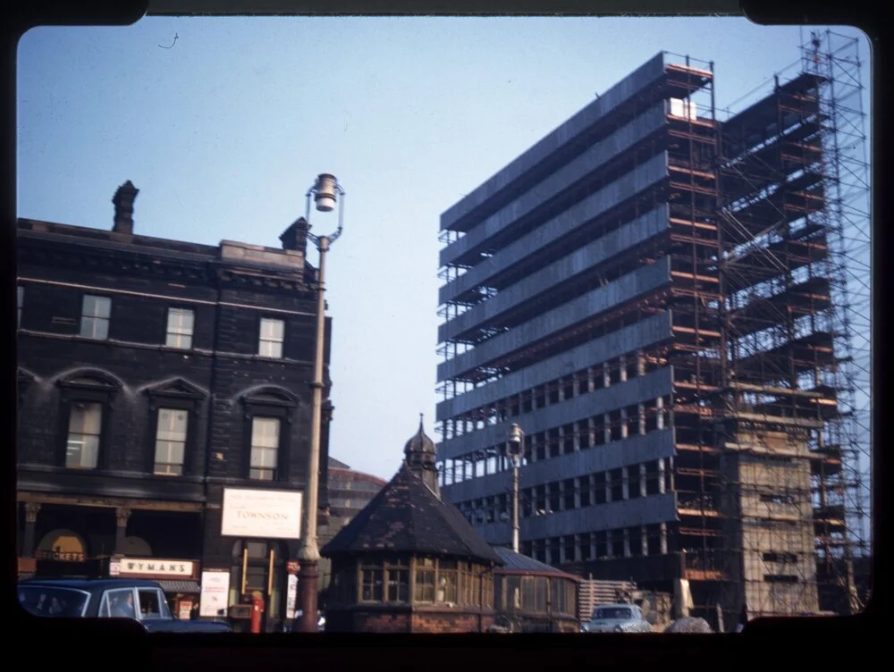
Our blog post today looks back to just a year ago, and our second volume of From The Archives. A remarkable set of photographs illustrating the transformation of Manchester in the 60s and 70s rediscovered by the Modernist Society in the archives of Chethams Library. The full collection of the second set of our From The Archives series presented in a special limited edition box set.
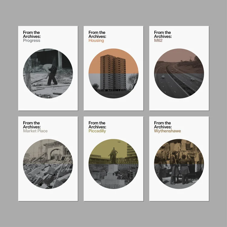
From The Archives 2 : Deconstruction/Construction, is a collaboration with Manchester’s historic Chethams Library, presenting images from their slide collection. Together with Richard Brook we have curated a series of 6 photo books each focussing on the demolition and rebuilding of Manchester. The majority of these images are rarely seen and have never been in print before. The images are historical, from the 1960s and 70s, and were scanned from the original slides.
The individual books are beautifully litho printed in full colour and are themselves limited edition.
Get all six books before everyone else by buying this lovely box set - hand numbered and limited to 100.
The individual titles are:
Progress
Housing
M62
Market Place
Piccadilly
Wythenshawe
Cost of Limited Edition Box Set : £40 plus p&p
From The Archives 2 : Deconstruction/Construction
Full Colour Litho Print on Munken Smooth
Curated by Richard Brook, Eddy Rhead and Jack Hale
Designed by Birthday
Printed by JUMP
6 x 32pp
148 x 210 mmm A5

Subscribe and receive each quarterly issue at a reduced price.
adventures...
Its a travel magazine of sorts.. Out now.
the shop
In our online shop you can buy back issues as well as our other publications and some other of Modernist goodies.. have a look.
fresh tweets
new events


Commodo cursus magna, vel scelerisque nisl consectetur et. Donec id elit non mi porta gravida at eget metus.